Categories
Pie charts Uncategorized

Pie Charts

Pie charts are used to compare categorical data and when done right they are extremely effective. They compare parts to a whole and are visually easy to understand. Below I came up with a perfect case to use a pie chart.


Let’s pretend you have a basket of 20 total fruits. You have five different kinds of fruits: apples, oranges, bananas, peaches, and pears. You want to find out the percentages of each fruit. A pie chart would be perfect for this because it compares a part to the whole.

Pie Chart without data labels
Pie Chart with labels

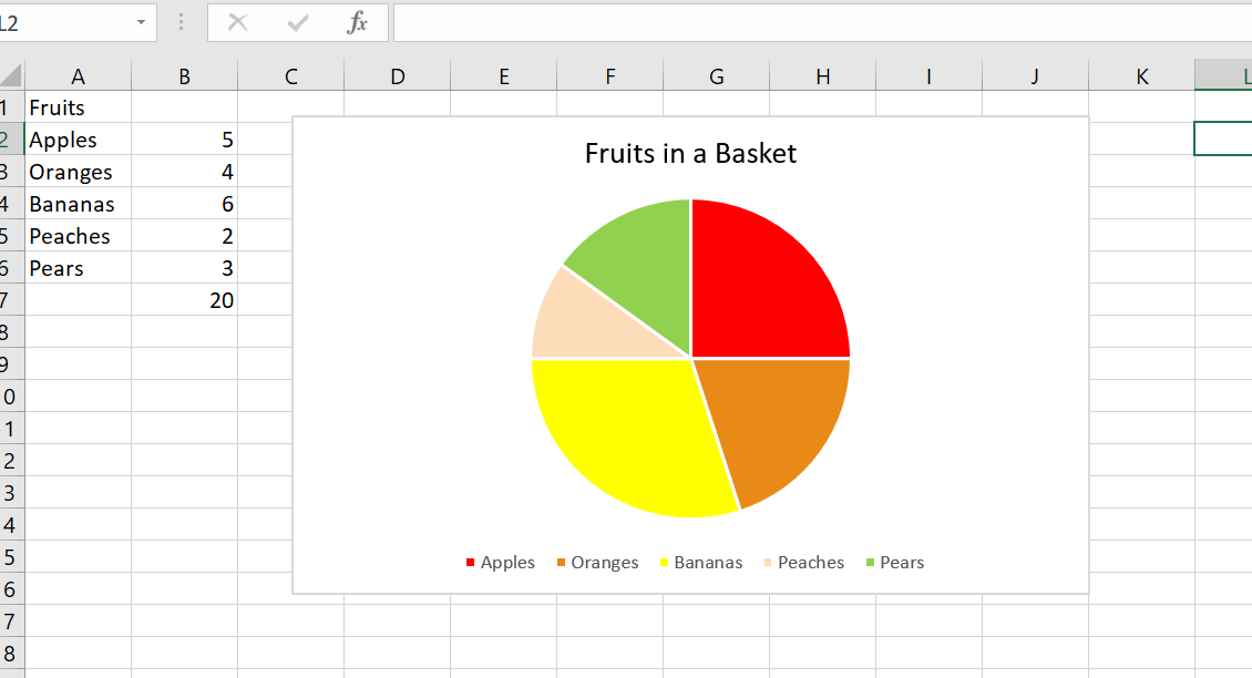
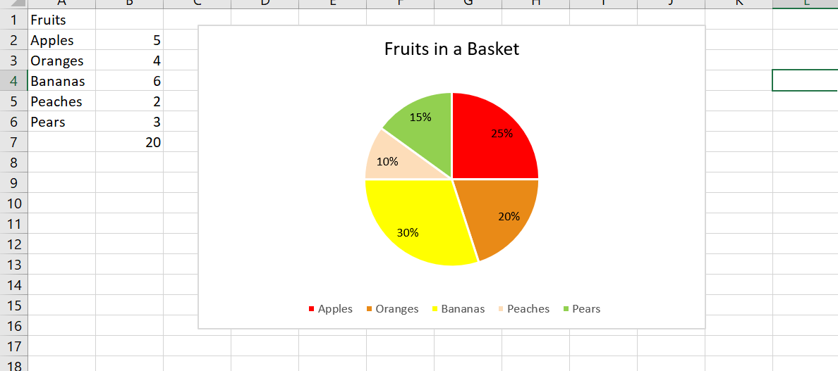
I included chart one and chart two to show the difference between no data labels and displayed data labels. Notice how without the percentages it is still easy to decipher that bananas make up the largest percentage in the basket. While the data labels help, they are not always necessary.

In this example, the pie chart is the most effective choice. I could have used a bar graph, but when trying to find the percentages of each fruit, it is best to use a parts of the whole chart. It is clear that peaches make up the least amount of the basket and bananas occur the most.

In addition, pie charts should only have around 5 categories and all data should add up to 100. Too many categories can look overwhelming and too cluttered. If the information given is not a part of a whole, this will confuse the reader. Check out https://visage.co/data-visualization-101-pie-charts/

It can be confusing how to know when to use a bar chart or pie chart but when trying to show percentages, it is the most effective and sensible choice. A bar chart can work, however visually looking at a circle and different sections is a better representation of the data. The circle represents the whole, or 100% while the sections represent parts or percentages of that whole. Bar charts do not do this.

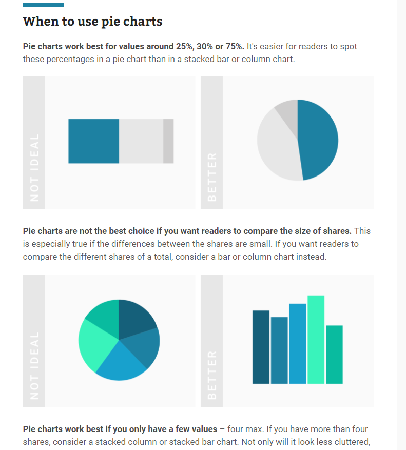
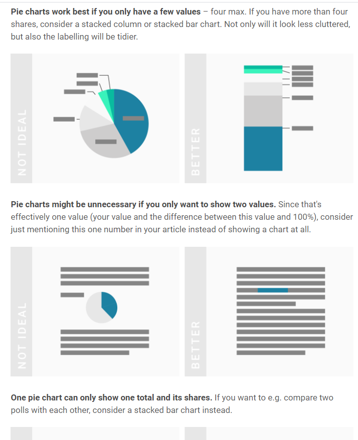
Below are some screenshots of a helpful website which explains when to use pie charts.

https://academy.datawrapper.de/article/127-what-to-consider-when-creating-a-pie-chart

To Sum It Up..

Pie charts are an extremely effective visualization that are used to find a percentage of a whole. The pie chart must equal 100 and are used for small amounts of categorical data. In the example shared, there were only five different fruits and the goal was to find the percentage of each fruit in the basket which is why this graph was the perfect visualization to use.

Categories
Uncategorized

Lollipop charts

Lollipop charts can be used where bar chart ink may be visually overwhelming. Shrinking visual obstacles can increase the readability for a large set of data. The base of a lollipop chart is a scatterplot. It is a little bit more complex to create than a bar chart, but it is more visually efficient than a blinding wall of bars. We can edit more individual pieces of a lollipop chart than we can with a bar graph. We can replace each dot with a related icon for a more detailed illustration and it won’t clog the graph like in a bar chart.

Solar Panel Sales

For my lollipop chart design, I converted data given to us for a different graph into a theoretical sales graph for solar panels. I used to work for a solar panel company so that was my motivation for creating this. I used green and yellow to help symbolize the data as renewable energy. Yellow for the solar energy. Green for the greener environment.

Categories
Data Visualization and Art Design lollipop chart

The Lollipop Chart

The lollipop chart is a variation of the traditional horizontal bar graph. It is used to rank categories, show trends over time or to compare categories. The lollipop chart eliminates most of the text show in a traditional horizontal bar graph, making it more approachable and minimalistic which allows readers to quickly gather information accurately.

The chart below shows a lollipop graph created in Excel. It displays the Socioeconomic Status rankings of 6 major countries in 2010. The graph has minimal information and therefore is easy to read. The reader can quickly learn that the United States has the highest SES ranking while the UK has the lowest.

This type of chart can be used with any data that can be represented by a standard bar or column chart. It is especially useful when you have a large amount of categories to represent, making a bar graph too cluttered. Lollipop graphs can also be vertical like the one shown below taken from Visualbi. A vertical lollipop graph allows you to add labels inside the lollipop to easily highlight values. To learn more about lollipop graphs and how to create them click here.

Lollipop Chart in SAP Lumira Designer - Visual BI Solutions
https://visualbi.com/blogs/sap/sap-businessobjects/sap-lumira-designer/lollipop-chart-sap-lumira-designer/

Categories
Uncategorized

Lollipop Visualizations

I think Lollipop Graphs are really interesting and creative ways to show your data. The first interesting thing is that you can create them in one of two ways: Either through Scatter Plot Graphs or through Bar Charts.

Lollipop Graphs are very simple, yet they show you exactly what you need. and that’s their exact purpose.

In my Lollipop Graph, I chose a data set about popular ice cream toppings. I chose to show them in ascending order because I thought it looked a lot better. It is very minimalistic, but I believe it gets the point across.

While doing some more research, I found some more variation of Lollipop charts like the ‘Cleveland Dot Plot’, which has a shorter line and shows two subgroups. More of these examples can be found at https://www.data-to-viz.com/graph/lollipop.html.

Categories
Uncategorized

Lollipop Graph

I find that the lollipop graph is useful for small amount of data points, say four to eight. Anything greater than ten and the graph just seems a bit overfilled to me.

I decided to use the data on Worldwide religions to make into a Lollipop graph Both vertical and Horizontal styles

Vertical Lollipops

Unfortunately, I couldn’t get my images to scale properly when I took them out of excel.

The interesting thing about the data is that is seems to be taken in one year (2010) and projected through the future. For example there is projected data for the breakdown in the year 2030. Thus, the numbers may not be accurate to today.

  • Sources
    • https://www.pewforum.org/2015/04/02/religious-projection-table/2020/percent/all/
Categories
data visualizations Examples

Lollipop Chart

The Lollipop chart seemed like a lot of special formatting from the beginning and I was pretty much right. It is just a bar graph that you edit to make it look better. As always, I spent way to long looking for data, but stumbled upon BTS pre-order sale numbers while I was taking a break on Twitter. It took a lot of time and it probably isn’t a type of graph I would use often, but the style is easier on the eyes that a bar graph, especially if there are a lot of bars.

BTS official album pre-sale numbers from 2015-Present

Like I said before, lollipop charts are best used when you have a lot of data to display, at least 20 different points, unlike my 9. It’s also saves on ink if someone would be printing this out to give to people or hand up. My biggest problem with this is that the circles aren’t an accurate representation of the number, the data point is located at the center of the dot and that makes it harder to read the true number. If you aren’t looking to be so precise with the visual and are looking to just show how the data points relate to each other, then using this graph is fine.

Categories
Uncategorized

Lollipop chart

A lollipop graph is a unique way to represent data and make comparisons between different figures or categories. Lollipop charts are favored over bar graphs when displaying figures of high values. Unlike bar graphs that present data in a cluttered way with a stack of bars, the lollipop chart allows the audience to better grasp the information that the chart is represented in a clear and concise manner. However, this type of chart has its limitations, it is not used to analyze for distribution, relationship, or composition.

This figure shows a comparison between a bar graph and a lollipop chart.

Image for post
https://towardsdatascience.com/lollipop-charts-2f748b90f6f0

There are two different types of lollipop charts, one is with vertical lines, and the other with horizontal lines. Both graphs offer the same visualization, but with different angles.

This is one example of a lollipop chart
This example of another type of lollipop chart was created in Excel.

In conclusion, lollipop chars are a great way to keep data simple, clear, easy to understand, and easy to compare and contrast by the audience.

Reference: Stephen ie D.H. Evergreen. Effective Data Visualization. 2nd edition

Categories
Uncategorized

Lollipop Chart… Sort Of

So this week I completely failed at trying to make a lollipop chart. I refuse to be too hard on myself because at one point I had been sitting at my kitchen table for over two hours trying to follow the directions from the book. The image below is what I ended up with.

I’m truly not sure where I went wrong. The petty side of my personality is saying who even cares. It’s just a bar graph that’s harder to read than normal. But I know before 3:00 tomorrow I will be trying again. And again. And if I can’t get it right then I’m willing to take that L.

Below is what a lollipop graph… should probably look like. Frankly, I don’t think I’m too far off. I think I can get there. But this has officially passed 3-D bar graph as my least favorite way to display data.

policyviz.com

A live look at me trying to figure out how the hell to make a lollipop graph and why can’t I get mine to look like hers and where are these supposed tools that will help me build one online

Categories
Uncategorized

The Lollipop Chart

When I first looked at Chapter 5 I thought it was way too complicated but the lollipop chart ended up being the easiest chart for me to understand. A lollipop is basically a bar graph but in my opinion is looks way more appealing. Lollipop charts look cleaner and simpler than the standard bar graph which are bulkier and look to cluttered.

The chart I made was just a sample data set of COVID tests that were done on the first of every month. The numbers on the set are not accurate but I was just playing around with the numbers so I could understand how the chart would actually work and how it would look.

My example was a simple example of a lollipop chart but there are so many different ways to actually display this type of chart. Similar to the back to back bar graphs, you can create a lollipop chart that looks the same. You can also switch the axis and make the chart of the y axis going horizontal instead of vertical on the x axis. The image below shows a combination of both the horizontal graph and also the back to back graph.

Categories
Uncategorized

All About Bench Marks.

As you very well may know, bar graphs are great at displaying differences between groups when there is a comparison that needs to be made

https://www.varsitytutors.com/ged_math-help/bar-graphs

Bar graphs are an awesome tool….but they aren’t perfect

Bar graphs only tell you what your group performances were. But what if you had a specific goal or mark in mind? And that is where benchmark lines fall short, in their story telling ability.

See here you not only have your group performances displayed in an organized manner, you are also able to quickly gauge the individual group performances against a specific goal.

Some Of The Benefits Of Adding a Benchmark line

  1. Understand How Your Business Stacks Up Against Your Competitors

2. More effectively Track the Progress of Business Goals and Objectives

3. Set performance expectations

Your line does not always have to be a positive number, sometime it can be negative or even Zero.

Done