Pie charts are very simplistic charts that can neatly display data that describes various parts of a whole. A properly designed pie chart should….
Always add up to 100%
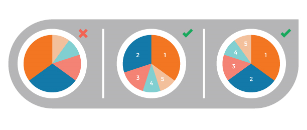
Display its slices in an easily understandable manner, such as by ordering them greatest to least in the clockwise direction.
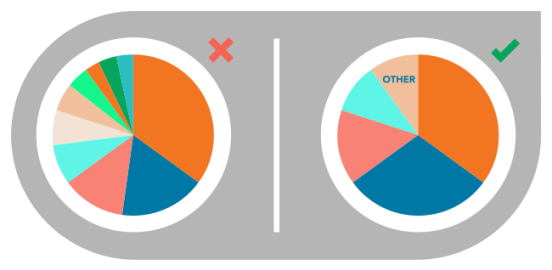
Avoid displaying too many categories, as it can crowd the graph.
Never include any 3-D features, a simple 2-D pie chart is more than capable of getting its information across without the added visual noise of 3-D effects.
Ideally include a readable legend within the graph itself that also includes the percentages/figures from the data.
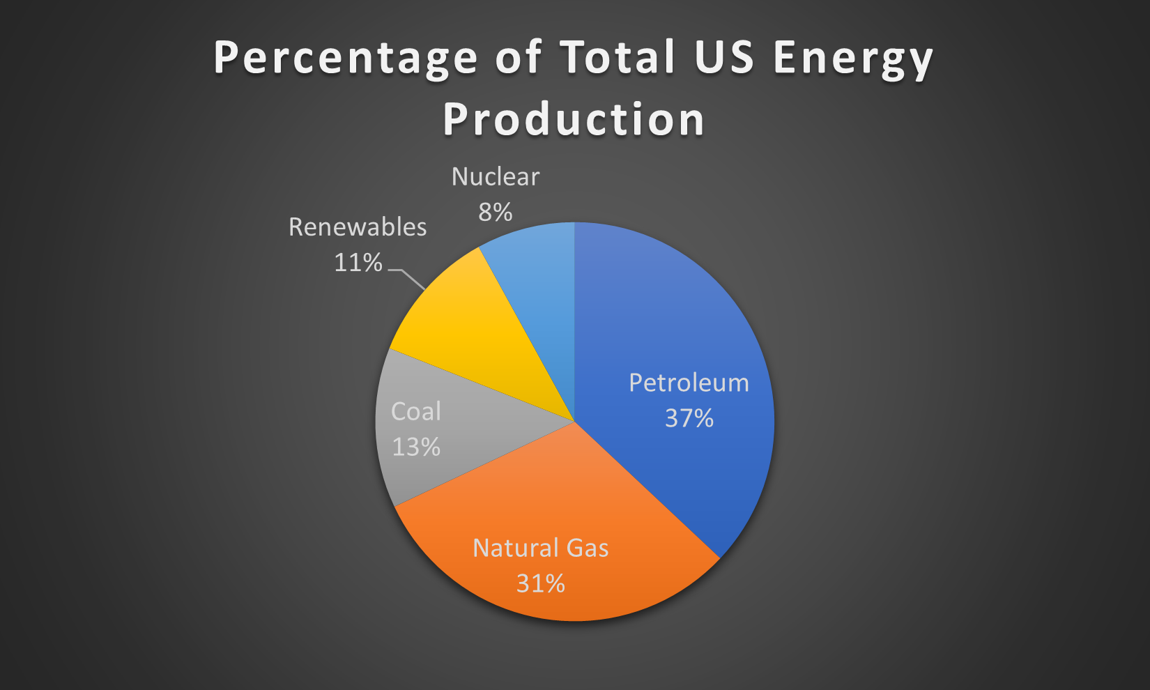
In order to display what a proper pie chart should look like, I used data from the Energy Information Administration on the make up of US energy production in 2018 by source.
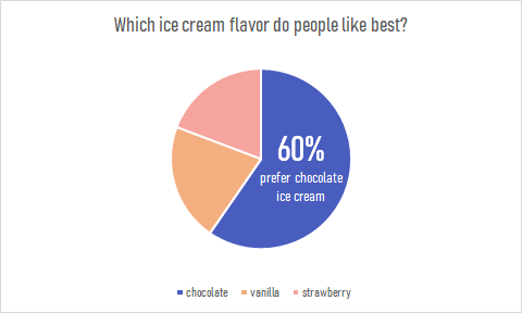
Since people typically have a hard time differentiating angles, pie charts have a very limited use as a data visualization tool. But there are special cases in which a pie chart could help your data stand out. Pie charts are used to represent data as a whole so it is important to make sure your percentages add up to 100%. In order to make your pie chart as effective as possible, it is best to use them for visualizations that don’t need many slices so that the graph is as simple as possible. Pie charts can also be used to highlight one piece of data to make a statement which can be seen in the graph I created down below.
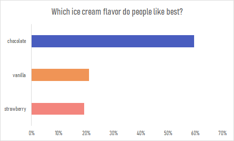
Pie charts are a great way to display simple survey results such as the one used to create the chart. The pie chart I created uses survey data from 104 participants to answer the question of which ice cream flavor is preferred by people. The results show that the majority of participants prefer chocolate ice cream over strawberry or vanilla. This information is highlighted in the pie chart to make the visualization effective. The audience can quickly pick up this information and answer the survey question easily. This data could also be presented in a bar graph such as the one down below. Although the horizontal bar graph is also easy to read and depicts the same story, the pie chart is the more effective chart in this case. It is minimalistic, straight to the point and contains less labels and text overall. The pie chart also compares the categories as a whole while a bar graph is not an effective method for that. More information on the usage and design of pie charts can be found here.
A Pie Chart is a type of graph that displays data in a circular graph. They display the percentage of total. The pieces of the graph are proportional to the fraction of the whole in each category. Each slice of the pie is relative to the size of that category in the group as a whole. The entire pie represents 100 percent of a whole, while the pie slices represent portions of the whole.
Pie Charts are a great way to represent part to whole data, like an actual piece of pie. They are best to use when you are dealing with data that adds up to 100% .
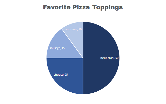
This is an example of a pie chart that I created displaying people’s favorite pizza toppings. Each slice represents a part of the whole, which is 100%.
Some things to note about pie charts
It is best to keep pie charts on the simpler side
Too much data can be distracting and messy
NEVER use 3D pie charts
Always remove the legend – the viewers eyes will be focusing on too many different things
Too many colors on a pie chart can be puzzling
Here is a link to the website that I found these tips on perfecting your pie chart.
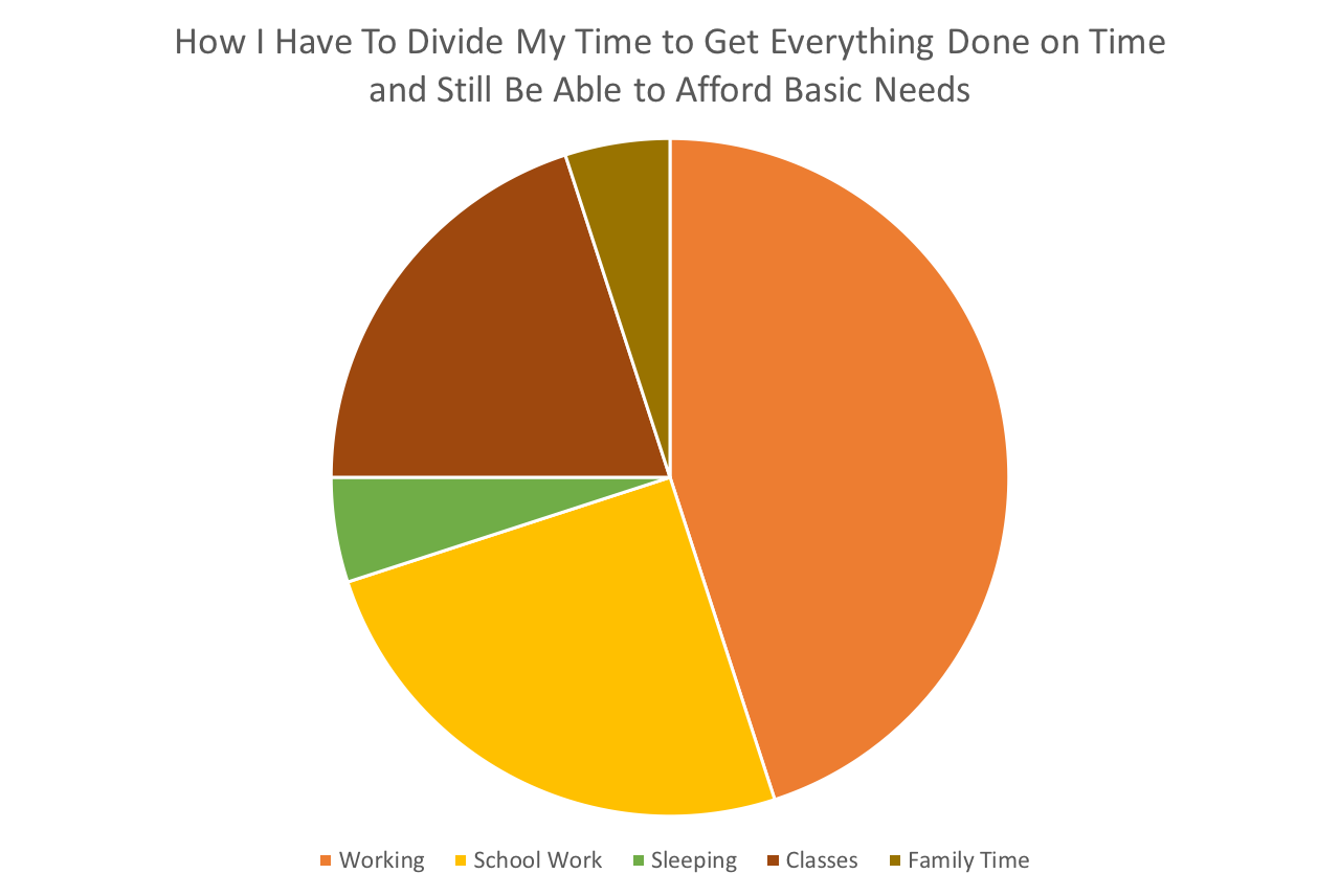
So with the semester starting to speed up it’s no surprise to literally anyone that I’m starting to fray around the edges a little bit. I don’t handle stress well, what can I say. Anyway, I thought this pie chart would be a good way for me to easily display how my time has to get broken up in order to live. See below.
I think this is definitely the best way to display this data. I wanted to emphasize how much time work takes out of my life. I think it worked. I also think that it’s best to use a pie chart when trying to show a large difference between several things.
If you want effectively communicate data visualization in which ” part-to-whole data is represented in binned quantitative values”, let’s use pie charts
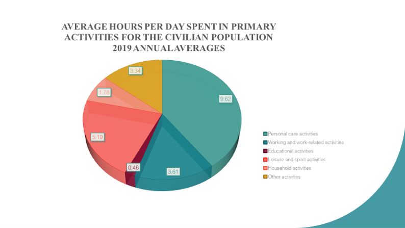
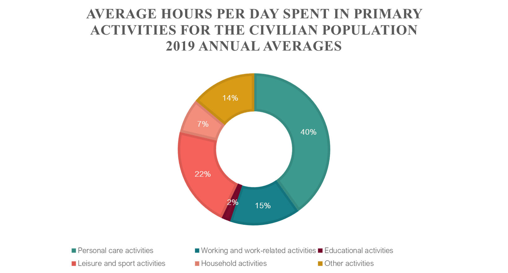
I introduce 2 pie charts to display average hours per day spent in primary activities for civilian population, 2019 annual averages that refer to person 15 years old and over. For more data details, please visit the website https://www.bls.gov/news.release/atus.toc.htm. American Time Use Survey Summary and tables are available.
Other charts can displays data correctly , but is is less effective to express its relative between data and part-to-whole data as pie charts
It is not so difficult for us to create these charts with a little computer skill.
All over the media, pie charts can be seen to represent data in the form of a visualization. BUT WHY?…
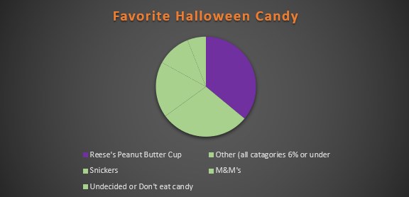
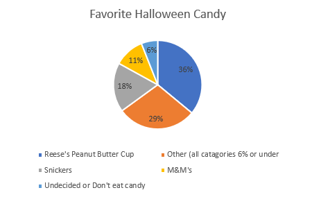
A pie chart allows the readers to understand the data without needing the specific numbers. Pie charts, when used accurately, can display a pieces of information within a specific population (sample) so a reader can see, depending on the size of the shape, roughly how it compares to the rest of the data. A bar graph is great for comparing multiple populations, and a pie graph works better for comparing within a particular population or within a whole. Using a pie chart allows readers to envision the data as one piece and can help condense data that can be confusing. It focuses on how each piece compares to the population; they can be manipulated to focus specifically on aspect of the pie. Pie charts are great to reveal the results of a poll and can neatly display the information. For example, I used data from a poll I found from Monmouth University about Halloween candy.
from a sample of 1,161 people
In this particular chart, I wanted to hone in on how Reese’s compares to the whole sample set. It is easy to see that though it is not the whole chart it takes up a large portion of the candy poll.
from a sample of 1,161 people
In this chart, I wanted to place focus on each candy and it’s comparison to one another. Leaving it up to readers to pick and choose which candy and how they want to compare it.
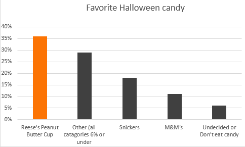
Take a moment and compare the two charts above, both use the same data and both have emphasis on the same value. The only difference between the two is the way the information is presented, a bar graph shows us that Reese’s earned the highest amount of votes on the candy poll. The pie graph, however, emphasizes on how much out of the whole sample Reese’s possesses.
Tips for creating pie Charts…
-Make sure the percentages equal 100%, otherwise the chart with be misleading and confusing to read.
– Use visually appealing colors, and if your goal is to place emphasis on a specific value chose a bold color to stand out amongst the rest.
– Organize information, keep in mind the way humans naturally read in a circle; clockwise or counter-clockwise (not across or up and down) . you will want to make sure data goes in a descending order.
Simply put, pie charts are best to use when you are trying to compare parts of a whole. They do not show changes over time. A simple organized pie chart can show lots information that can be read easily. A pie chart is a circular graph that is broken down into segments. These segments represent each category’s contribution to display parts of a whole. Therefore, if the data you have does not follow this, then you should use a diffrent type of graph.
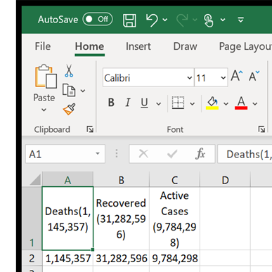
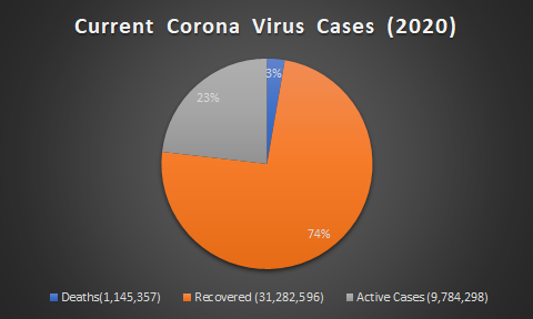
In my case, i decided to use current corona virus cases around the world. In the data i found, it has the total amount of cases, deaths resulting from the virus and the recovered. Below is a example of how i layed out my data in excel.
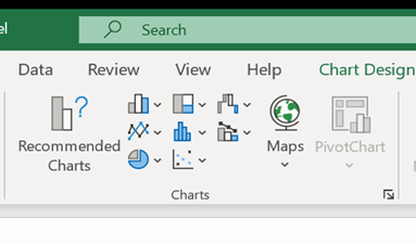
And from there, it is as simple as going to the insert tab and inserting a 2D pie chart.
The result is a easy to read pie chart that shows your data effectivly. From there you can go crazy with colors but dont forget to label your data and create a title for the data you are trying to represent!
Pie charts are a very interesting visualization as they cause some uproar for being invaluable and basic. Even with this belief, there will always be a great case for using a pie chart! In this blog you will explore one of these examples to better understand when you should and should not use a pie chart.
Example:
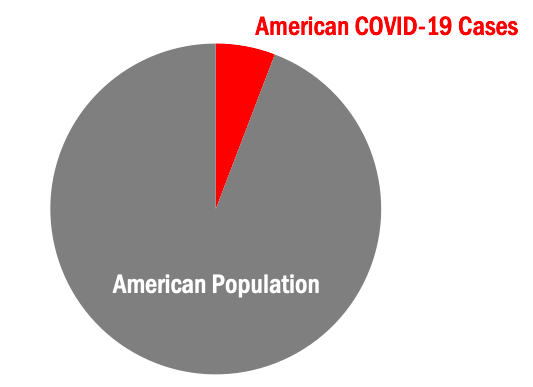
Today, we will explore a case that is perfect to visualize in a pie chart. This case is, coronavirus (COVID-19) cases in the United States versus the United States population. As you can already see, our pie chart will have two slices. A very important rule for pie charts is to stick with four or less slices per visual. This allows your audience to better understand what you are showing them.
Step One:
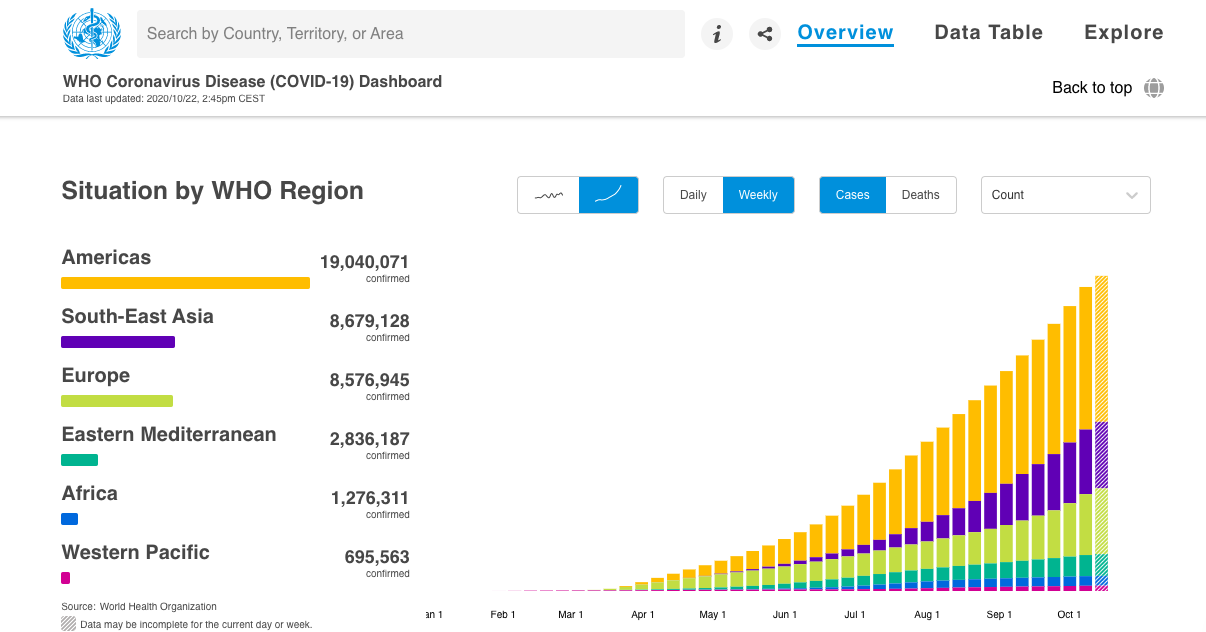
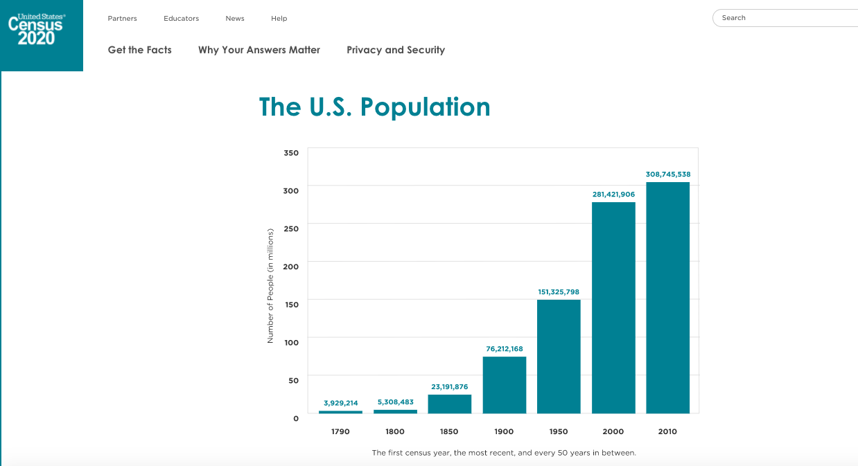
The first step in creating your pie chart is to collect your applicable data. Here I used the World Health Organization’s Coronavirus Disease Dashboard & the United States Census population data from 2010. Both of these resources are pictured below.
Americas cases (19,040,071) data was used in creating this pie chart example. United States 2010 population (308,745,538) data was used in creating this pie chart example.
Step Two:
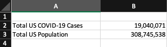
The second step in creating your pie chart is to construct your data in Excel. Pictured below is what the data table in Excel was for this pie chart example.
Step Three:
The third & final step in creating your pie chart visualization is to simply insert a pie chart visual & format your pie chart exactly how you’d like it. Remember, your audience craves something that is clean, clear & concise with it’s information. Do not clutter your pie chart with excess data causing it to have too many slices. Also consider highlighting your “important” data with color and making the other data a neutral color (like grey). An example of this can be seen below in the pictured final product of the United States COVID-19 cases example pie chart.
Wrapping It Up:
Remember, in order to have an effective visual you must only include the needed data and nothing more. A pie chart is a visualization that is best suited for simple datasets where complex datasets may need more then four slices and this is a no-go for pie charts! Allow color to help you highlight specific key details easier to your audience. I’m certain you noticed your eyes peeking at the red slice for COVID-19 U.S. cases in the above pie chart before the grey slice for U.S. population. This was exactly what I had intended the red to do, grab your attention! Using this information you will now understand how to create an effective pie chart visualization!
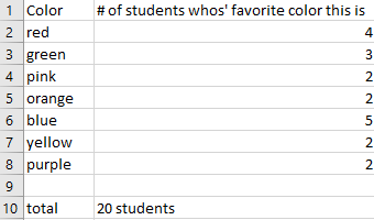
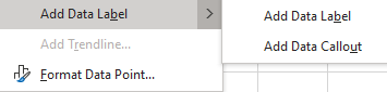
I believe one of the easiest ways to show how a pie chart should be used is to use “people’s favorites” of any topic. I provided a made-up survey of students and their favorite colors (out of 20 students). I plugged in the survey into excel, highlighted it, then inserted a pie chart with that information.
I thought something easy for the design of this pie chart was to right click on a section of the pie chart, then click on add data label, and lastly add data callout to have the number of and percentages labeled for each section.This is the end result.
The website I provided explains what a pie chart is, the way to make a pie chart, how to get the percentages for each section of the data for the pie chart, and more. https://www.mathsisfun.com/data/pie-charts.html
Pie charts are excellent for expressing proportions, especially those that have percentages. Pie charts tell a whole story but then divide it into smaller segments to better understand and visualize what the story is trying to portray. The best way to use pie charts is when expressing 2 to 6 different categories. A pie chart can be used to express the percentages of people with heart disease and those without, or people with BMW and those with Sudan. Pie Charts are most effective if labeled correctly, have few slices, and the colors show each slice with good contrast.
There are good Pie Charts, and there are poor quality pie charts.
There are also different types of Pie Charts to represent data, depending on the type of data and how someone wants their data to be displayed.
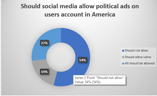
This pie chart is sliced into three sections to portion out the data. It gives the audience a visual of how big the percentage is.
This donut pie chart has a hole in the middle to separate the slices, which allow the audience to pull the slices apart and analyze it.
The colors used in this pie chart represent the slices and their data clearly. The numbers are organized in a clockwise direction and are in order with the legend,making it easy to understand and read.
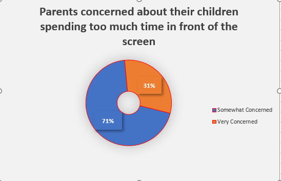
This is the same data as in the pie chart to the left. The data is best represented in a pie chart because with the pie chart, the slices give the audience a better visual of how many percentage or number.
These are some websites explaining how to effectively use pie charts and when it should be used: