Lollipop charts are perfect to use in similar situations that a bar graph would be used. Lollipop charts are great for comparing different sets of data in a category. This is especially a good chart for showing data with large number values: a long tall “lollipop” can help emphasize the data. It gets the name “lollipop” from its bars with circles at the end that mimic a lollipop. The biggest con of lollipop charts is the circle which can be hard to tell the exact value its marking.
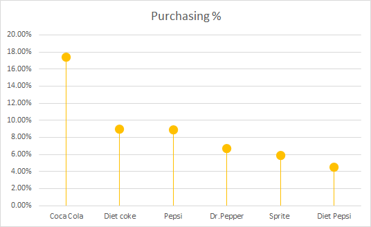
The below chart I found on google is a great example when to use a lollipop chart. The data is all in the higher percentages with emphasizes the old age retirement of the government officials. The chart also projects the long term increase compared to the current 2012. Since the circles land right on the lines the graph values are easy to read.
