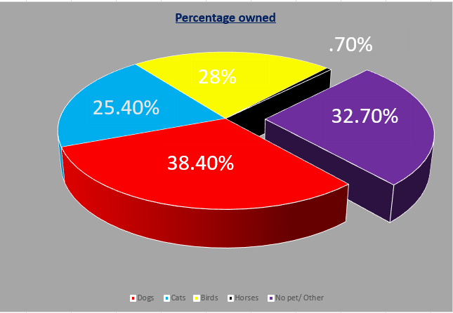
Pie charts are best used when depicting parts of a whole in data sets. I made this chart below to show the data I found on the American Veterinary site. This data is perfect because it shows the percentages of different pets owned in the United states. The different pet categories are the parts of a whole pet ownership in the united states. The different parts add up to a 100% perfectly because it is the whole ownership broken down. https://www.avma.org/resources-tools/reports-statistics/us-pet-ownership-statistics

The above example (found on google) is a perfect example of when to use a pie chart. This chart depicts the grades from a whole class broken into the different letter grades. This is a perfect way to see what percentage of the class did well and how many did not . This may help a teacher determine if a test was difficult for students.
One reply on “Pie Chart”
Hey i don’t see you have anything posted. I’m not gonna lie this class is very difficult for me as well. But just keep trying you’ll get it. Also YouTube helps a lot.