The assignment is to make a good argument for the “perfect use” of a pie-chart. I have found just that

A children’s maths book or activity book is probably the only perfect case. Children love look at shapes, and colourful objects, and the illogicality of the pie-chart is the same at any age and any stage of the growing mind
To be Frank, I don’t believe perfect’ case exists, if we define ‘perfect’ as ‘A pie chart would be the best choice, over any other graphical or visual method’. Nevertheless, for the sake of the assignment, I will give an example of acceptable use for a pie chart.
In this example. The slices of the pie is used to give a general size difference to represent the number of the numbers. As we have seen in the ‘bad infographics’ section of the course, too many entries makes pie charts cluttered and pointless. Nevertheless, take a look at this bar chart version of this pie-chart.
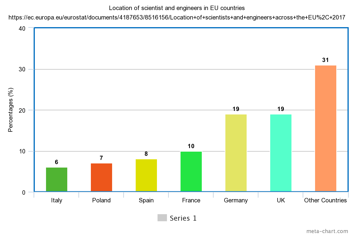
In this case you wouldn’t keep the percentages, you would use the actual figures each percentages is representing. But the point I want to make is that, that is the entire point of a pie chart: to oversimplify or trivialise the information. Humans do two things poorly: Percentage mathematics and intuitively understanding angle measurement, The pie chart combines two things we are bad and yet these are widely used. The bar graph, however, gets the job done just fine.
For the purpose of the assignment, I chose to use data from a favourite candy bar survey for a pie chart.
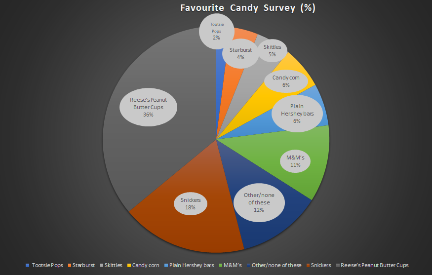
As a general rule I keep the elements of a Pie chart below 10. I keep the background a darker colour so that my eyes focus on the pie or wheel, and I keep the colours semi-simple. Keep the labels on the pie chart and the icons labels at the bottom, or the icon legend, is optional, but helps keep reference, even if it is redundant.
In the survey they claim it was taken by over 1100 people. So they took the number an changed it into a percentage. So but if you don’t know that, the percentage is meaningless. God forbid someone assumes a worldwide candy survey. Which would ruin the data considering Chocolate in the UK taste very different, in my opinion.
With that said, pie charts are pleasing to look at. And these days, the general population care more about aesthetics than useful, meaningful information. Here’s an amusing presentation simply titled ‘Pie charts are Evil’ done by Glen Bell, A data governance specialist in Australia.
For the purpose of this assignment I reached out to my university preceptors in both Applied maths and physics, all of them proudly or derisively asserted they have never seen or used pie charts in their entire professional career. This further inspired this section of my blog.
~~Haneef Abdul-Jabbaar
Can you tell I don’t like pie charts?