Pie charts are one of the easiest ways to represent your data. Some people seem to like using these charts and including them in their data stories. Others can’t stand them for a multitude of reasons.
I am a personal fan of pie charts when they are done correctly. In cases of 2 or 3 pieces of data, a pie chart can show you how each of their values differ in proportion to the size of their slice. But when you have 5 or more values, the chart can become crammed and you cannot accurately visualize the data.

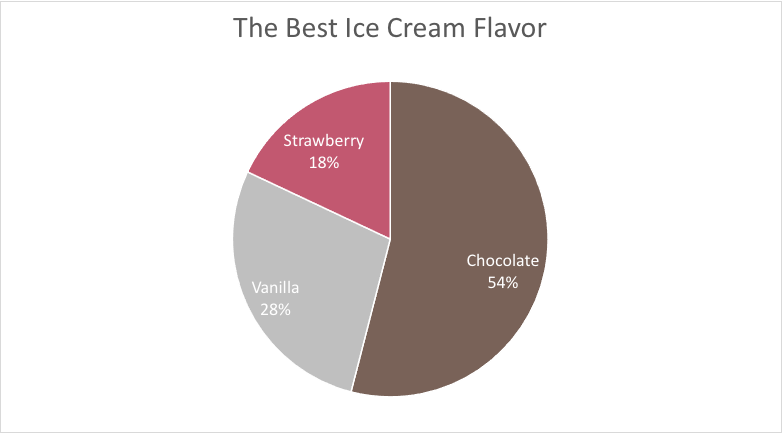
In this example, the values are easily identified and even have the values within their slices. This is a great way to show the significance of a number.

In this example, it’s a lot harder to see each of the data sets. Sure, the slices are labeled. But things are beginning to get cluttered and overwhelming. A simple bar chart would be much better to show these ratios.
More examples can be found at: https://medium.com/@KristinHenry/in-defense-of-pie-charts-and-why-you-shouldnt-use-them-df2e8ccb5f76
I wanted to include a pie chart of my own to show you what I think is the ideal chart.