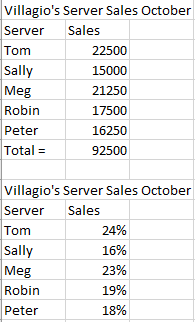
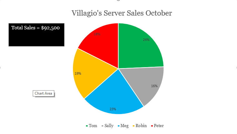
I created a hypothetical restaurant named Villagio’s for my pie chart. We will be looking at how much each server is contributing to our restaurant’s sales for the month of October. We need to set a new sales goal based on this information. This data is best suited for a pie as each individual server is contributing to the total sales.
The sales goal for December will be $100,000. We expect Tom and Meg to be our biggest contributors. We will be pushing Sally, Robin, and Peter to produce higher sales for December. We will begin to provide a $200 gift card for the largest contributor to incentivize our workers. We may need to hire an additional server if our current servers do not feel that they can reasonably meet the sales goals.