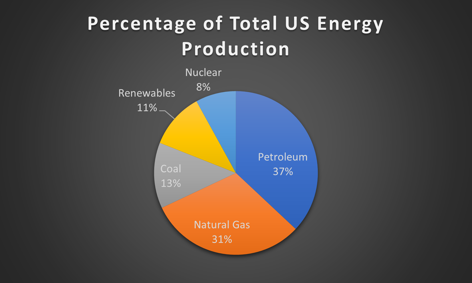
Pie charts are very simplistic charts that can neatly display data that describes various parts of a whole. A properly designed pie chart should….
- Always add up to 100%
- Display its slices in an easily understandable manner, such as by ordering them greatest to least in the clockwise direction.
- Avoid displaying too many categories, as it can crowd the graph.
- Never include any 3-D features, a simple 2-D pie chart is more than capable of getting its information across without the added visual noise of 3-D effects.
- Ideally include a readable legend within the graph itself that also includes the percentages/figures from the data.
In order to display what a proper pie chart should look like, I used data from the Energy Information Administration on the make up of US energy production in 2018 by source.