Since people typically have a hard time differentiating angles, pie charts have a very limited use as a data visualization tool. But there are special cases in which a pie chart could help your data stand out. Pie charts are used to represent data as a whole so it is important to make sure your percentages add up to 100%. In order to make your pie chart as effective as possible, it is best to use them for visualizations that don’t need many slices so that the graph is as simple as possible. Pie charts can also be used to highlight one piece of data to make a statement which can be seen in the graph I created down below.
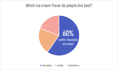
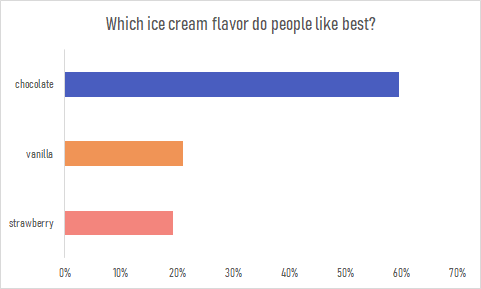
Pie charts are a great way to display simple survey results such as the one used to create the chart. The pie chart I created uses survey data from 104 participants to answer the question of which ice cream flavor is preferred by people. The results show that the majority of participants prefer chocolate ice cream over strawberry or vanilla. This information is highlighted in the pie chart to make the visualization effective. The audience can quickly pick up this information and answer the survey question easily. This data could also be presented in a bar graph such as the one down below. Although the horizontal bar graph is also easy to read and depicts the same story, the pie chart is the more effective chart in this case. It is minimalistic, straight to the point and contains less labels and text overall. The pie chart also compares the categories as a whole while a bar graph is not an effective method for that. More information on the usage and design of pie charts can be found here.