This week we were asked to create a lollipop chart and then blog about our experience.
First things First, what the heck is it?
The Lollipop chart is way of taking a column graph/ chart and making it less visually overwhelming. I dont know about you but my visual appetite is big, so the simpler the better, especially when conveying a non-artistic message is you “point”.
while working on previous assignments we strived for simplicity by simply deleting the elements of the chart that were not helpful in getting our point across.
we deleted tick marks, lightened grid lines and even removed an axis line. so, what Left?
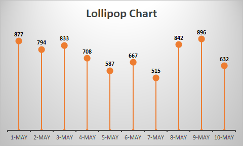
All that ink making up each bar. Some research has shown that this “ink-friendly design impacts readability and leads to faster response times and greater accuracy
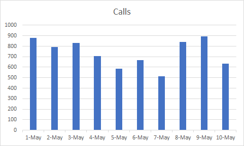
| Date | Calls | |
| 1-May | 877 | |
| 2-May | 794 | |
| 3-May | 833 | |
| 4-May | 708 | |
| 5-May | 587 | |
| 6-May | 667 | |
| 7-May | 515 | |
| 8-May | 842 | |
| 9-May | 896 | |
| 10-May | 632 | |
To make my own i started with 10 simple data entries then i inserted a clustered column chart.
The hardest part for me was those darn grid lines, so after my 25th time of reading the instructions i finally got it.
This was the hardest chart to figure out how to make but the easiest once to figure out how, it is a pretty straight forward data visual.