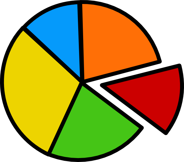
A Pie Chart is a type of graph that displays data in a circular graph. They display the percentage of total. The pieces of the graph are proportional to the fraction of the whole in each category. Each slice of the pie is relative to the size of that category in the group as a whole. The entire pie represents 100 percent of a whole, while the pie slices represent portions of the whole.
Pie Charts are a great way to represent part to whole data, like an actual piece of pie. They are best to use when you are dealing with data that adds up to 100% .
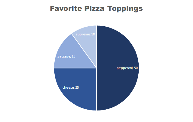
This is an example of a pie chart that I created displaying people’s favorite pizza toppings. Each slice represents a part of the whole, which is 100%.
Some things to note about pie charts
- It is best to keep pie charts on the simpler side
- Too much data can be distracting and messy
- NEVER use 3D pie charts
- Always remove the legend – the viewers eyes will be focusing on too many different things
- Too many colors on a pie chart can be puzzling
Here is a link to the website that I found these tips on perfecting your pie chart.