If you want effectively communicate data visualization in which ” part-to-whole data is represented in binned quantitative values”, let’s use pie charts
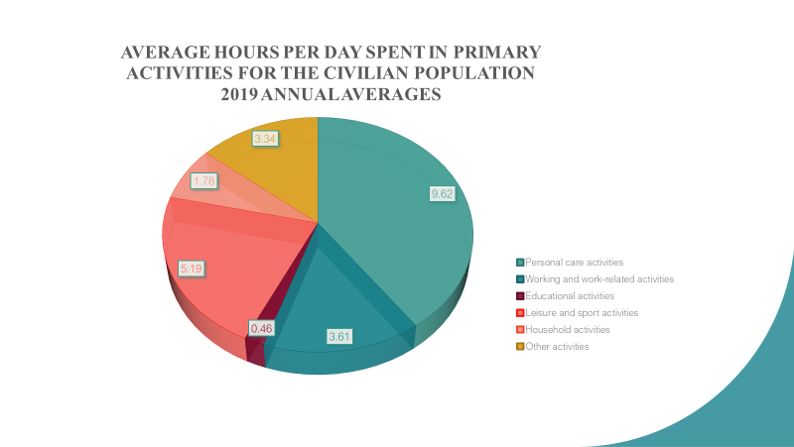
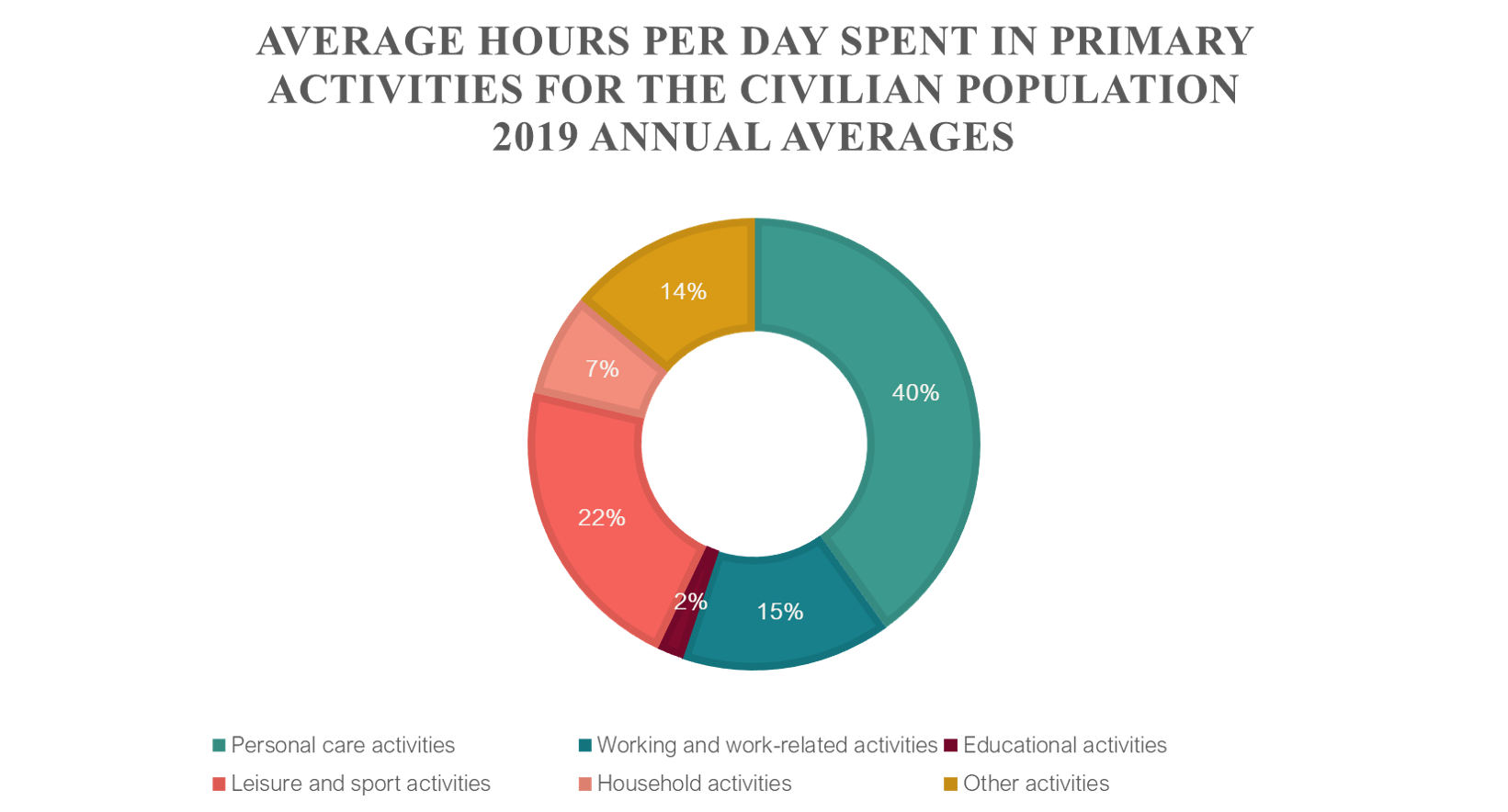
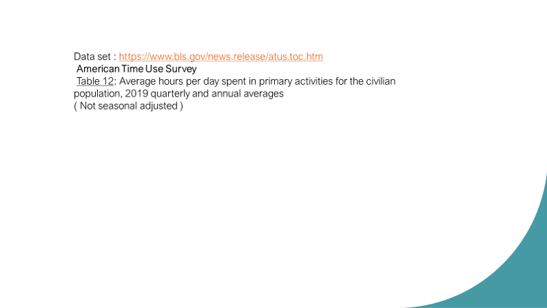
I introduce 2 pie charts to display average hours per day spent in primary activities for civilian population, 2019 annual averages that refer to person 15 years old and over. For more data details, please visit the website https://www.bls.gov/news.release/atus.toc.htm. American Time Use Survey Summary and tables are available.
Other charts can displays data correctly , but is is less effective to express its relative between data and part-to-whole data as pie charts
It is not so difficult for us to create these charts with a little computer skill.

Thank you!