All over the media, pie charts can be seen to represent data in the form of a visualization. BUT WHY?…
A pie chart allows the readers to understand the data without needing the specific numbers. Pie charts, when used accurately, can display a pieces of information within a specific population (sample) so a reader can see, depending on the size of the shape, roughly how it compares to the rest of the data. A bar graph is great for comparing multiple populations, and a pie graph works better for comparing within a particular population or within a whole. Using a pie chart allows readers to envision the data as one piece and can help condense data that can be confusing. It focuses on how each piece compares to the population; they can be manipulated to focus specifically on aspect of the pie. Pie charts are great to reveal the results of a poll and can neatly display the information. For example, I used data from a poll I found from Monmouth University about Halloween candy.
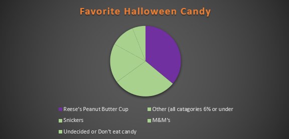
In this particular chart, I wanted to hone in on how Reese’s compares to the whole sample set. It is easy to see that though it is not the whole chart it takes up a large portion of the candy poll.
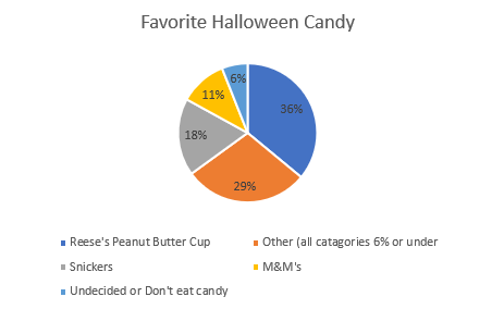
In this chart, I wanted to place focus on each candy and it’s comparison to one another. Leaving it up to readers to pick and choose which candy and how they want to compare it.

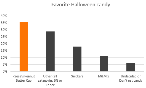
Take a moment and compare the two charts above, both use the same data and both have emphasis on the same value. The only difference between the two is the way the information is presented, a bar graph shows us that Reese’s earned the highest amount of votes on the candy poll. The pie graph, however, emphasizes on how much out of the whole sample Reese’s possesses.
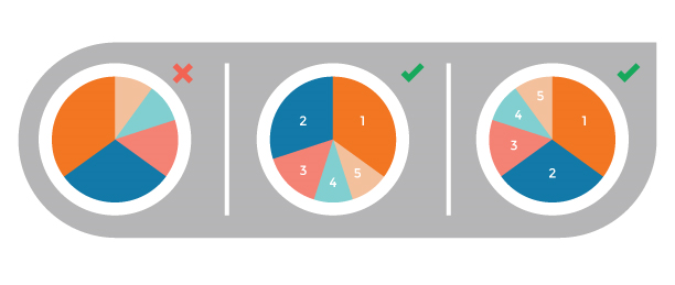
Tips for creating pie Charts…
-Make sure the percentages equal 100%, otherwise the chart with be misleading and confusing to read.
– Use visually appealing colors, and if your goal is to place emphasis on a specific value chose a bold color to stand out amongst the rest.
– Organize information, keep in mind the way humans naturally read in a circle; clockwise or counter-clockwise (not across or up and down) . you will want to make sure data goes in a descending order.
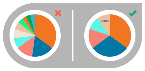
-Use smaller data sets to avoid overcrowding