Simply put, pie charts are best to use when you are trying to compare parts of a whole. They do not show changes over time. A simple organized pie chart can show lots information that can be read easily. A pie chart is a circular graph that is broken down into segments. These segments represent each category’s contribution to display parts of a whole. Therefore, if the data you have does not follow this, then you should use a diffrent type of graph.
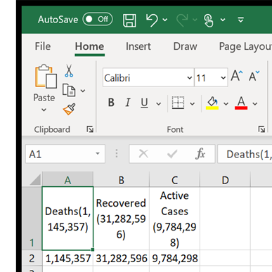
In my case, i decided to use current corona virus cases around the world. In the data i found, it has the total amount of cases, deaths resulting from the virus and the recovered. Below is a example of how i layed out my data in excel.
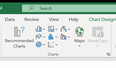
And from there, it is as simple as going to the insert tab and inserting a 2D pie chart.
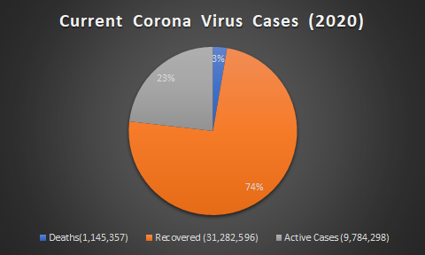
The result is a easy to read pie chart that shows your data effectivly. From there you can go crazy with colors but dont forget to label your data and create a title for the data you are trying to represent!
One reply on “Creating Pie Charts”
I Agree if you are trying to show changes over time a pie chart would be very confusing and would not get the point across.