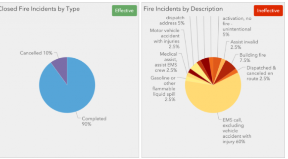
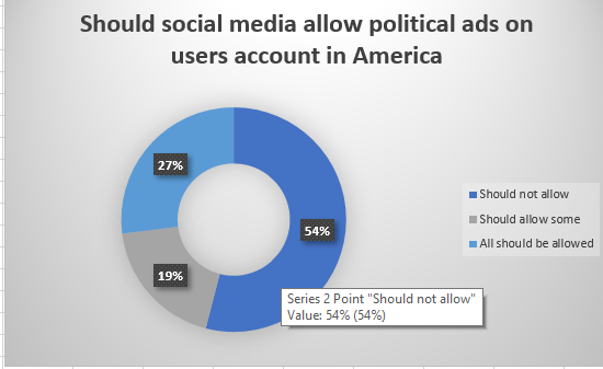
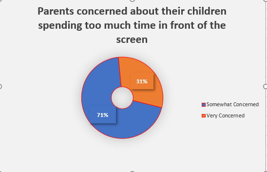
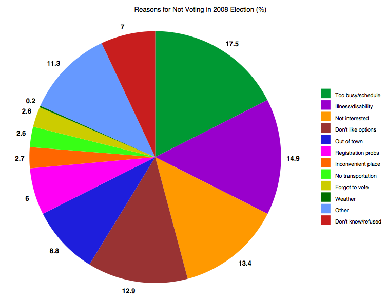
Pie charts are excellent for expressing proportions, especially those that have percentages. Pie charts tell a whole story but then divide it into smaller segments to better understand and visualize what the story is trying to portray. The best way to use pie charts is when expressing 2 to 6 different categories. A pie chart can be used to express the percentages of people with heart disease and those without, or people with BMW and those with Sudan. Pie Charts are most effective if labeled correctly, have few slices, and the colors show each slice with good contrast.
There are good Pie Charts, and there are poor quality pie charts.
There are also different types of Pie Charts to represent data, depending on the type of data and how someone wants their data to be displayed.
These are some websites explaining how to effectively use pie charts and when it should be used: