Pie charts are used to compare categorical data and when done right they are extremely effective. They compare parts to a whole and are visually easy to understand. Below I came up with a perfect case to use a pie chart.
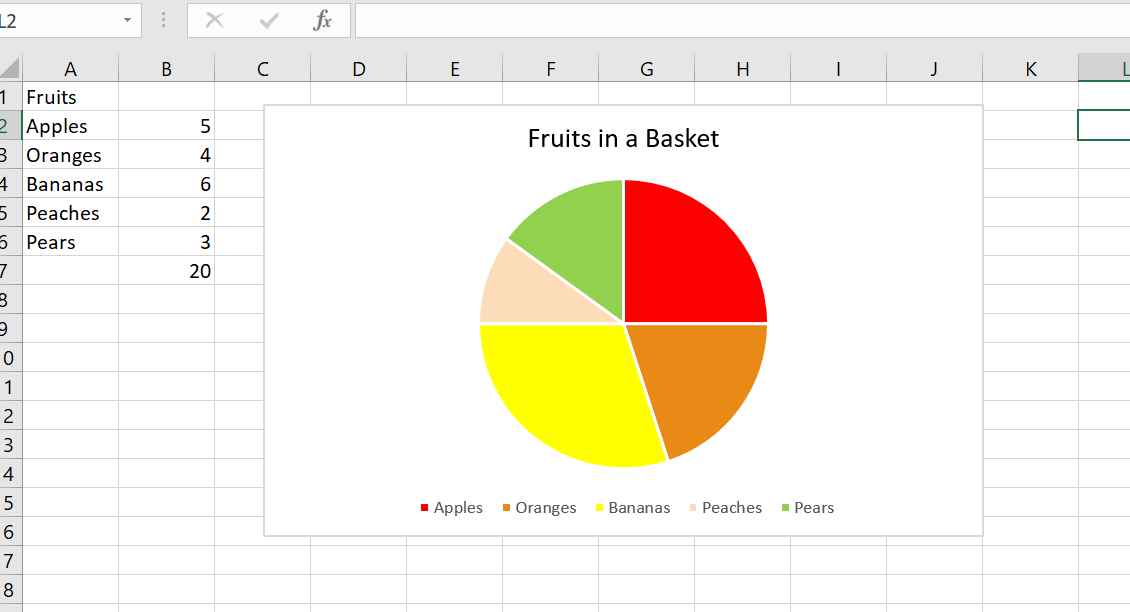
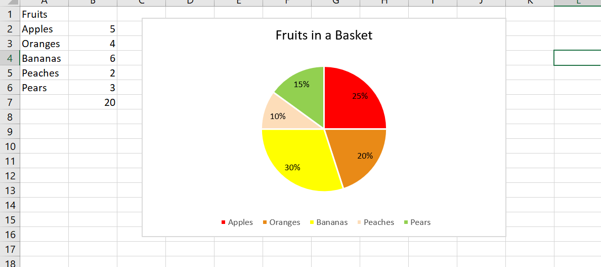
Let’s pretend you have a basket of 20 total fruits. You have five different kinds of fruits: apples, oranges, bananas, peaches, and pears. You want to find out the percentages of each fruit. A pie chart would be perfect for this because it compares a part to the whole.


I included chart one and chart two to show the difference between no data labels and displayed data labels. Notice how without the percentages it is still easy to decipher that bananas make up the largest percentage in the basket. While the data labels help, they are not always necessary.
In this example, the pie chart is the most effective choice. I could have used a bar graph, but when trying to find the percentages of each fruit, it is best to use a parts of the whole chart. It is clear that peaches make up the least amount of the basket and bananas occur the most.
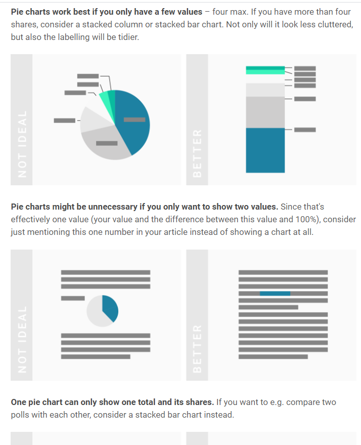
In addition, pie charts should only have around 5 categories and all data should add up to 100. Too many categories can look overwhelming and too cluttered. If the information given is not a part of a whole, this will confuse the reader. Check out https://visage.co/data-visualization-101-pie-charts/
It can be confusing how to know when to use a bar chart or pie chart but when trying to show percentages, it is the most effective and sensible choice. A bar chart can work, however visually looking at a circle and different sections is a better representation of the data. The circle represents the whole, or 100% while the sections represent parts or percentages of that whole. Bar charts do not do this.
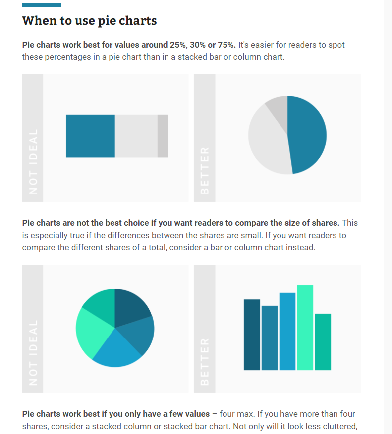
Below are some screenshots of a helpful website which explains when to use pie charts.


To Sum It Up..
Pie charts are an extremely effective visualization that are used to find a percentage of a whole. The pie chart must equal 100 and are used for small amounts of categorical data. In the example shared, there were only five different fruits and the goal was to find the percentage of each fruit in the basket which is why this graph was the perfect visualization to use.
One reply on “Pie Charts”
I feel like including the percentages can really help when comparing multiple sets of data or when they are very small amounts.