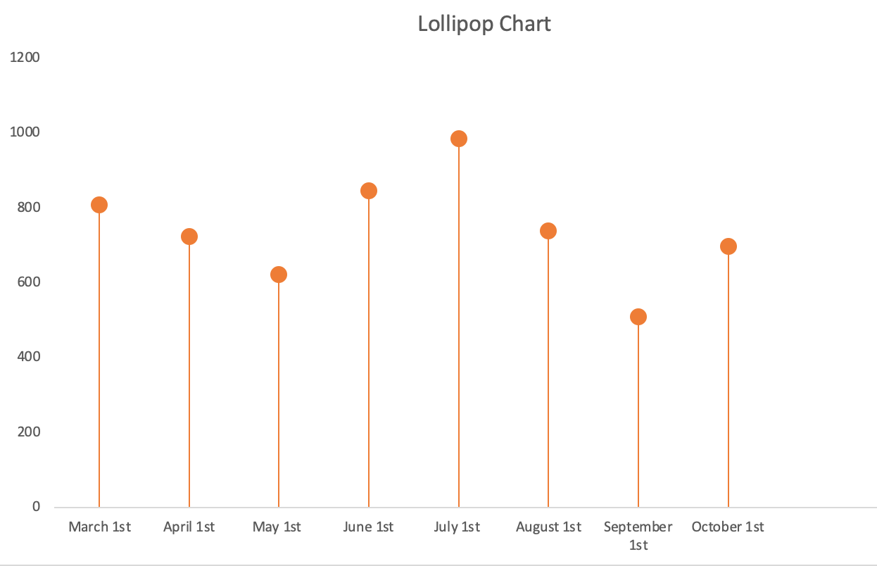
When I first looked at Chapter 5 I thought it was way too complicated but the lollipop chart ended up being the easiest chart for me to understand. A lollipop is basically a bar graph but in my opinion is looks way more appealing. Lollipop charts look cleaner and simpler than the standard bar graph which are bulkier and look to cluttered.
The chart I made was just a sample data set of COVID tests that were done on the first of every month. The numbers on the set are not accurate but I was just playing around with the numbers so I could understand how the chart would actually work and how it would look.
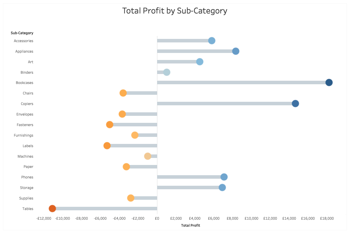
My example was a simple example of a lollipop chart but there are so many different ways to actually display this type of chart. Similar to the back to back bar graphs, you can create a lollipop chart that looks the same. You can also switch the axis and make the chart of the y axis going horizontal instead of vertical on the x axis. The image below shows a combination of both the horizontal graph and also the back to back graph.
3 replies on “The Lollipop Chart”
Brilliant charts! My favourite lolli chart design is the last one you used and I couldn’t wrap my head around how to make it.
Did the graph just come out like that by the data or did you do that on purpose?
My only suggested would be to get rid of the y-axis, and just add the labels in so that they float on top of the ‘head’ of the lollipop
I think a vertical Lollipop Graph is a lot easier to create than the horizontal. I tried following the directions in the book only to find myself giving up. I think it’s interesting that you can create lollipop charts out of both Scatterplots and Bar charts. Your Lollipop chart does a great job of showing Covid statistics over the past few months It’s very easy to understand. Great Job!
Great work keep it up!