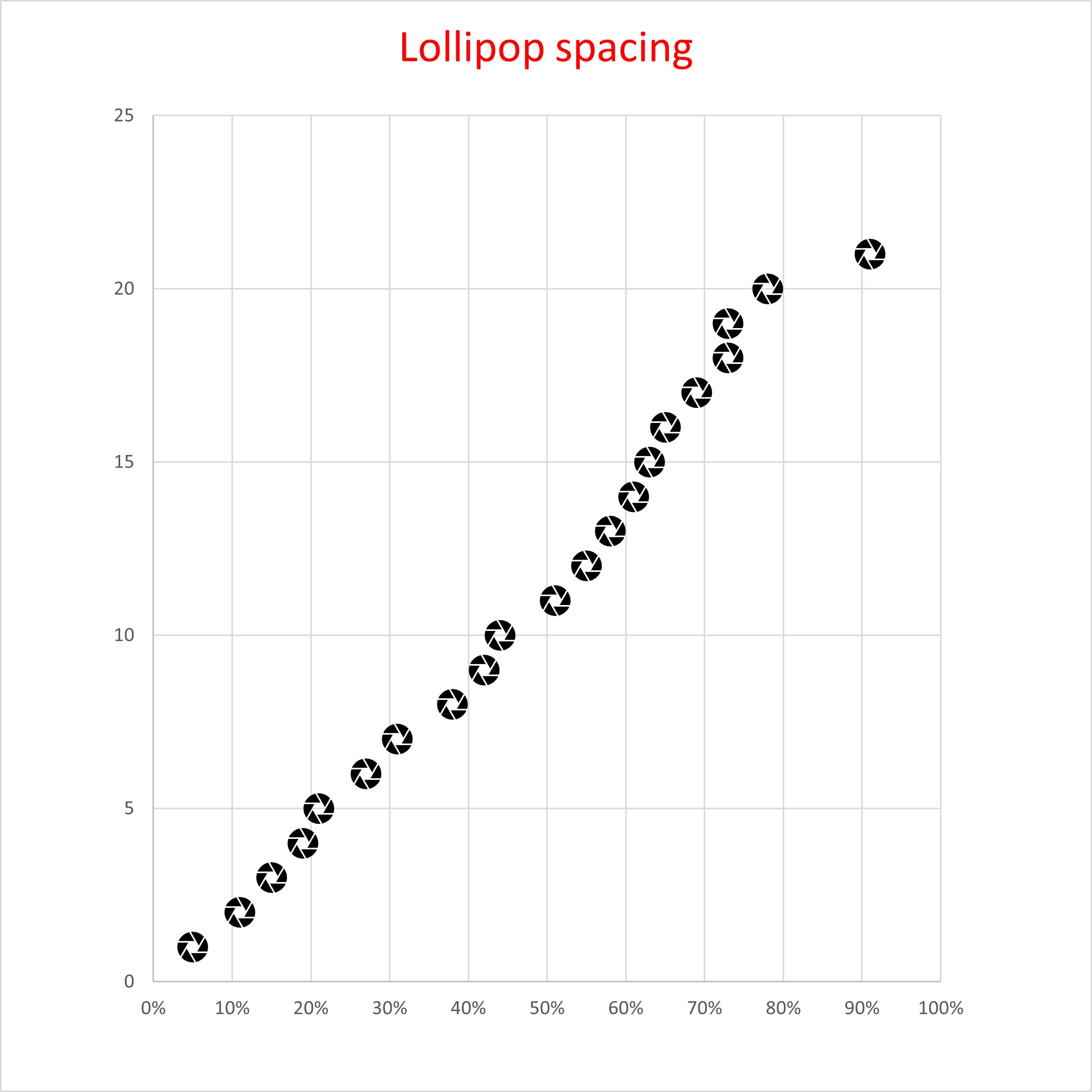
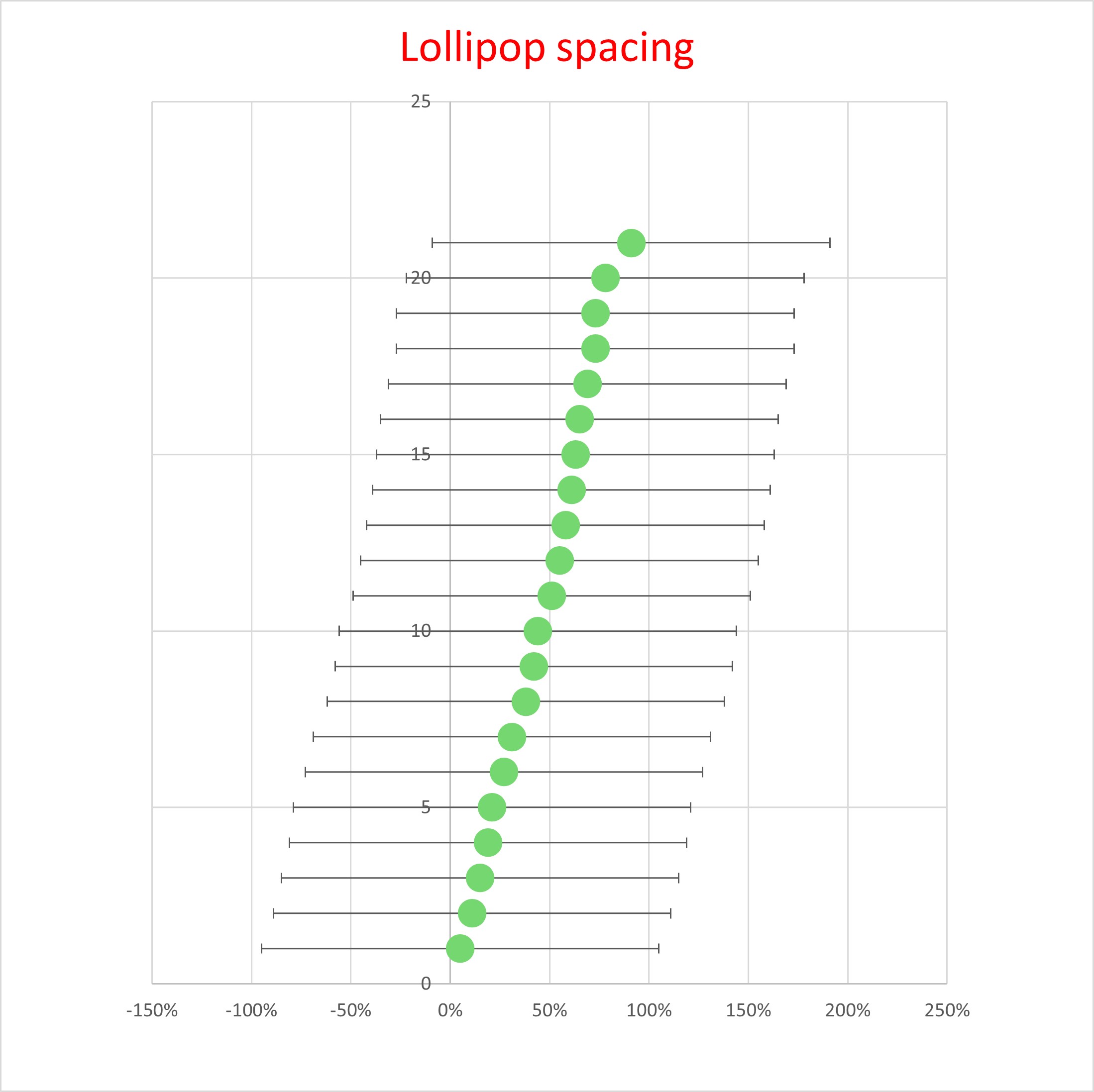
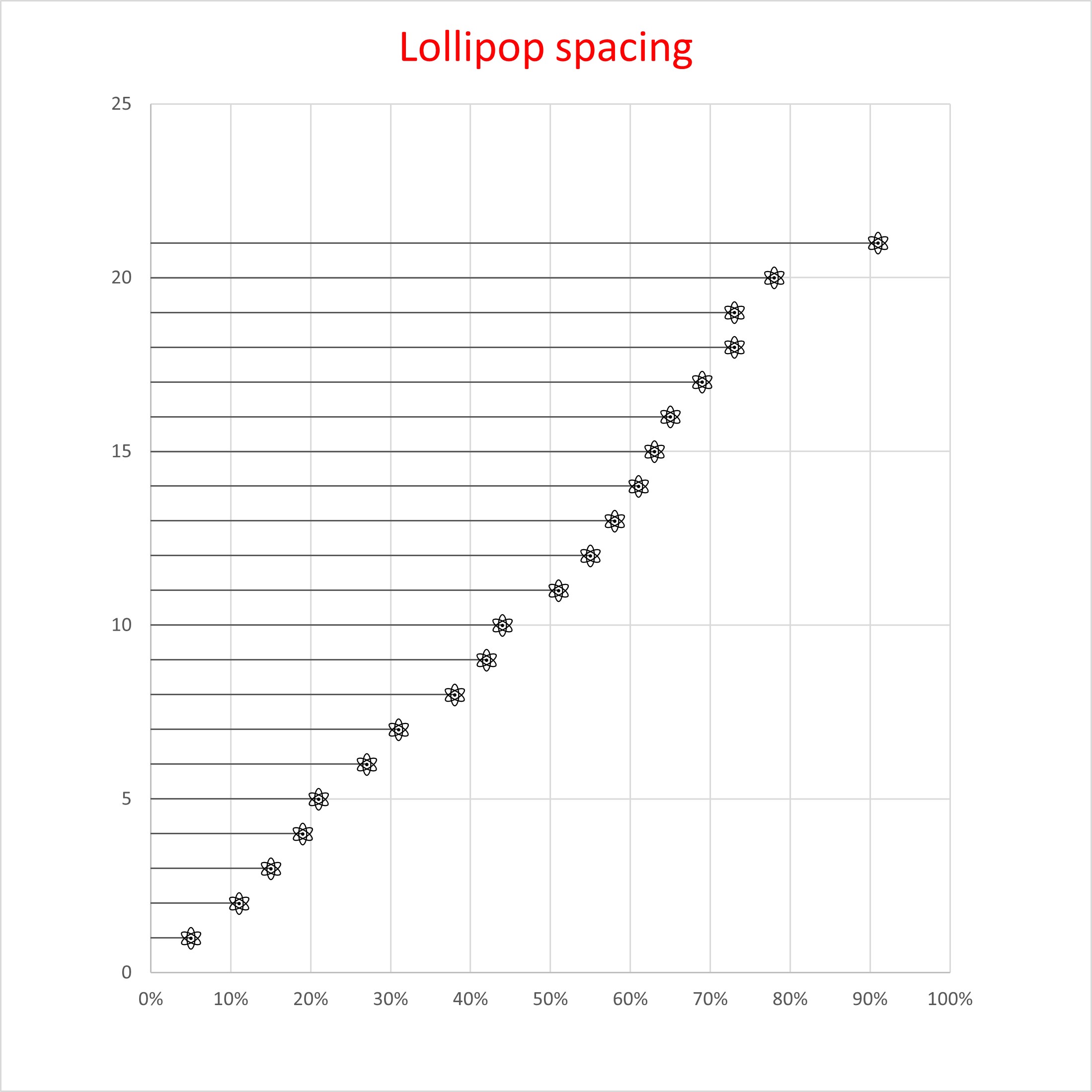
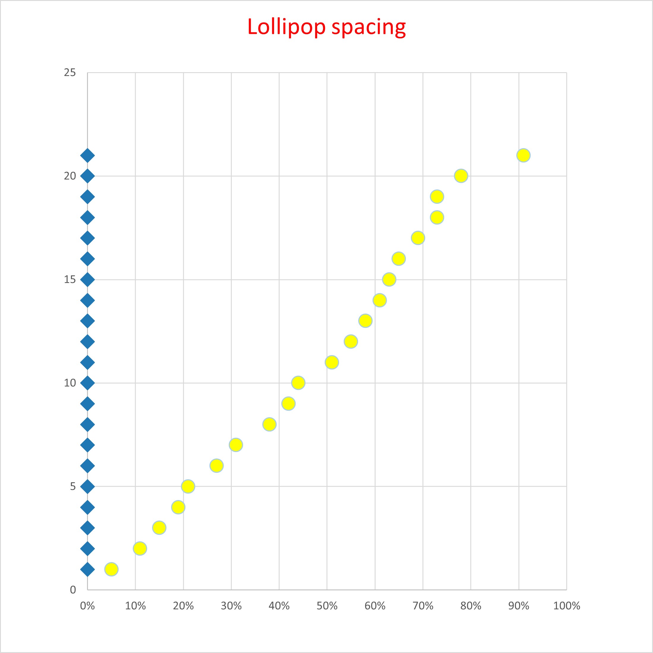
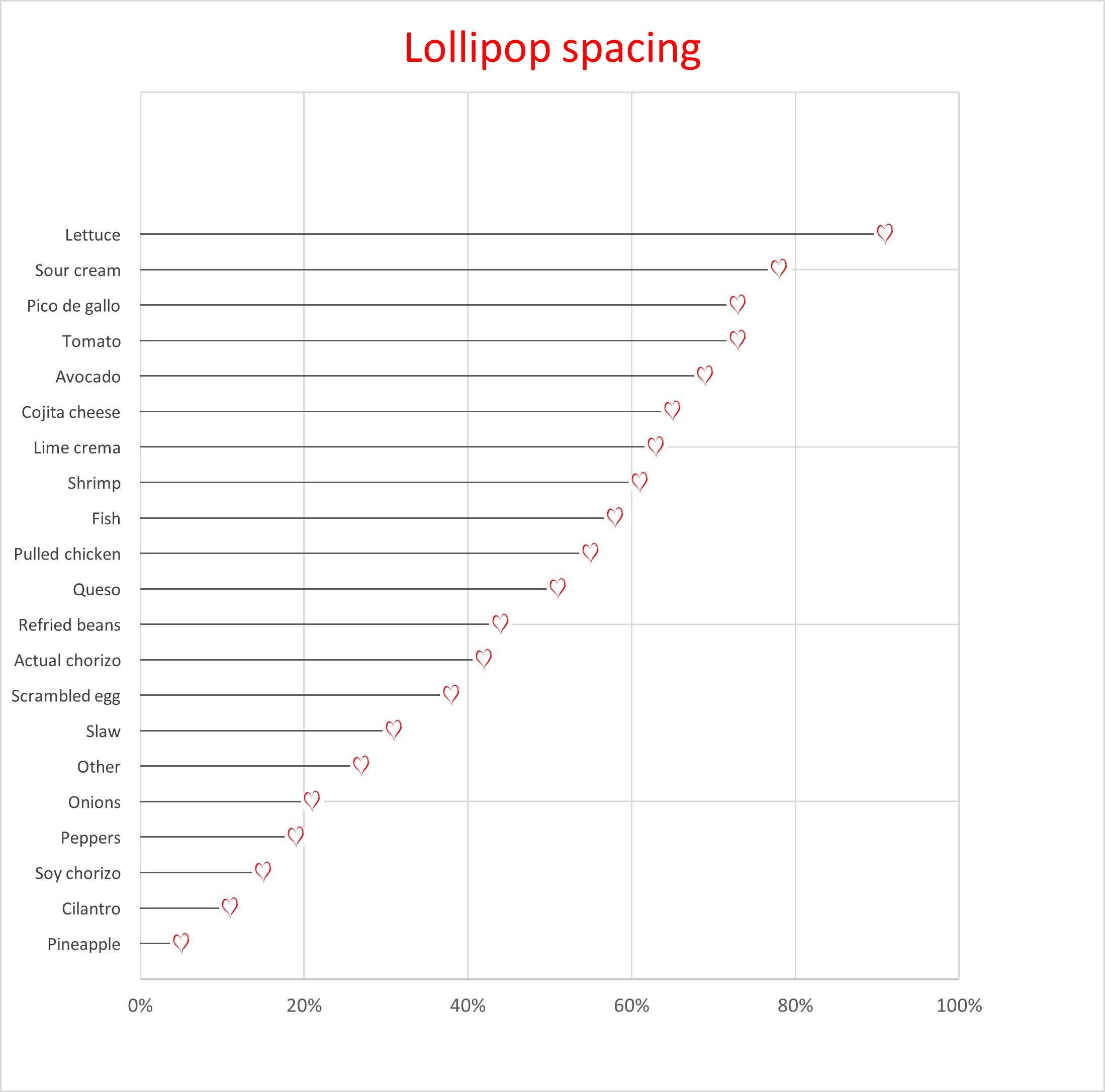
The charts were made by Excel base on the data set from Chapter 5 of the book Effective Data Visualization 2 edition of Stephanie D.H. Evergreen. If you want to display data set with dots, you can use the lollipop chart.
I am not sure whether cost of ink and paper is one of advantage for using them.
| The Lollipop Variation | |||
| Topping | % of respondents | Lollipop spacing | Labels |
| Pineapple | 5% | 1 | 0 |
| Cilantro | 11% | 2 | 0 |
| Soy chorizo | 15% | 3 | 0 |
| Peppers | 19% | 4 | 0 |
| Onions | 21% | 5 | 0 |
| Other | 27% | 6 | 0 |
| Slaw | 31% | 7 | 0 |
| Scrambled egg | 38% | 8 | 0 |
| Actual chorizo | 42% | 9 | 0 |
| Refried beans | 44% | 10 | 0 |
| Queso | 51% | 11 | 0 |
| Pulled chicken | 55% | 12 | 0 |
| Fish | 58% | 13 | 0 |
| Shrimp | 61% | 14 | 0 |
| Lime crema | 63% | 15 | 0 |
| Cojita cheese | 65% | 16 | 0 |
| Avocado | 69% | 17 | 0 |
| Tomato | 73% | 18 | 0 |
| Pico de gallo | 73% | 19 | 0 |
| Sour cream | 78% | 20 | 0 |
| Lettuce | 91% | 21 | 0 |
Thank you!
3 replies on “The Lollipop Chart”
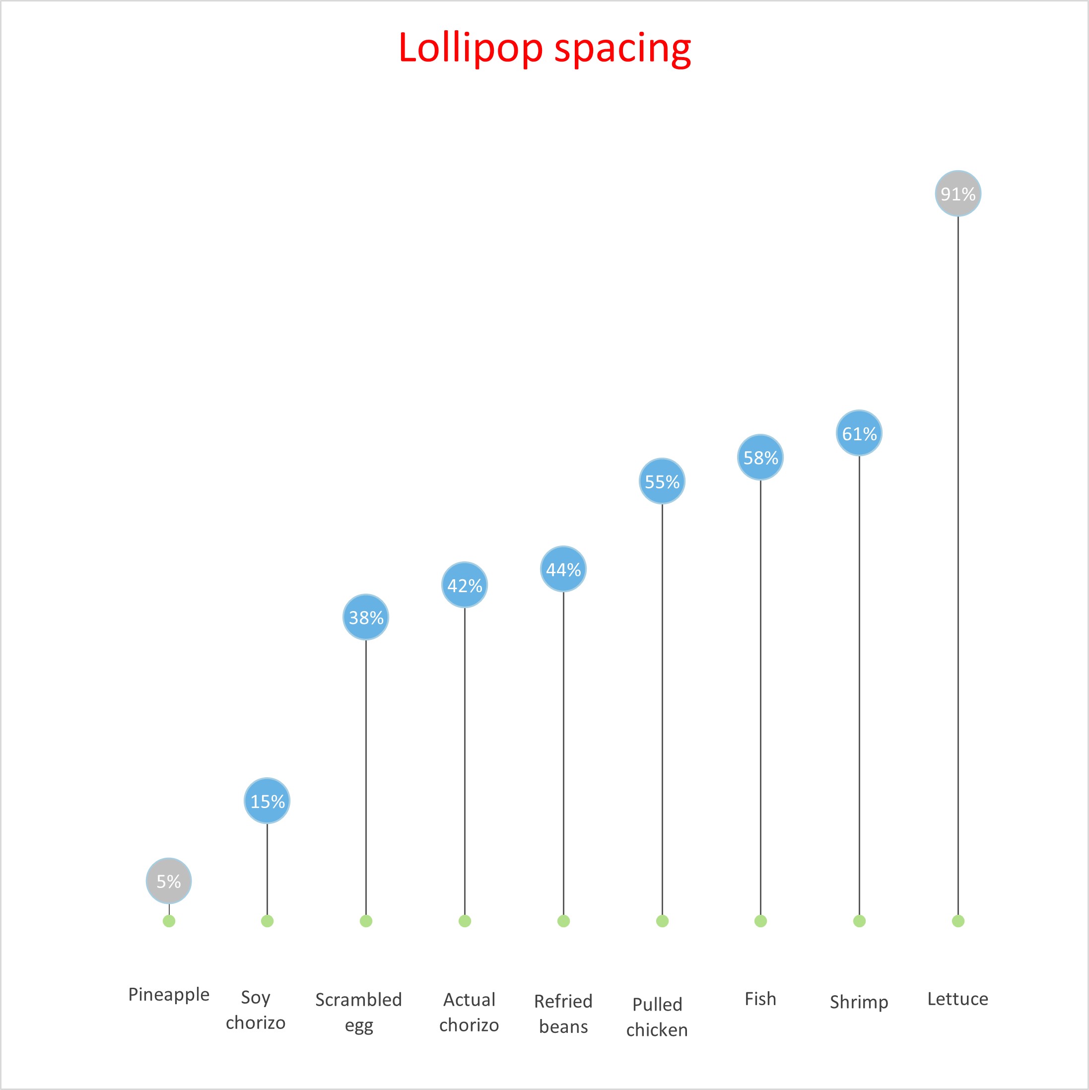
I like your step-by-step process of creating the lollipop graph. The images are extremely helpful so anybody can follow along. One suggestion would be to put captions under each picture so readers can understand what is happening. Other than that, the lollipop graph looks good!
You were the only one to include the full break down/steps of your process that I noticed.
I like that you moved the percentage ‘inside’ of the head of the lollipop.
The only two things I don’t like are:
1. the lollipop has two ‘heads’ at both ends of the stem
2. The first and last lollipop are different colours.
-I would have probably made all of them the same colour, or all of them different colours
Thanks.