
Lollipop Charts, like the name infers, look like little lollipops and is used as a visual infographic. Like many other charts, lollipop graphs are used to compare different variables of data. A lot like a bar graph lollipop charts compare the size and ending points of the data set.
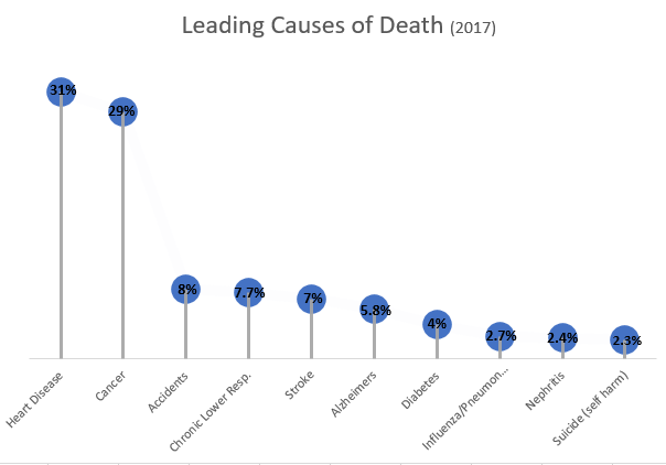
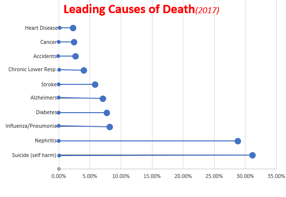
Data for both charts can be found here from the Centers for Disease Control and Prevention Website, as well as, the following pdf.
https://www.cdc.gov/nchs/data/nvsr/nvsr68/nvsr68_09-508.pdf
As you can see from both charts above, which I made using Microsoft Excel, lollipop charts can be vertical or horizontal depending on the user’s preference. The pros of using a lollipop chart as opposed to a bar graph are that it puts focus on the end data points rather than the whole graph and it allows for less visual distractions. Colors can still be used but in a minimal way that does not make a chart seem overwhelming. Lollipop charts also allow for sharing a lot of data without losing its visual aesthetics.
While looking at tutorials on how to make a lollipop chart and the different tools available, I came across an article. This article titled “Lollipop charts, Why & how, Story Telling with Lollipops” written by Dario Weitz, is a great resource as to why and how to use a lollipop chart. The author touches base on the pro’s, con’s, and even the similarities of using this specific graph.
4 replies on “Lollipop Charts”
your visual at the top was so cute! definitely caught my attention right away and kept me reading.
The lolipop visual defienlty was catching while scrolling through this blog! I also enjoy how you included a youtube link about the benifits of a lolipop chart and how to create one!
I like that you added the percentages for each bar because you don’t have a y axis so it makes it easy for the audience to still see what the bar is supposed to represent.
I like how you added actual lolly pops on the top great work and keep it up!