What Are Lollipop Charts
Lollipop charts are alternatives to traditional bar graphs that present their data in more visually appealing ways. They are best used when the differences between the data you are trying to present is quite large. When using a standard bar graph, this can make the chart look very cluttered and impeded the viewers ability to quickly discern what the chart is trying to say. The lollipop chart gets around this issue by forgoing the use of wide bars and instead using small columns ending dots, similar to a lollipop, to show the end point of the data. Ben Neville, a blogger at the data visualization site Tableau.com, has a post that looks much deeper into the topic than I do here.
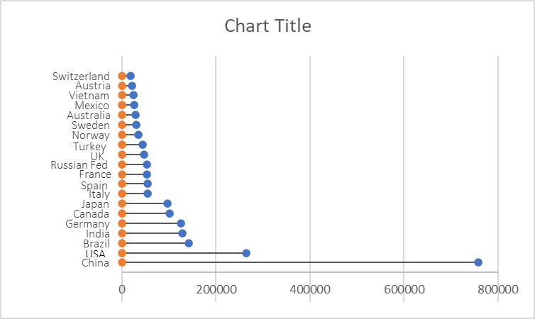
My Lollipop Chart
As you all are probably aware of by now, I am very interested in renewable energy, so I have decided to look into the renewable energy capacity of the top 20 producing countries. This data can be found on the International Renewable Energy Agency’s website. I created mine by following the steps outlined in the “Effective Data Visualization” textbook.
One reply on “Lollipop Chart”
I like that you mentioned that the lollipop charts are more appealing. I totally agree with you because it definitely makes the large data sets seem less cluttered and easier to understand and it isn’t much of an eye sore.