It is no secret that a majority of the United States thinks poorly of President Donald Trump, especially given his handling of the ongoing COVID-19 pandemic among other issues. But what do the nation’s overseas allies think of him? A Pew Research report published on September 15, 2020 details how the United States’ image waned on the global stage since Trump took office, and the numbers are damning.
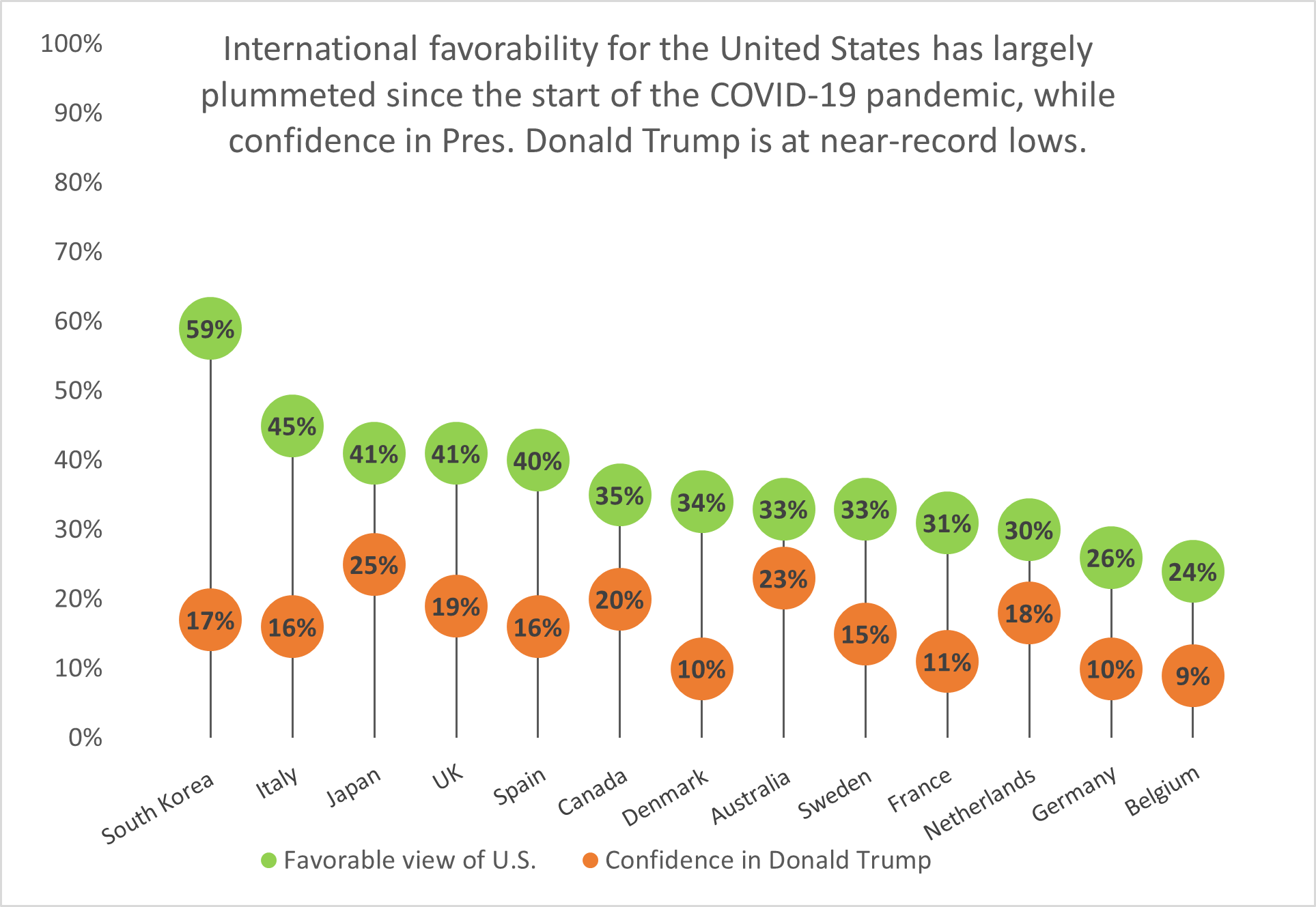
South Korea has the highest approval rating of the United States’ image out of thirteen nations surveyed, yet it holds little confidence in President Trump’s ability to lead the U.S. Fourteen points behind South Korea is Italy with a 45% approval rating, while Belgium holds the least favorable view of the United States and the lowest confidence in Trump.
Lollipop charts like this one are a visually-appealing alternative to column or bar charts because they cut down on the amount of space the chart ink takes up; instead, they focus on the data points themselves and showing how they rank among other categories.
4 replies on “Lollipop Chart”
I love your comment on the aesthetic of lollipop charts versus bar graphs. bar graphs have a timeless quality about them but lollipop charts are definitely a more interesting way to display data.
I like that you choose this topic because it shows current events and it’s something that could be very beneficial to us, especially in the next month and even the next 4 years. I also really enjoy your lollipop chart because you can clearly see the contrast between the confidence bar and the favorable bar. Good choice of colors!
No one can deny the loss from COVID 19 pandemic. However, there are talents are approved in this battle, at least in data visualization. After experiences with charts, I confirm that they are wonderful to effectively communicate COVID 19 data to us due to its level of difficulty. Do you think so?
I hope us to be able to overcome this challenge as soon as possible.
I like that you used a relevant topic for your lollipop chart. I was listening to broadcasts about America’s dropping favorability a few days ago. Many officials that used to work in the Trump administration are sending out warnings that his reelection could permanently damage our image. The vast majority of Americans don’t want to be forcefully divided by radical positions taken by his administration.
Back to the chart, I like how there’s two dots for each subject to show a comparison between Donald Trump’s favorability and favorability of the United States. This illustrates that a leader cannot be more important than the people he is in charge of in the eyes of a neighbor :). You can see the human factor directly playing into this chart.