This week we all created lollipop charts. While looking online for different explanations on how to make a lollipop chart, I came across a really easy one. It did not explain the steps clearly towards the end but I figured it out with the textbook for the last few steps. Compared to the textbook this website: excelk.com went straight to the end product in a few steps.
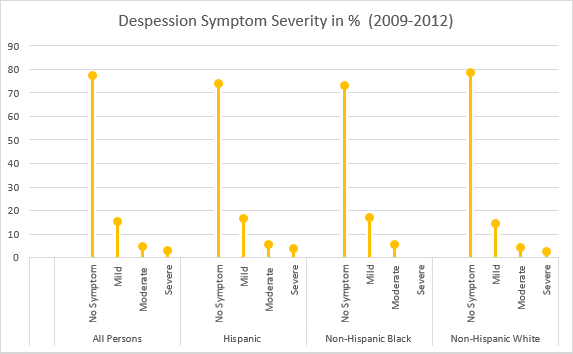
A lollipop chart is just like a bar graph, but easier to follow when you need to display a large number of values and when those values are high. This type of chart is also more appealing to look at.
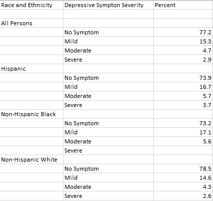
For my data set, I was looking through the CDC website and came across Depression in the US Household Population. They had graphs displaying the percentage of symptoms persons of ages 12+ with depression. I picked to use race and ethnicity as my x-axis vs gender, and ages. But also the PDF form which included the data set.
I will say this lollipop graph was pretty easy to make thanks to the website I used. The only problem I came across is trying to change the colors on each of the x-axes ( I wanted no symptom, mild, moderate, and severe on the graph to have their own color to better distinguish the severities.) I also wanted to add data labels, but I could not figure out how to.