One of the most common forms of benchmarking is done by utilizing a line graph. The illustrator can choose many different ways to set a benchmark on a line graph either by plotting a point, plotting multiple points, or using a color scheme to represent when the benchmark is reached. Benchmarks are often added as a line to the graph, trending with the businesses’ projections over time.
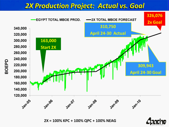
Businesses can use benchmarks to help measure the attractiveness of their company by how they are introducing themselves on certain platforms. For example, the following graph shows how certain companies’ websites are attracting customers with effective design psychology.
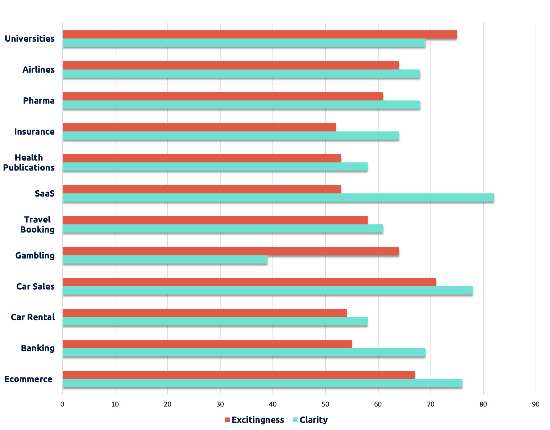
Companies can use this type of data to maintain the success that they have achieved in the past and to see where they are capable of improving for the future. It is important for companies to look at the benchmarks of other companies so that they may know where to look for marketing strategies that bring in and maintain customers.
One reply on “Benchmark Comparisons”
Both graphs provide a sense of how things are alike or different, but only the first example provides an example of a benchmark. The second chart you provided does not have a benchmark value, and it uses too many colors (which may cause issues for color-blind readers or create confusion for the data points). Perhaps you can re-create the second chart in a program like Excel and use a limited color palette to reduce or eliminate some of these issues.