Although benchmarks can show us a variety of things, I think they are best at showing us comparisons. You can compare almost anything and everything. When you compare something you are basically showing how well something or someone performs compared to one another. For example you can compare the brands Tesla and Honda; you could compare the pricing, the style, how much you would save on gas and so on.
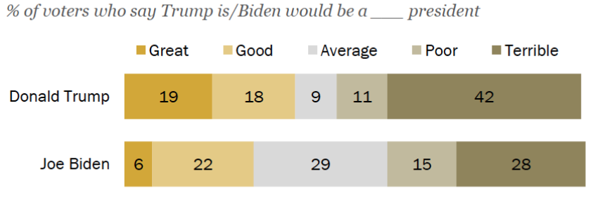
An article by Pew Research Center does some analysis on our presidential candidates. The article is meant to reflect on traits of both candidates and how voters are viewing each one. This particular benchmark to the left is the percentage of voters that think Trump or Biden would be a Great, Good, Average, Poor, or Terrible president. It is interesting because Trump has the highest percentage for both great and terrible.
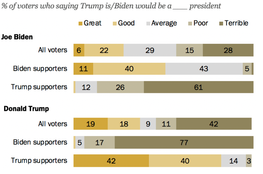
Similar to the benchmark previously mentioned, the one to the right shows the percentage of voters that think the. candidates are great, good, average, poor, or terrible. It goes a little more in detail by adding the percentages for both sides of the spectrum. It gives Biden’s supporters on Trump and Trump’s supporters on Biden.
In general, both graphs are just comparisons of performances from both of the candidates. This doesn’t explain to us which one is the better candidate because that is up to your own personal beliefs on each stance but it gives you a look into what other people are thinking about your candidates and you can kind of get an insight on how the election could go but it is not a definite answer.