Over this past summer, I was given the chance to upgrade my current laptop to a newer model. This presented me with the problem of deciding what kind of laptop I should buy and what parts I should be looking for. During my search, benchmarking infographics became the most important tool for finding the best deal for my needs.
PC Benchmarkers
There are a variety of free websites that allow you to test combination of PC parts to determine if they fit your needs. Each of these sites presents their results in the form of graphics relating their results to a general benchmark.

When evaluating the performance of a specific GPU, as pictured above, the results are presented based on their percentile position in comparison to other models. In this case, the percentile line serves as the benchmark that allows the observe to visualize how well the product they are looking at stack up to others.

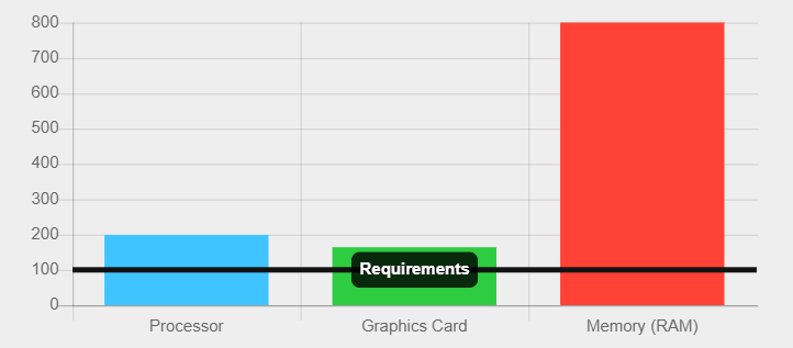
In addition to using the benchmark as an axis, other benchmarking infographics present their benchmarks as a more traditional minimum border. In the graphic above, the minimum requirements of a specific piece of software are presented as the benchmark. This border line allows the person viewing the graphic to see how well the parts of their PC are suited to the programs they wish to use.

It is also possible to turn the information you are studying as a benchmark itself, such as with this graphic. By doing this, you could compare other options and visually see which ones could be improvements.
2 replies on “Benchmark Infographics”
I like the visualizations you included in your post especially the last one where the actual specs of one of the processors was used as the benchmark. I think it is interesting to have one of the datasets as the benchmark comparison rather than using a line as a benchmark like in the 2nd graphic.
The link that you included of the variety of free websites to test pc parts if very intresting and helpful. After reading about this blog, i will want to test my own pc with this link you provided !