The presidential election is a topic that brings about many different types of visualizations. One search on google and you will be bombarded with statistics for each candidate. Below we will look at simple visualizations that have been generated by CNN for each presidential candidate.
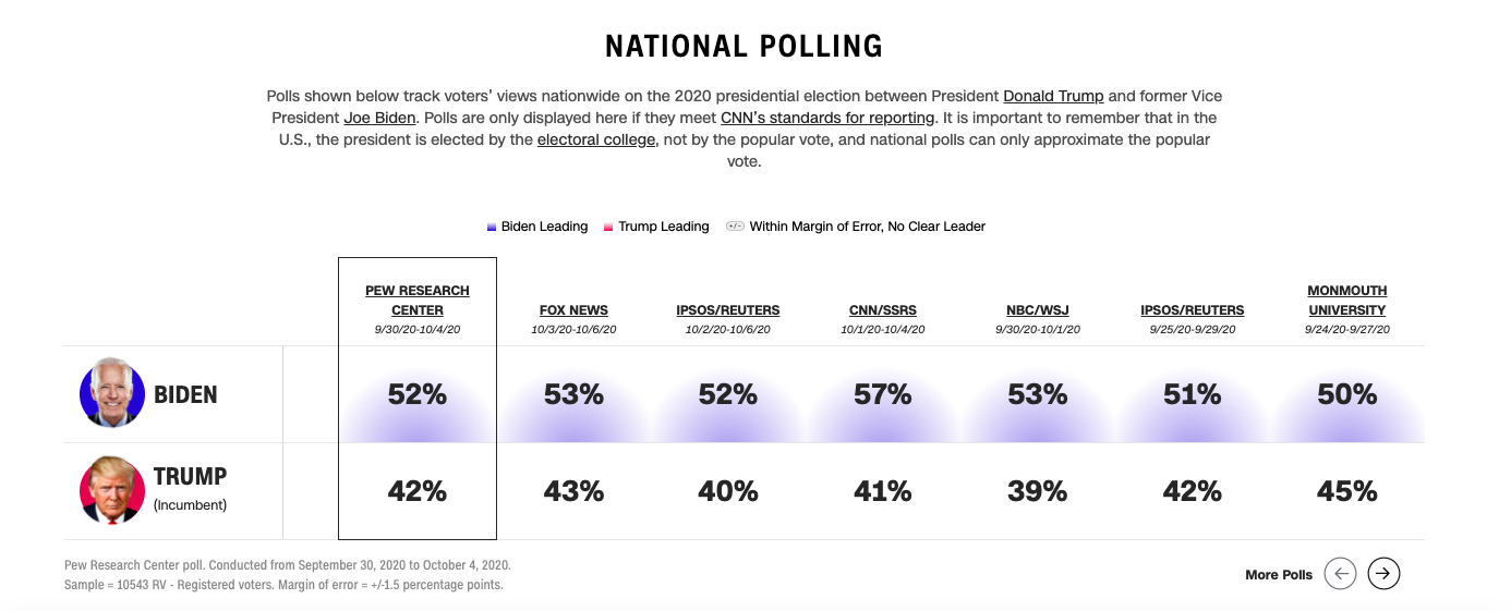
Above you see a visualization that depicts how each candidate is polling nationally. You can find the article this visual is captured from here. It is quite apparent to see that according to this visual, Biden has the overall support for the presidency. One thing that this visual does that is very helpful for the audience is highlighting the trending candidate’s (in this case Biden) numbers with their associated party color (blue for Biden, red for Trump). This visualization also included other news sources & polling agencies results to ensure that there were no extreme cases.
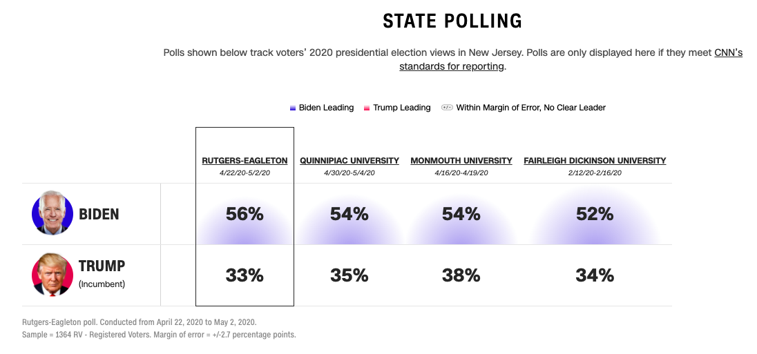
In the visualization above you immediately notice that there are not as many polling agencies listed for results. This is because after viewing the national polling for each candidate, the article allows us to narrow in on exactly how each candidate is polling within the states, here I selected New Jersey. Based off this visual for NJ, you notice that Biden has over half of its support with trump staying consistent around 35%.
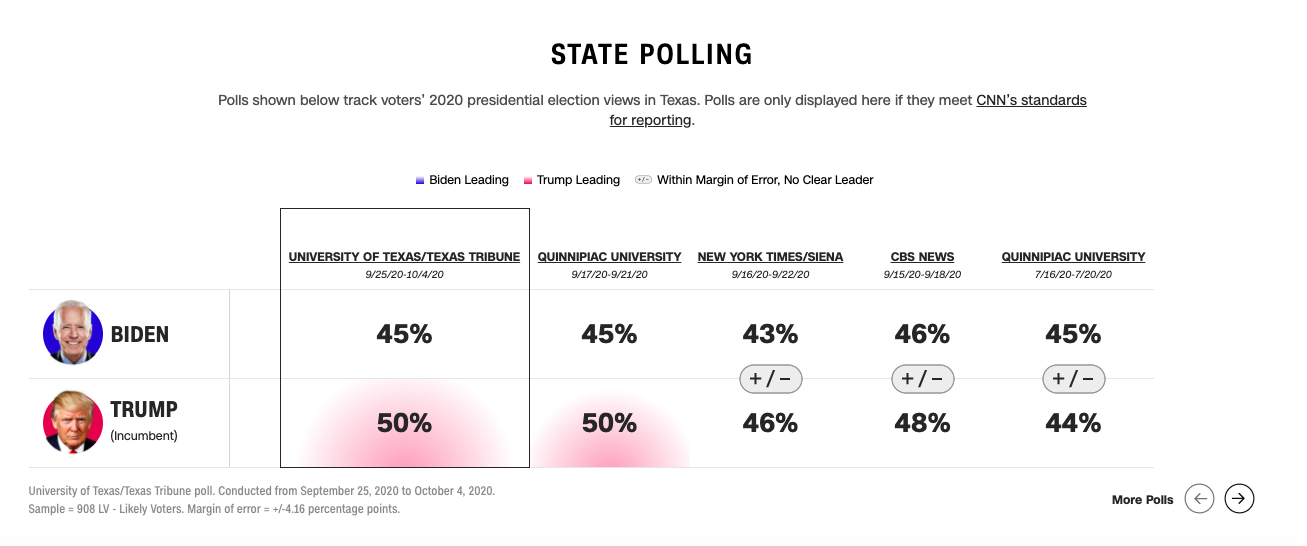
In the above visual Texas was selected and as you can see right away, this visualization looks a bit different then the two prior. Immediately your eyes are drawn to the red highlighted percentages for Trump. However, as you view the entire visualization you notice that only two of the entire five polling agencies were able to determine a difference between the two candidates. The last three polling agencies were unable to determine if there was more or less support for Trump/ Biden because the final percentages they came up with, were within the margin of error.