First of all, I want to explain what a benchmark infographic is before I begin my comparison. The word benchmark itself means something that is used to mark a standard in which others can be measured by or judged by. So, it would only make sense if a benchmark infographic is a graph that portrays that same content as the meaning of the word. Benchmark graphs can be used in any style of visualization and simply serves the purpose of indicating where that standard lies within the graphic.
To be honest, during my research I expected to find more benchmark graphics that pertained to business. I expected to find graphs that involved a company’s earnings and if they are meeting their “minimal required business”. What I didn’t expect to find were Benchmarks that involved the current pandemic. In my mind, I didn’t see how exactly a benchmark would be implied for a virus.
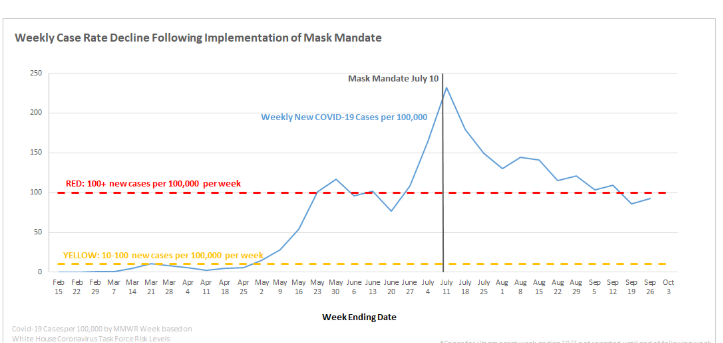
The graph above uses a double dashed benchmark line, the yellow is the standard before the outbreak and the red is the standard they would like to stay under for the number of new cases. the dark solid benchmark vertical line marks a significant period of time to use for further research.
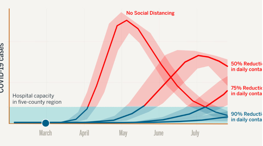
I found this way of indicating the bench line the most interesting because they shaded in a whole section that they wanted to highlight. The data set on the graph shows where some of the hospitals started at and even one coming back down below the 90% reduction mark. The colors are also very significant in the graph the benchmark being a cool calm blue and the data that exceeds the benchmark area is red as in hot, or dangerous.
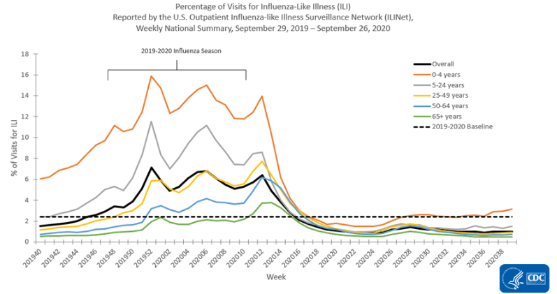
The above graph comes from the CDC and using the benchmark dashed line as the baseline mark. It is comparing weeks versus hospital visits for Influenza-like illnesses. The reason the benchmark line is here is to show the normal range as opposed to the spikes of visits. Giving a reader a visualization point to base measurements off of is important to accurately paint the picture.
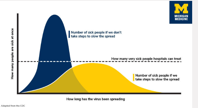
This infographic uses a dashed line to indicate the number of people a hospital can treat at a time. Using a bell-curved graph to show the readers why it is important to take the steps and be precaution during the pandemic. They are indicating if people step up the curve stay below the benchmark standard.
The way I have understood the differences in the benchmark indicators is that if its a dashed line it seems to be more of a recommendation or goal. Whenever I’ve seen a solid line the information seems to be more important or must meet the requirement. I think if a line is colored it indicates the importance, the example above the double-lined benchmark had a yellow and red line, from my schema, I know yellow is cautious and red dangerous. I think it is important for people to understand what they are reading so, they don’t have to try to interpret the information and interpret it wrong. People need to be given a standard to base information off of as a way to compute it properly.