There are so many tools to help you create visualizations but a lot of them are kind of animated, which is fine but sometimes you need something that is going to help you bring out some data that needs to be shown. There is a software that could be used on your desktop, mobile device or even online.
Tableau is good for all types of graphs, scatterplots, line graphs. You name it and you can literally make it happen. They even have diagrams that you can choose from like the map of the country or even the whole world. Let’s say you need to compare cases of COVID between New Jersey and Florida, you would be able to show the hotspots in both regions.
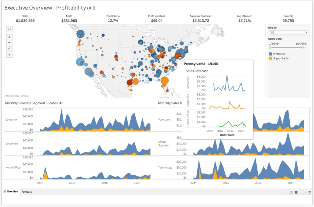
In the image shown is an example of how you can use the maps in different ways. You can keep track of trends and even combine different types of charts, graphs, diagrams to bring together a full visualization of data.