Before we begin, ask yourself these 5 Questions…
- Who is your audience?
- What is the question they want answered?
- What answer am I giving them?
- How will I transfer this information to them?
- Will they have a follow-up question the need answered?
After answering these questions, you must then create your infographic. In an article on tableau.com, we find 5 new ways to convey our information in an effective way.
Number 1: The Right Charts and Graphs are Key.
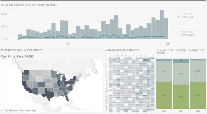
Bar Graphs, Pie Charts, Histograms, etc., we need a physical representation of our data. By showing these, our reader can get a good sense of why the data is significant.
Number 2: Predictable Patterns.
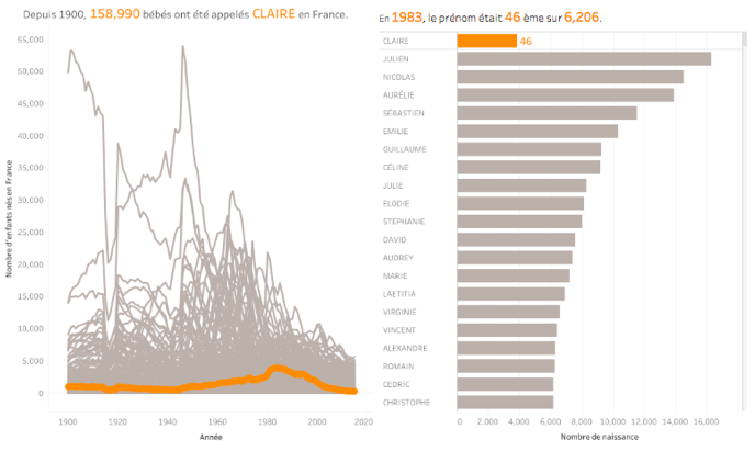
We love to see patterns and symmetry in everything we do. Visually, it makes everything look clean and neat. It also helps us understand the data better. An extra long column or a outlier on a chart can show us the abnormalities in our data.
Number 3: Clear Color Cues.
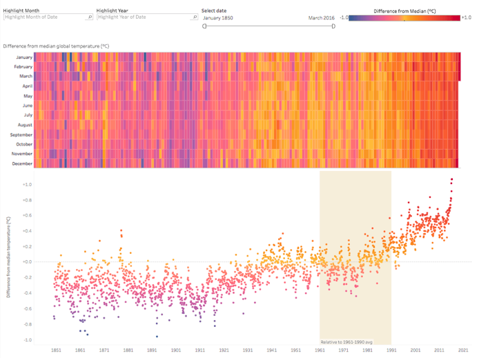
Just like patterns and symmetry, colors have an effect of the human brain too. Some colors may be to harsh like neon yellow. Some colors maybe be too drab and dull like gray. But when you have colors that catch your eye, data can become visually pleasing.
Number 4: Use Familiar Shapes and Designs for Simplicity
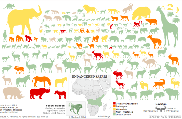
If I were to show you the outline of a house, you would know it’s a house. By making your data easy to understand, you’re doing everyone a favor. Simplicity is key when making and Infographic.
Number 5: Everything You Do Is Intentional.
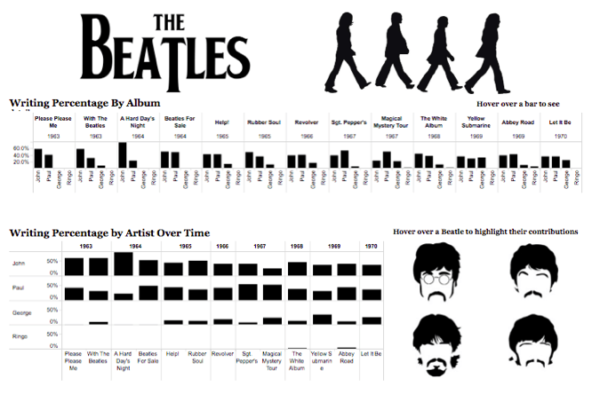
Every placement of an image and every passage you right is done for a specific reason. You should be accurate and not withhold any information, but you should also be concise. Make your data visually pleasing and minimal, but don’t make it boring. These are very vague restrictions, but they also give you a lot of room to be creative.
Find even more presentation tips and tricks at Tableau.Com!
2 replies on “How To Translate Significant Data Into Your Work”
Hi,
Your blog post is very informative, really interesting and I like the images that you used to explain your data. I do have one question, would using to much colors in presenting data be too distracting, or does it depend on the type information, graph or chart you are using?
I have a suggestion, in the first part of the blog where it says “ask yourself 5 questions,” I think you should include,”what type of graph/chart should I use to best display my data.”
When transferring data into infographics it is important to understand who your audience is and what type of messages you want your infographic to carry. This is especially important when it comes to topics that are not very favorable among many people in society.
This post was really helpful for me with trying to make my graphics stand out a little more. I have always preferred simple graphs that get straight to the point, so I have struggled a bit with making them a little more pleasing to the eyes. I will definitely be using some the tips you pointed out here in the future.