Datasets for Potential Project Use
I decided to look at how current gender trends in college may result in a different version of America in the future. Ever since the early 1980s, women have been earning more Associate’s and Bachelor’s degrees than men. It took a little while longer for women to surpass men in earning professional and Doctor’s degrees, but they have earned more of these degrees than men on average ever since about the mid-2000s. The education gap between men and women has been projected to increase in women’s favor as time goes on. Here is the summary of raw data that is available through the Department of Education. https://nces.ed.gov/programs/digest/d19/tables/dt19_318.10.asp
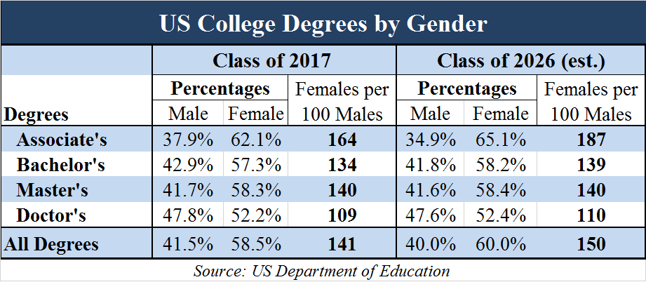
Below is a fairly recent table showing percentages of US college degrees by gender and a projection of how it may look in the future. Tables are an easy way to compare numbers, but they often lack visual appeal. These are good for displaying accurate numbers, but there is not much to draw in the audience. Comparisons must be mathematically interpreted.
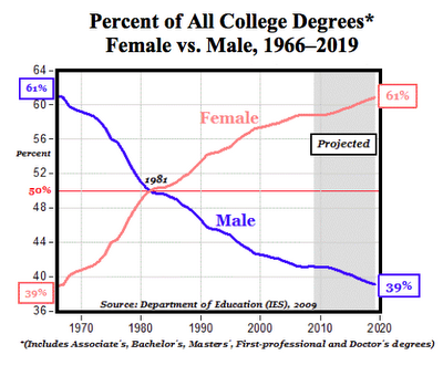
We can also use a line graph to compare numbers, which is a very effective way to draw in the audience through the color scheme and trends in the data that are easy to interpret through rising/declining figures. The following graph is not very recent, but it gives us a better visual representation of the growing gender gap in American colleges.
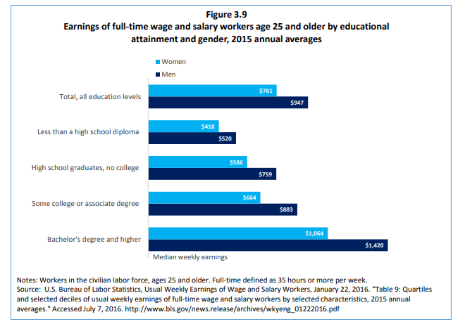
What these numbers mean is that more college-educated women are entering the workforce than men. You would expect these figures to mean that women are the majority of today’s American breadwinners. However, although women have been earning more post-secondary degrees than men in recent times, men still currently dominate the earnings reports while holding the same job positions. This is probably due to a long history of oppression passed down through the generations and complications of motherhood. One argument is that it is difficult to measure work ethic that is not on an individual basis, so we may never know for sure in regards to everyone’s specific situation. We can compare these income inequalities in a bar graph.
There is a lot to dissect when it comes to gender inequalities because we cannot freely assume that women suffer in all areas of life more than men, but this is a decent general overview of how we can utilize datasets for project use on this subject.
One reply on “Men versus Women in College”
I really appreciate the topics you selected to discuss in this blog post. I found your entire post to be very enticing and visually pleasing as your narrative and visuals shown were presented extremely well. I liked that you took your post a step further by discussing two different datasets that were relevant to one another. I enjoyed that you used subtitles under your visuals presented to explain to your audience the benefits of each visual you were presenting.