A clean & concise visualization is critical for your audience’s understanding of what your selected topic may be. Without this, your audience is likely to struggle with the content presented to them as they will not grasp the important topics you had hoped they would. When designing a visual that involves comparing numbers, it is crucial that you only include what is most important for your topic at hand. This is because if you overload your visual with too much information, your audience will become overwhelmed and leave your presentation feeling more confused about the topic, and this is exactly what we should attempt to avoid.

As you can see in the above visual, there is one main point being conveyed to the audience with three measured categories. The main point of this visual is to show what the future of workplaces may adapt to become. Each one of the three measured categories is given a specific color that all of its data is highlighted in. This does wonders for your audience’s understanding! This is because your audience can quickly identify that the red 69% of the doughnut is portraying that employees could be paid based on their performance rather than hours worked as commonly seen today. As you can see, this visual is very effective in communicating only the data it needs to and contains no extra information or frills that could grab the audience’s attention away from the main points.
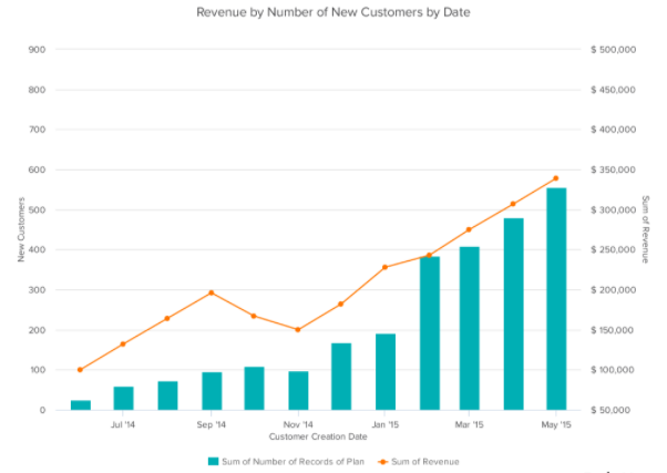
Seen above is a vertical bar-graph that depicts the revenue of new customers for a company over a specific time span. As seen in the legended below the x-axis, the blue vertical bars represent the number of new customers and the orange trend line represents the revenue generated from these new customers. With this visual we can clearly see that this company had a large uptake in new customers from before March of 2015 until May of 2015. We can also see that this company did not have nearly as many customers in September of 2014 but they still generated more income off of these customers then they did in November of 2014. This visual is very easy to understand upon first glance and does not leave room for your audience to have many questions about what this data is portraying. This is exactly what you should be aiming for when creating your own visuals comparing numbers.
Above is a short three minute video explaining exactly what data visualization is and why it is crucial in everyday life. This video highlights how a data visualization should be constructed and how these visualizations can benefit more than just the person that created them.
One reply on “Comparing Numbers”
I agree that you need to summarize and narrow down your data in order to create the best data visualization for your audience. Including too much information is overwhelming and it is important to keep in mind what the final message of your graphic is. I enjoyed the video you included as it addressed how data visualizations are crucial in the workplace. Understanding the components of a good visualization has a lot of real world applications.