An interesting comparison I found is the separation of years in schooling.

It’s a basic table, but what it fails to represents is that in the UK, you may finished “secondary education” by year 10 or 11. Whilst in the US you are required to do 12 years no matter what. An interesting comparison none the less.
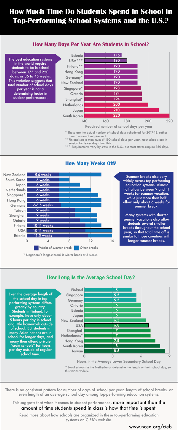
Here is some data comparing schooling days, hours, and time of by select countries.
Perhaps you want to look at survey data and compare that, well be wary of certain tricks that are used!
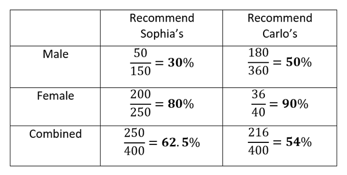
This may not be interesting, or pretty, but it is very insightful. You’ll notice that the numbers show that male and female audiences separately, preferred Carlo’s shop. As a whole, however, Sophia’s is preferred.
I believe this is very insightful because it looks into a paradox of statistics looking at numbers, known as:
Simpson’s Paradox
This precious little paradox shows that when comparing numbers, it is not always a good idea to take them at face value. There may be factors accidentally, or intentionally ignored when delivering a study. Of course, the boring solution to a case like the one above is to have equal data sets for each group for a proper comparison!
What if you legitimately have an unbalanced data set, that you cannot balance? Then you simply cannot properly compare the data sets. You must change the data.
A funny little presentation by Glen Bell, an Australian data governance specialist, explain how to not represent data.
sources