Utilizing the right visualization to display numerical data is important when presenting accurate, and meaningful data to the audience. Numerical data seen through visualization allows the audience to interact with the data and compare the numbers and understand the information that is being displayed on the charts. One major advantage of data visualization is to help the audience see patterns, links, and trends that may not otherwise be visible through text-based information. While some visualizations are meaningful in representing numerical or statistical data, there are visualizations that are not hence, it is important to choose the most appropriate chart to reach your audience.
Examples of Visualizations to Compare Numbers
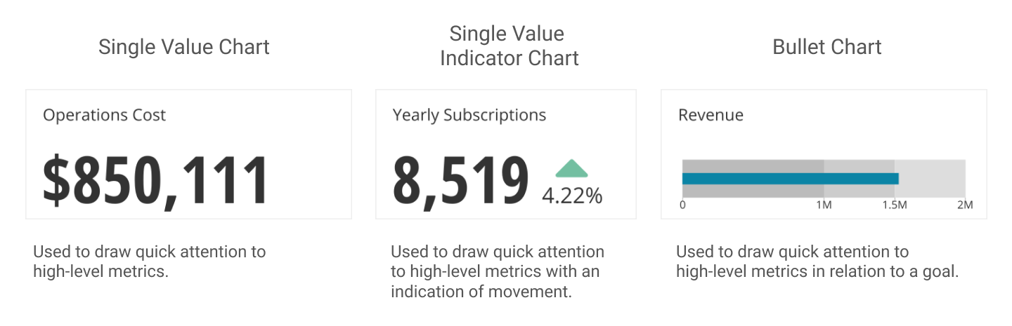
The Single Value Chart is a phenomenal tool for comparing single value digits. Displaying Revenue figures and calculating Operation costs are best used on this type of chart.
Four categories when displaying numbers:
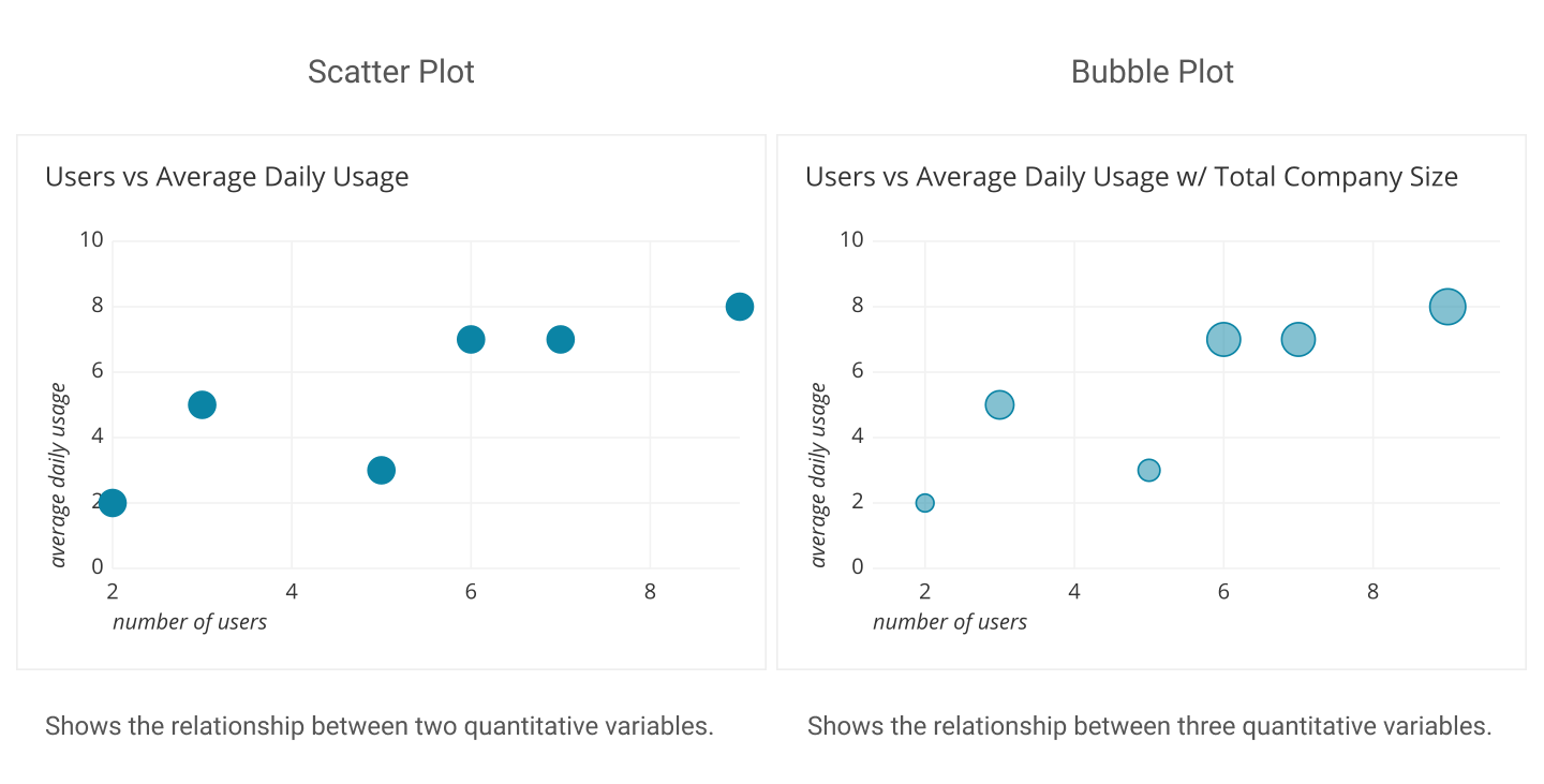
- Relationship: Used to show relationships between multiple variables.
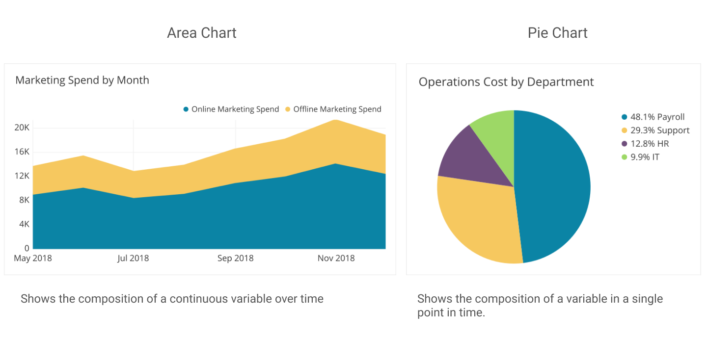
2. Composition: This chart is used to display how sets of a whole data are created into smaller divisions to highlight differences of each of the smaller parts to the total value.
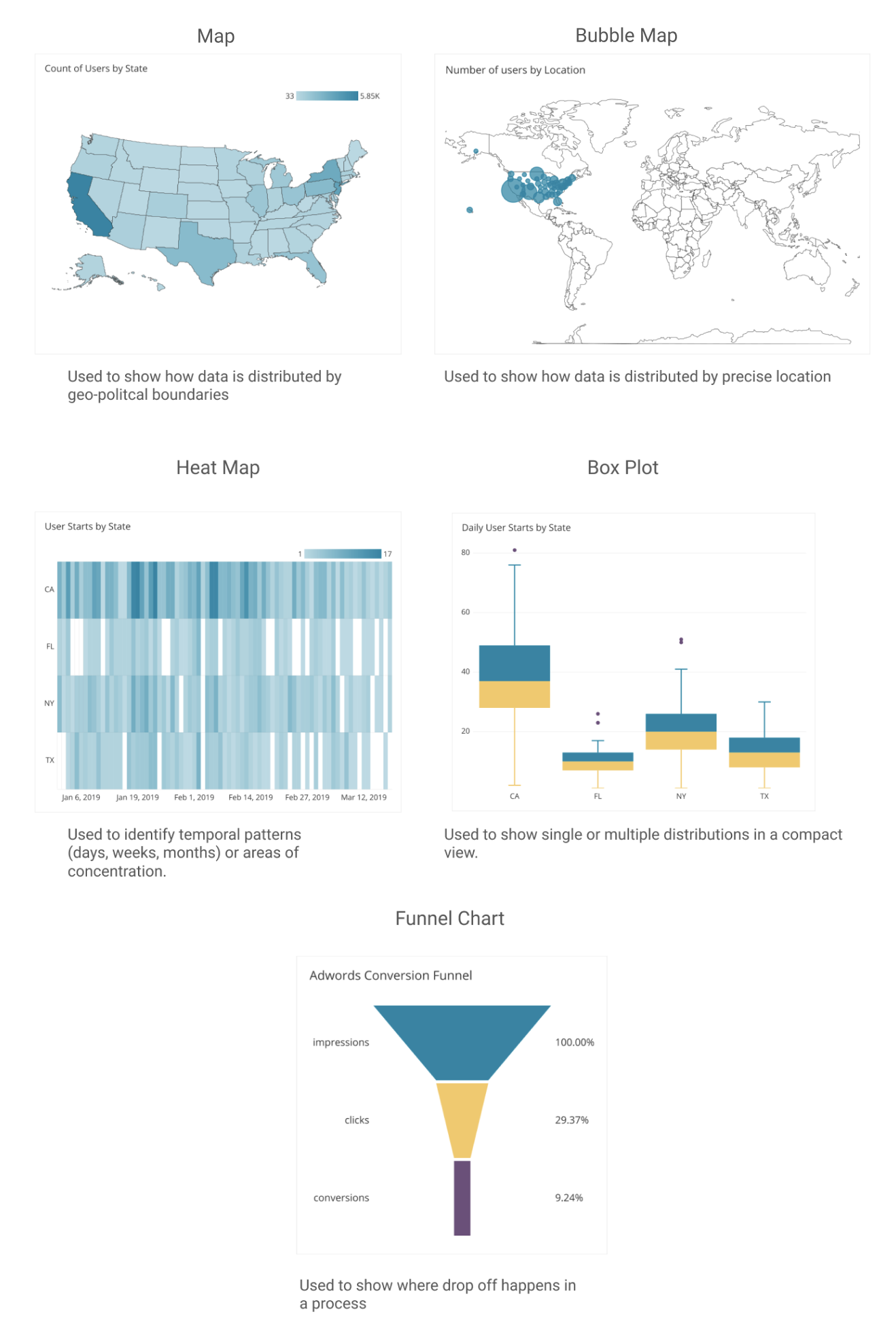
3. Distribution- When displaying data values about a population within an area, the distribution map is helpful to accurately, and clearly represent figures within the specific location.
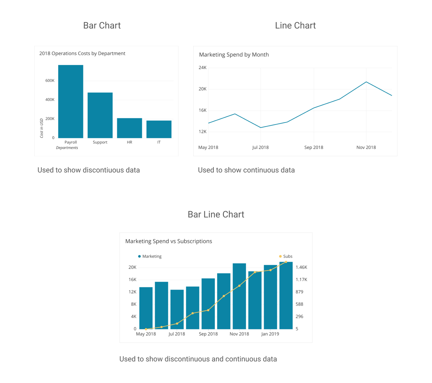
4.Comparison – These types of charts are very helpful in understanding and displaying data of multiple information over a period of time.
https://dataschool.com/how-to-design-a-dashboard/find-the-best-visualizations-for-your-metrics/
One reply on “Comparing Numbers”
I like your 4th point. I think bar and line graphs are great for comparison. I think they do a great job of comparing data over time as well. I do think that when comparing dat, color in the chart can help draw the viewer in, but not too much color. These charts are more simple.