Categories
Uncategorized

mmm Pie…

So this week we were asked to come up with a perfect case for the use of a pie chart. So…….

I had some questions:

  1. What is a pie chart exactly?
  2. What are Pie charts Good for?

To answer my first question i started doing some research, it turns out that The pie chart has been around for over 200 years. It was first invented in 1801 by Scottish writer on political economy William Playfair (1759-1823), nowadays known as the inventor of statistical graphs. At the time Playfair believed “making an appeal to the eye when proportion and magnitude are concerned, is the best and readiest method of conveying a distinct idea” and the pie chart and bar chart were born. Some people believe that he also invented the line chart, but that story is better left for another time.

https://infogram.com/blog/the-infamous-pie-chart-history-pros-cons-and-best-practices/

Pro and Cons

The problem with Pie charts has a lot to do with our physiology. we as human beings are good at telling the difference between lengths but not so much when it comes to comparing angular differences. Meaning that compared to say a bar graph pie charts are not as efficient at getting their points across due to the extra time it takes for interpretation. as well as the need for more chart elements like clear labels to aid with quick interpretation of the graph.

However if you want to visualize pieces of a whole then a pie chart is your best choice. So for this assignment I decided I was going to breakdown a product i use often and turn its respect constituents into data points for a pie chart that i will post shorty.
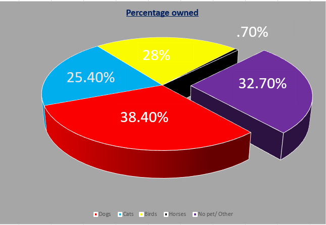
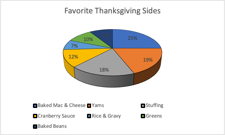
Coconut Oil

The product I chose to to break down for my data is coconut oil. I’ve always know that coconut oil had many health benefits. But hypocritical to that notion, I’ve never really know what was in it? I use coconut oil as a moisturizer so I’m going to focus on the fatty content.

A quick google search for ” fatty composition of coconut oil” gave me this :

Coconut oil is made up of 7 know fatty acids plus one unknow acid

  1. Caprylic-7%
  2. Deconoic-8%
  3. Lauric-48%
  4. Myristic-16%
  5. Palmitic-9.5%
  6. Oleic-6.5%
  7. Other -5%

So I plugged those numbers into excel and this is what i got as my data table

Fatty acid Compositon of coconut oil
Acid Percentage
Capryilic 7.0%
Decnoic 8.0%
Lauric 48.0%
Myristic 16.0%
Palmitic 9.5%
Oleic 6.5%
OTHER 5.0%

Then i turned those lovely points into a pie chart.

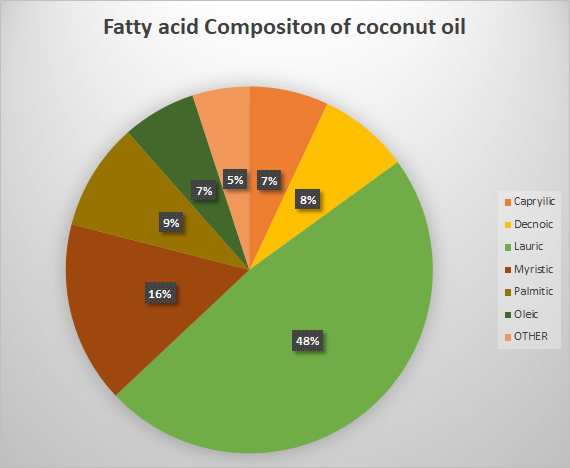
Interesting enough Lauric acid had the biggest portion of coconut oil’s fatty acid of composition, coming in at 48%!

Due to the fact that im more interested in how each component compares to the whole i believe this is a better option for a visual even when compared to the beloved bar graph.

This was a very fun activity and I look forward to doing more like it for my individual project.

Categories
Uncategorized

Lollipop charts

Lollipop charts are perfect to use in similar situations that a bar graph would be used. Lollipop charts are great for comparing different sets of data in a category. This is especially a good chart for showing data with large number values: a long tall “lollipop” can help emphasize the data. It gets the name “lollipop” from its bars with circles at the end that mimic a lollipop. The biggest con of lollipop charts is the circle which can be hard to tell the exact value its marking.

The below chart I found on google is a great example when to use a lollipop chart. The data is all in the higher percentages with emphasizes the old age retirement of the government officials. The chart also projects the long term increase compared to the current 2012. Since the circles land right on the lines the graph values are easy to read.

Categories
Uncategorized

Pie Chart

Pie charts are really good at displaying data in a simple form. They are easy to look at and they are not overwhelming with data. They are meant to be simple and are amazing at displaying part-to-whole data.

This chart took me no more than 5 minutes to make and I think it’s pretty self explanatory. I think the different kind of eating habits for women. The data set is just made up but I did it just as an example to show how simple it can look. I also changed the colors so that it’s easier to identify the different sections. I think it is so easy to read and it is visually appealing to the eyes.

Categories
Uncategorized

Pie Chart

Pie charts are best used when depicting parts of a whole in data sets. I made this chart below to show the data I found on the American Veterinary site. This data is perfect because it shows the percentages of different pets owned in the United states. The different pet categories are the parts of a whole pet ownership in the united states. The different parts add up to a 100% perfectly because it is the whole ownership broken down. https://www.avma.org/resources-tools/reports-statistics/us-pet-ownership-statistics

See the source image

The above example (found on google) is a perfect example of when to use a pie chart. This chart depicts the grades from a whole class broken into the different letter grades. This is a perfect way to see what percentage of the class did well and how many did not . This may help a teacher determine if a test was difficult for students.

Categories
Data Sets Data Visualization and Art Pie charts

Pie Charts

Pie charts are useful for depicting parts of a whole in a dataset. However, most people think that pie charts are a one-size-fits-all solution for data visualization, often making a visual mess of the data or telling a misleading story about its message.

Recently, the Pew Research Center published a report about the value of online instruction in the wake of the ongoing COVID-19 pandemic. The majority of participants in one study covered in the report say that online instruction does not have the same value as in-person instruction.

Source: Pew Research Center

Looking at the pie chart above from a design perspective, the researchers used a darker shade of teal to depict the majority opinion. In comparison, the lighter shade shows the minority opinion. The pie slice that is greyed out represents the 2% of survey participants who did not answer or had no opinion.

Pie Charts Related to My Interests

While looking for data that is better suited to a pie chart, I recall a census site created by a small group of Final Fantasy XIV Online players, XIV Census. Though the data shown on the site may not be up-to-date (only shows data collected as of April 2020), I did find a pie chart for Grand Company statistics. Hovering my mouse over each slice only shows the number of characters enlisted in each Grand Company, as well as players who have not progressed far enough into the game’s story to select a company. However, the information does not list the percentages, so I took it upon myself to properly graph the data.

Source: XIV Census

The chart on the left depicts Grand Company affiliation across all characters, while the chart on the right shows where all active characters are enlisted. Among all characters, the Company distribution seems fairly equal. Compared to the number of active players, however, it is evident that the Maelstrom and Order of the Twin Adder are the two most popular Grand Companies.

Categories
Uncategorized

Lovely Lollipops

This week we were asked to create a lollipop chart and then blog about our experience.

First things First, what the heck is it?

The Lollipop chart is way of taking a column graph/ chart and making it less visually overwhelming. I dont know about you but my visual appetite is big, so the simpler the better, especially when conveying a non-artistic message is you “point”.

while working on previous assignments we strived for simplicity by simply deleting the elements of the chart that were not helpful in getting our point across.

we deleted tick marks, lightened grid lines and even removed an axis line. so, what Left?

All that ink making up each bar. Some research has shown that this “ink-friendly design impacts readability and leads to faster response times and greater accuracy

Date Calls
1-May 877
2-May 794
3-May 833
4-May 708
5-May 587
6-May 667
7-May 515
8-May 842
9-May 896
10-May 632

To make my own i started with 10 simple data entries then i inserted a clustered column chart.

The hardest part for me was those darn grid lines, so after my 25th time of reading the instructions i finally got it.

This was the hardest chart to figure out how to make but the easiest once to figure out how, it is a pretty straight forward data visual.

Categories
Uncategorized

#piecharts

There are numerous uses for Pie charts, especially as conveyors of information. When trying to present some any kind of data that is relative to a whole, this is the graph you would use. While it may depend on what kind of data you are trying to get across, I think these are easy to make, the technical parts can be time consuming if you aren’t great at creating them.

|My Pie Chart|

I chose to convey this type of information, but I believe that any kind of graph would have gotten the information I wanted to convey. It’s just a simple 3D bar graph made using excel. The types of foods went into one cell, while the percentages went into the other. After inserting the type of pie chart you want, from there the labeling, and other technical things lookovers, and there you have a pie chart. =]

Categories
Uncategorized

Pie Charts: Good or Bad?

Pie charts are one of the easiest ways to represent your data. Some people seem to like using these charts and including them in their data stories. Others can’t stand them for a multitude of reasons.

I am a personal fan of pie charts when they are done correctly. In cases of 2 or 3 pieces of data, a pie chart can show you how each of their values differ in proportion to the size of their slice. But when you have 5 or more values, the chart can become crammed and you cannot accurately visualize the data.

Image for post

In this example, the values are easily identified and even have the values within their slices. This is a great way to show the significance of a number.

Image for post

In this example, it’s a lot harder to see each of the data sets. Sure, the slices are labeled. But things are beginning to get cluttered and overwhelming. A simple bar chart would be much better to show these ratios.

More examples can be found at: https://medium.com/@KristinHenry/in-defense-of-pie-charts-and-why-you-shouldnt-use-them-df2e8ccb5f76

I wanted to include a pie chart of my own to show you what I think is the ideal chart.

Categories
Uncategorized

Stop Using Pie-Charts

The assignment is to make a good argument for the “perfect use” of a pie-chart. I have found just that

I children’s book, sold in the UK.

A children’s maths book or activity book is probably the only perfect case. Children love look at shapes, and colourful objects, and the illogicality of the pie-chart is the same at any age and any stage of the growing mind

To be Frank, I don’t believe perfect’ case exists, if we define ‘perfect’ as ‘A pie chart would be the best choice, over any other graphical or visual method’. Nevertheless, for the sake of the assignment, I will give an example of acceptable use for a pie chart.

In this example. The slices of the pie is used to give a general size difference to represent the number of the numbers. As we have seen in the ‘bad infographics’ section of the course, too many entries makes pie charts cluttered and pointless. Nevertheless, take a look at this bar chart version of this pie-chart.

Made using the meta chart tool

In this case you wouldn’t keep the percentages, you would use the actual figures each percentages is representing. But the point I want to make is that, that is the entire point of a pie chart: to oversimplify or trivialise the information. Humans do two things poorly: Percentage mathematics and intuitively understanding angle measurement, The pie chart combines two things we are bad and yet these are widely used. The bar graph, however, gets the job done just fine.

For the purpose of the assignment, I chose to use data from a favourite candy bar survey for a pie chart.

SOURCE: https://www.monmouth.edu/polling-institute/documents/monmouthpoll_us_101019.pdf/

As a general rule I keep the elements of a Pie chart below 10. I keep the background a darker colour so that my eyes focus on the pie or wheel, and I keep the colours semi-simple. Keep the labels on the pie chart and the icons labels at the bottom, or the icon legend, is optional, but helps keep reference, even if it is redundant.

In the survey they claim it was taken by over 1100 people. So they took the number an changed it into a percentage. So but if you don’t know that, the percentage is meaningless. God forbid someone assumes a worldwide candy survey. Which would ruin the data considering Chocolate in the UK taste very different, in my opinion.

With that said, pie charts are pleasing to look at. And these days, the general population care more about aesthetics than useful, meaningful information. Here’s an amusing presentation simply titled ‘Pie charts are Evil’ done by Glen Bell, A data governance specialist in Australia.

For the purpose of this assignment I reached out to my university preceptors in both Applied maths and physics, all of them proudly or derisively asserted they have never seen or used pie charts in their entire professional career. This further inspired this section of my blog.

~~Haneef Abdul-Jabbaar

Can you tell I don’t like pie charts?

Categories
Pie charts

Pie Charts

I created a hypothetical restaurant named Villagio’s for my pie chart. We will be looking at how much each server is contributing to our restaurant’s sales for the month of October. We need to set a new sales goal based on this information. This data is best suited for a pie as each individual server is contributing to the total sales.

Total is calculated by using the AutoSum function for all of the first set of “Sales” Amount. Sales percentage is calculated by (Server: “Sales” / Total: “Sales”) and adding the % function to the quotient. The percentages will be our pie slices.
Green indicates the highest server. Blue indicates a server that has met $20,000+. Yellow indicates $17001-$19999. Red indicates below $17000-$15001. Gray indicates $15000 and below.

The sales goal for December will be $100,000. We expect Tom and Meg to be our biggest contributors. We will be pushing Sally, Robin, and Peter to produce higher sales for December. We will begin to provide a $200 gift card for the largest contributor to incentivize our workers. We may need to hire an additional server if our current servers do not feel that they can reasonably meet the sales goals.