One of the best tools for quick and easy infographics I have found so far is Canva Basic and Canva Pro. Canva Basic is a free subscription with over free 100+ design types, along with thousands of free templates, free photos, fonts, and storage. On the other hand, Canva Pro is a $9.95/month subscription, which comes with 450k+ premium templates, 1000 GB storage, background remover, premium stock images, logos and many more.
Canva Infographic Example
Personally, I have been using this tool for over 6 months now to operate various social media accounts for one of the student organizations. Through this tool, I have created various infographics, IG stories, posts, and flyers just in a matter of a few minutes. And, the best part about this tool is that it can be found in the Apple app store and can be used through the phone. Hence, this is a super easy but satisfactory tool for Infographics. Below I also provided a design I created for Earth Day to post on student organizations IG posts.
I chose this topic to see what type of cool infographics were already out there that could offer us more of a conscious state to the world around us. I’ve been a scientist for a while now, and I noticed that my curiosity with the facts only grows as time goes on.
U.S. Intelligence Funding. Courtesy of the NSA’s biggest whistleblower, Edward Snowden.
That’s a lot of money right? Imagine being in control of that amount of money and the only thing you chose to do with it was to spy on people. Notice how one specific area of spending is “Data Processing and Exploitation”. This is surreal when you think about how much of that money could go towards building communities instead of selling them things or watching them burn so they can mount a response. Terror attacks are to blame for a lot of this.
The world is increasingly dangerous, so I’m on the fence about government surveillance, but does it really take this amount of spending to get done on a yearly basis? Are we spending this much to analyze holes in people’s backyards without their consent? Are we watching people through walls from outer space using thermal vision? How much is actually going on in the world to require this? The money seems to speak for itself, as it usually does, which is the scary part. The U.S. intelligence budget has also increased every year. Yikes. Stranger danger. https://www.dni.gov/index.php/what-we-do/ic-budget
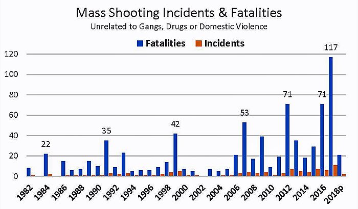
Mass Shootings. Loose motives.
Now, when you look at this graph compared to the last one you may think, “Oh yeah, that money was worth it.” There seems to be a really vile trend growing in America where American citizens are just straight up losing control of their mind and committing hideous acts of violence on their fellow man or woman. These are events that took place at complete random, where the shooter was most likely dealing with inner demons, and reached a deadly level of rage/depression where they could take out their vengeance on complete strangers.
Although these figures are always in the news for people to see, they only seem to be getting worse with most people’s only response being more guns or no guns. These figures also pale in comparison to the total homicide data. I feel that we need to switch the focus to addressing more foundational issues like parenting, bullying (physical/cyber/social), self-destructive tendencies, and mental illness. People are losing their identities more than ever, and shelling up as a defense maneuver. What we’ve come to know is that silence is deadly. Especially, when it comes to not talking about the real issues. https://www.cato.org/blog/are-mass-shootings-becoming-more-frequent
The following video provides insightful knowledge into what a dataset is along with several concrete examples.
Finding Datasets Using Scientific Research:
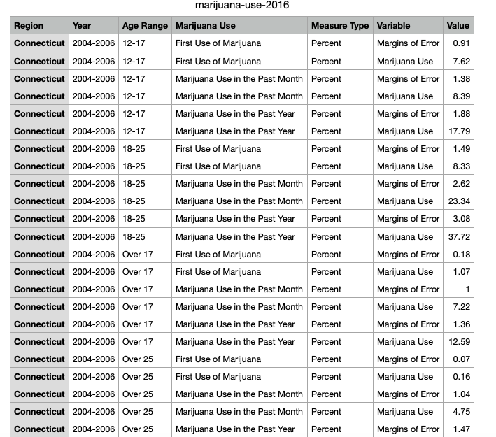
Upon navigating to the Connecticut Data Collaborative website & downloading the “Marijuana Use” CSV, you will be shown results to a study conducted to determine the usage of marijuana in individuals aged twelve years and older. Upon first glance this may seem like an overwhelming amount of information. Fret not, there are actually many different possible datasets within this study! Below you will see there is also a sample of the data included in this study.
Location: Where would you like your dataset to take place? For this example your options would be Connecticut, Eastern Region, North Central Region, Northeast, Northwestern Region, South Central Region, Southwest Region & United States.
Time: Over what time span would you like your data set to take place? The possibilities within this example would be 2004 through 2006, 2006 through 2008, 2008 through 2010, 2010 through 2012, 2012 through 2014 & 2014 through 2016. You could also choose to measure a span of four years (such as 2006 through 2010) or even the entire span of the study (2004 through 2016).
Age: How old do you want the participants in your observed dataset to be? Possibilities within this example are 12 to 17, 18 to 25, over 17 & over 25.
It is important to understand how to select the appropriate dataset(s) from scientific research as if you do not, it is likely that you will select a dataset that is not the best suited for your topic at hand. Always be sure to have a clear and concise understanding of what it is you would like to present to you target audience.
How to present data without losing your reader’s attention!
Summary: “Information graphics translate data into a visual medium that is easy to understand and engaging. Integrated visuals with text and pictures that strengthen each other are the goal, but hard to achieve.” -Lexie Kane (2018)
Click “Summary” to access the website.
Honest Information-
The information included in your infographic needs to be accurate and sourced.
Make sure you have extra links to your data as well as popular sources.
This will give the viewer more reason to use your information.
Minimalism is Key-
Keep your infographic design simple.
Use about 3-5 colors that compliment each other.
Make sure your words don’t crowd the data.
You essentially want your infographic to show your data in a professional way but also be able to have a 5 year old understand it.
Interactivity-
Having an interactive infographic is a great way to get your viewer involved with your presentation.
Sliding objects and adding preferences to the information they want to see automatically keeps the viewer invested.
Being able to narrow down what data they want to see is very important. It combines all 3 of these examples into one!
Think about seeing posters on a wall, are you more inclined to stop and read the one with just a paragraph of information or would you rather stop for a poster with bold lines, colors, images, and minimal wording? Most people will be drawn to the second poster because it engages us and attracts our eyes. This is why infographics are so popular, it gets the point across in a visually aesthetic way while effectively getting information to you in just a few words.
Infographics can be used for just about anything, what caught my attention is its use in our education system. Infographics can be used to help guide younger students with directions and instruction, especially students who don’t know how to read yet, it can give visual cues and help students recognize words. Infographics can also help students who are visual learners, which means they learn best by using their vision.
Since their inception in the late 1700’s, infographics have proven themselves to be invaluable tools for neatly visualizing data and presenting it to the public at large. These early graphics mainly focused on topics relating to business, such as with the case of the first recorded infographic which related wheat prices to labor wages, or geographic information. Some examples of these graphics can be found by following this link to Atlas Obscura. As the field of data visualization has grown and infographics have become more complex, encompassing a much wider variety of topics, several infographic archetypes have been created.
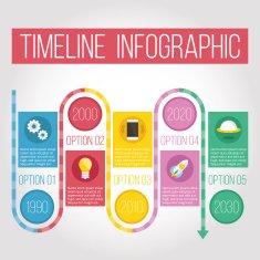
The Timeline
Timeline infographics are best used for displaying the evolution of a certain topic/data set over time.
2. Data Visualizations
Data Visualizations are artistic ways of presenting a wide variety of data sets to an audience in such a way that they are easy to interact with, allowing the audience to better understand and remember the presented dat.
3. The Comparison
Comparison infographics are used to highlight similarities and differences between sets of data or particular topics, such as mountains in the example shown above.
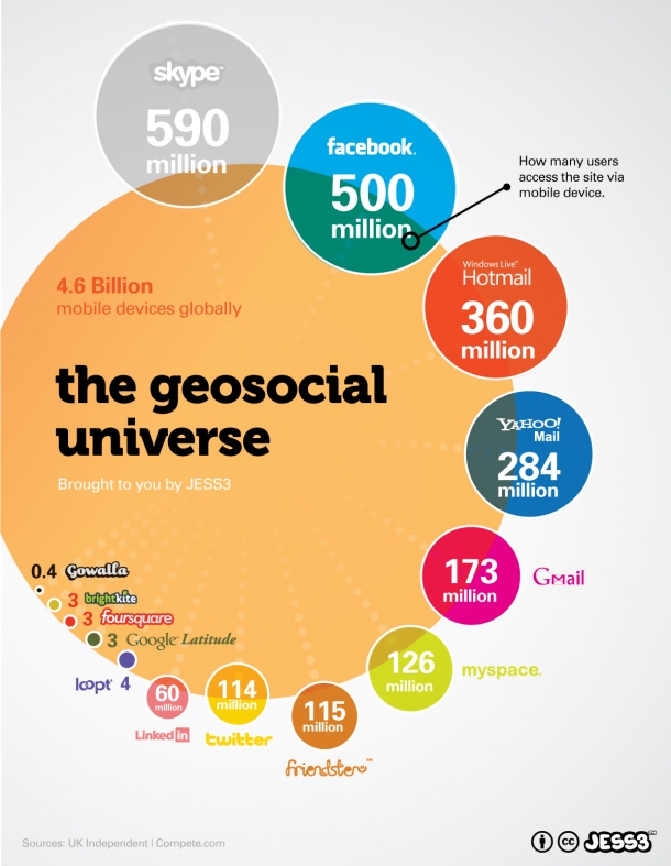
4. The Geographic
Geographic infographic are focused on displaying data sets that can be related to geographic information, such as population densities or economic output of certain regions.
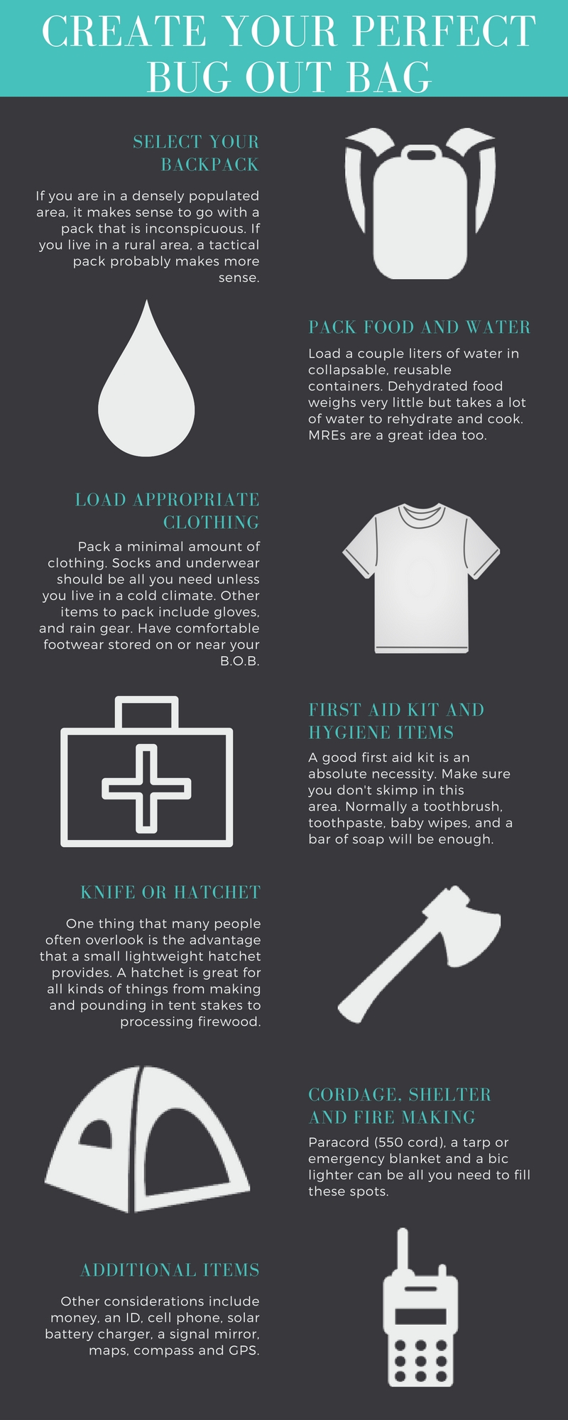
5. The List/Visualized Article
This type of infographic serves to summarize an otherwise lengthy article and distill its finer points into a list of short blurbs. Care must be taken to make sure that the important messages of the original source are properly translated into the graphic.
6. The Statistical
Statistical infographics serve to consolidate statistical data sets into a graphical image in much the same way as data visualizations. The key difference between the two is that statistical infographics are focused more on the presentation of hard numbers rather artistic designs. Anyone who has worked with data management programs like Excel should be familiar with the most basic of statistical infographics, such as pie charts and line graphs.
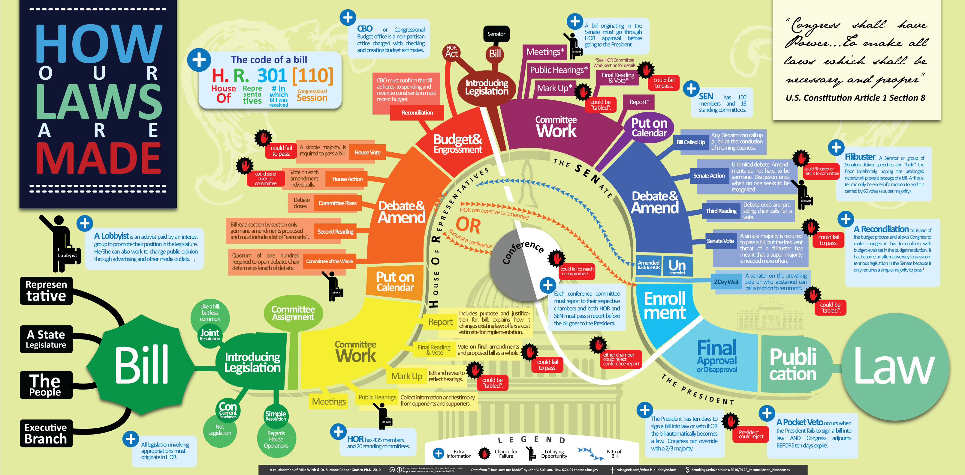
7. The Process
Process infographics display the order i which events tend to occur regarding a specific topic, such as with how laws are passed in the example given above. These graphics are separated from timelines due to the fact that the progression of time is not a necessity for the creation of a process infographic, as it relies only on the order of events and not on when the events occur.
Tools to Help Create Infographics
Creating organized and eye-catching infographics from scratch can be a difficult task. For this reason, I have put together a list of sites and resources that make creating infographics a breeze.
Canva.com – allows limited creation of infographics with a free account
Venngage.com – similar to Canva and Easely, but with a more limited scope for free student accounts
Adobe Spark – Spark allows full access to college students and provides a wide range of graphic styles and tools
These are just a few examples out there that greatly simplify the process of creating infographics. There are other sites that offer similar services, but these are usually limited in scope with a free account. In terms of generating simple charts and other quick data visualizations, Microsoft Excel and Google Sheets are the best choices available to you.
Interesting Data Sets
I am a Sustainability major who is concentrating in Energy, so I am very interested in all things related to energy efficiency and generation. I managed to pull together a few different sets of data relevant to the field of Sustainability which you can find below.
Data visualizations are a colorful and creative way to present data. It allows you to organize data in a way that’s both compelling and easy to digest. Data visualizations can be animated, colorful, use images, metaphors, and can save you time. They also can explain a process, stimulate imagination, present data in a pretty way, tell a story, and be educational. It is important to choose the best visual for your data and its purpose. It is crucial that your data is understandable. Keeping your visual as simple as possible is the best way to do that. Some examples of data visualizations are charts, tables, maps, graphs, infographics and dashboards.
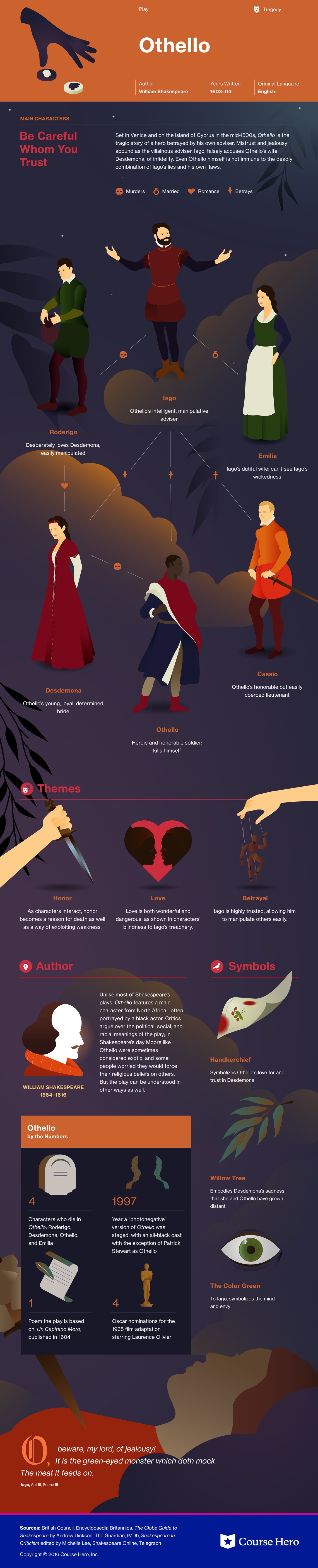
Course Hero is a website that provides students various study resources like study guides and textbooks, and their solutions. The one I am specifically going to talk about it their literature infographics. This resource helps students learn about a story’s characters, plot, themes, and more in a visual way. (I will insert an example they provide of a play named “Othello”). Depending on the type of story, the infographics have various information it will provide the reader with. They create colorful infographics with the theme of the story and draw out characters, shapes, and more to grab the reader’s attention. The website also goes into detail with what happens in the chapters, they describe the characters and how they change over time if you click “view study guide for this book”. I would recommend this resource for people who are struggling with understanding a book they are reading.
There are several very popular and well done data visuals that I find attractive and useful and I thought I would share
Covid-19 Spread Data such as the one put together by the John Hopkins University. Probably my favourite data set put together in the last decade. The visuals change with data, it’s attractive, and it almost tells a ‘story’ of the Covid-19 and it’s behaviour around the world
2. Plastic Waste data Set. Made by National Geographic. It is kinetic, interactive , stimulating, and, even though some of it is not that pretty, they do that on purpose to show just how gross you should feel about waste.
this data set that was put together no doubt too much more research, and imagination, and time to put together. It is very interactive and tells a story with the data.


