Categories
Infographics Visualization Tools

Exploring VizHealth

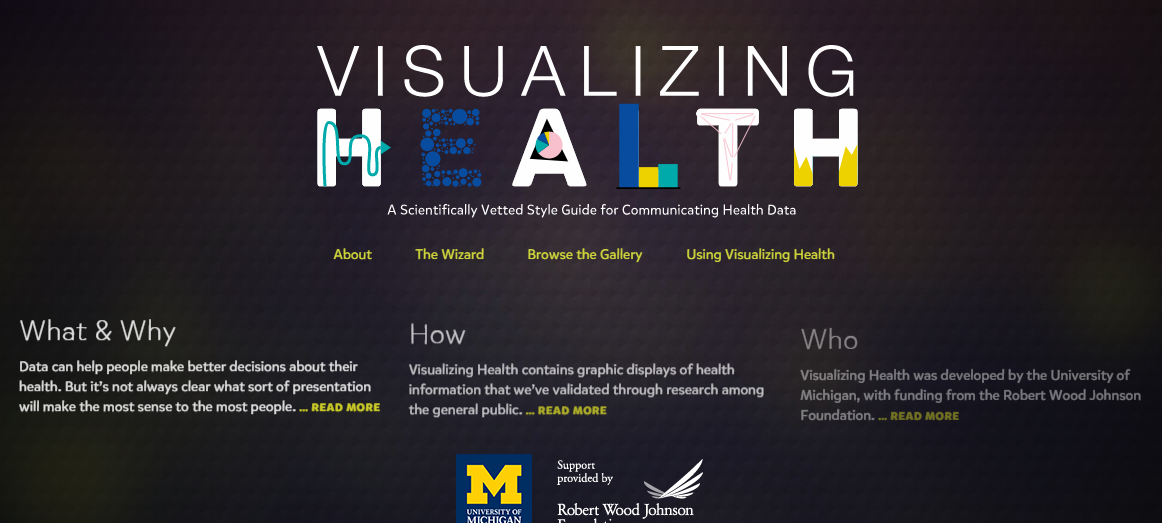
This week I had the pleasure of exploring VizHealth.org, a data visualization site for the medical field run by the University of Michigan. My initial impressions on the site were mixed at best, as I was not sure how useful a site categorizing visualizations specific to the medical field would be to other areas. I am happy to say that this impression was completely untrue and I will most likely use VizHealth as a reference for any future infographic projects.

A Brief Synopsis

The opening page of VizHealth

VizHealth serves as a database detailing a wide variety of infographic examples and their potential uses. The two main features of the site are its gallery of infographic examples and, more importantly, a search wizard for finding infographic designs. Given the wide range of designs and searchable tags the site presents, they thankfully provide a simple but concise guide on how to navigate the site and attribute any of designs for your own use.

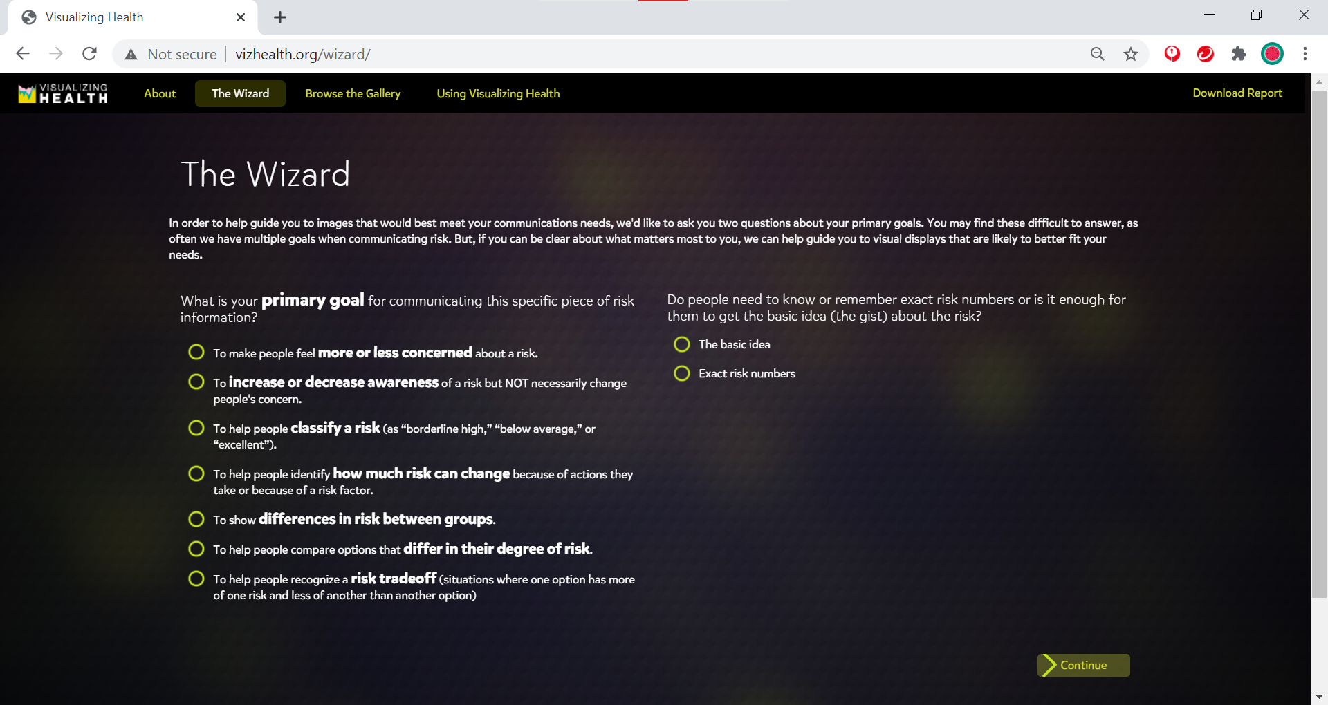
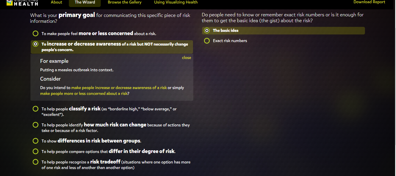
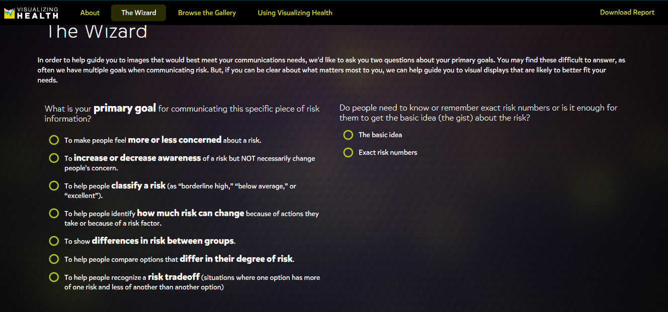
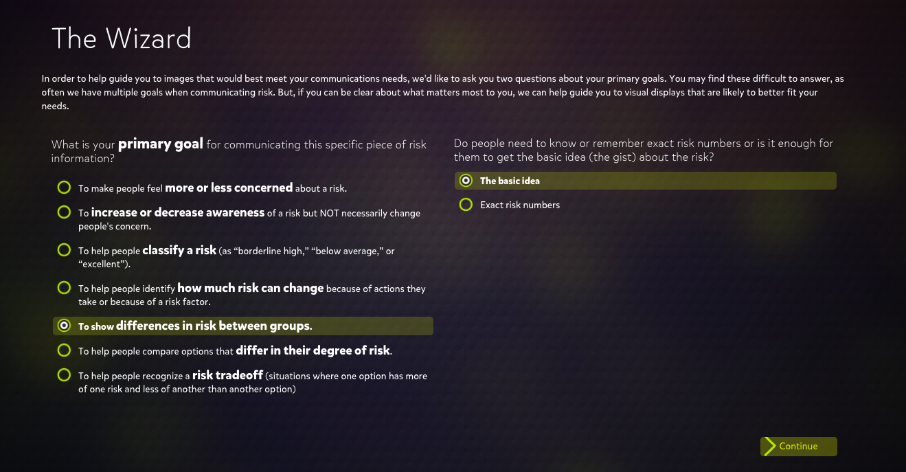
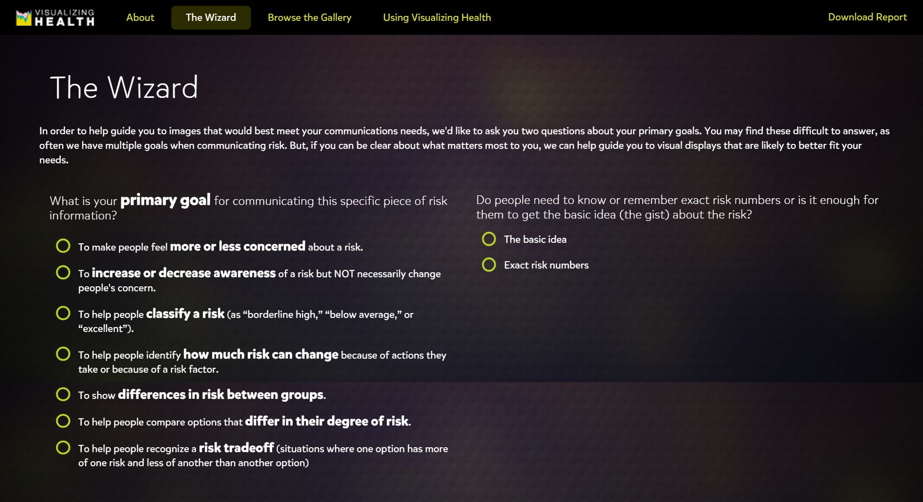
The VizHealth Wizard

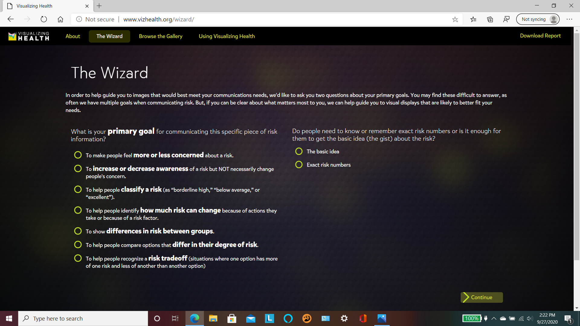
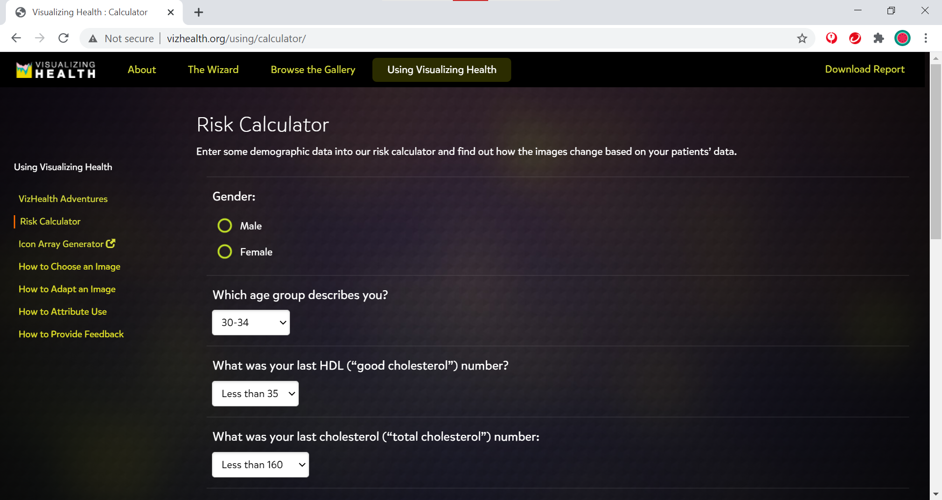
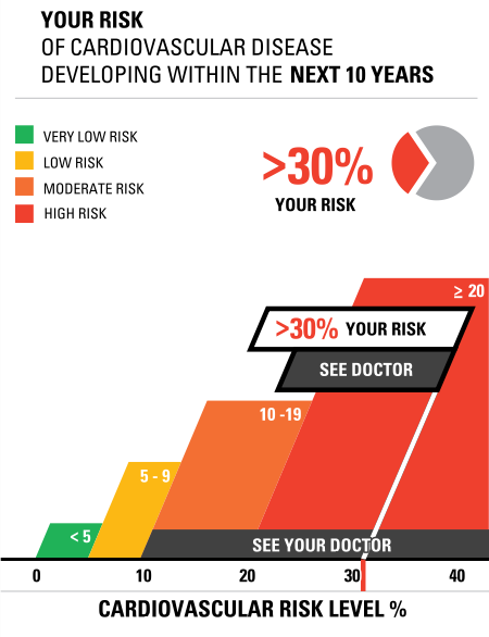
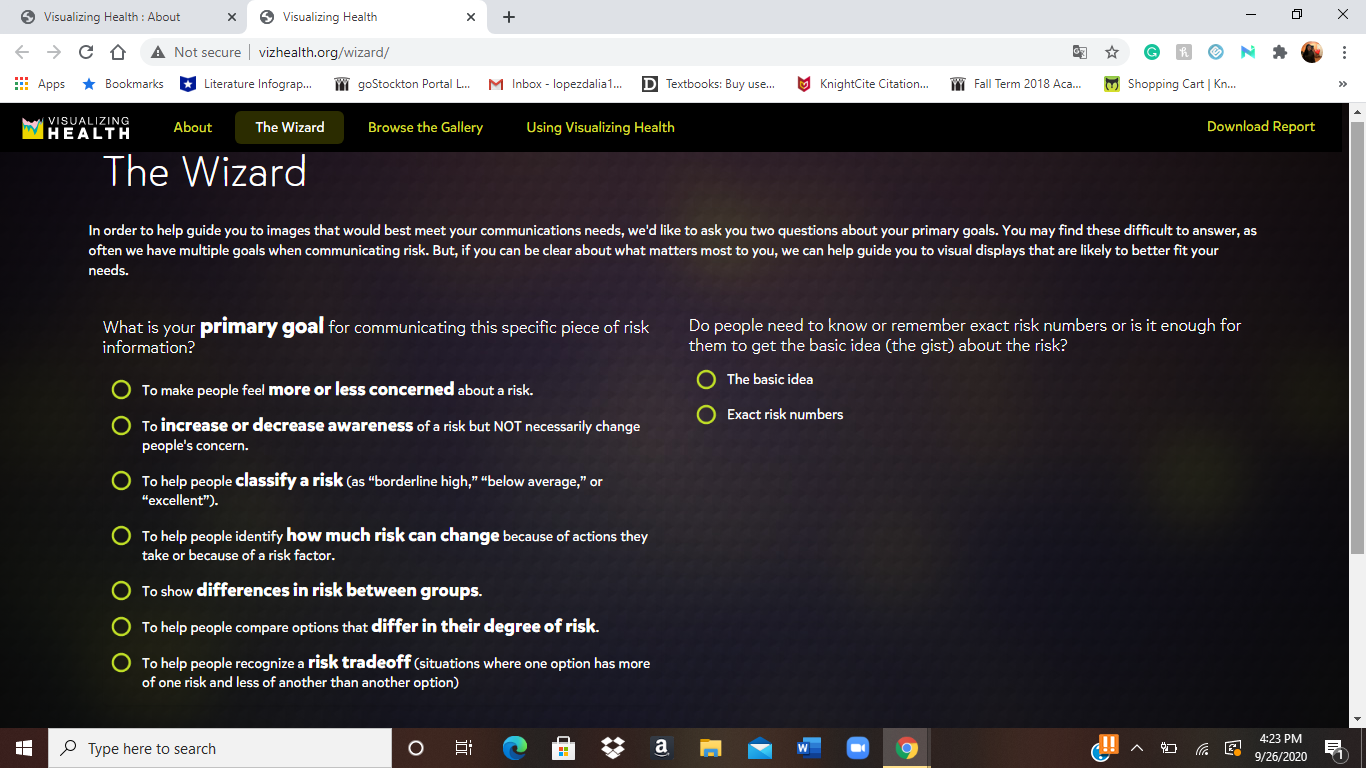
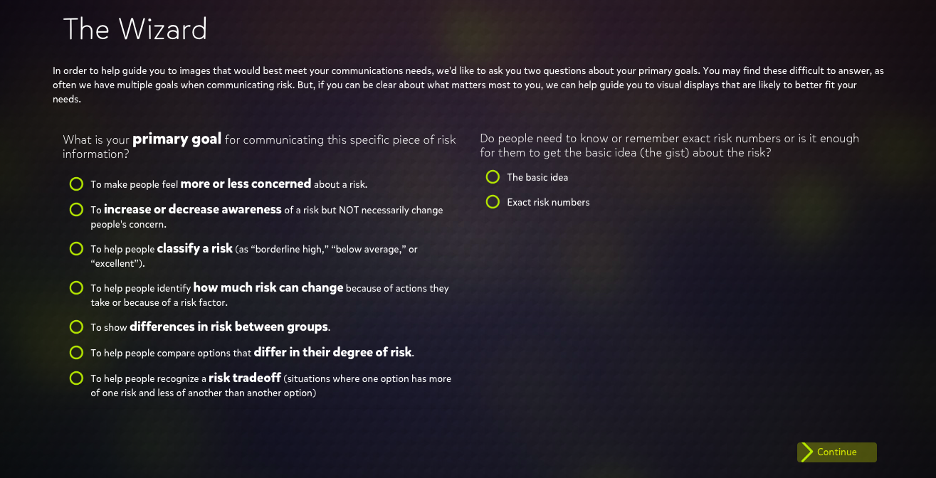
Serving as the main attraction of the site, the VizHealth wizard is an easy to use tool that allows you to quickly search for specific infographic designs based on a variety of criteria.

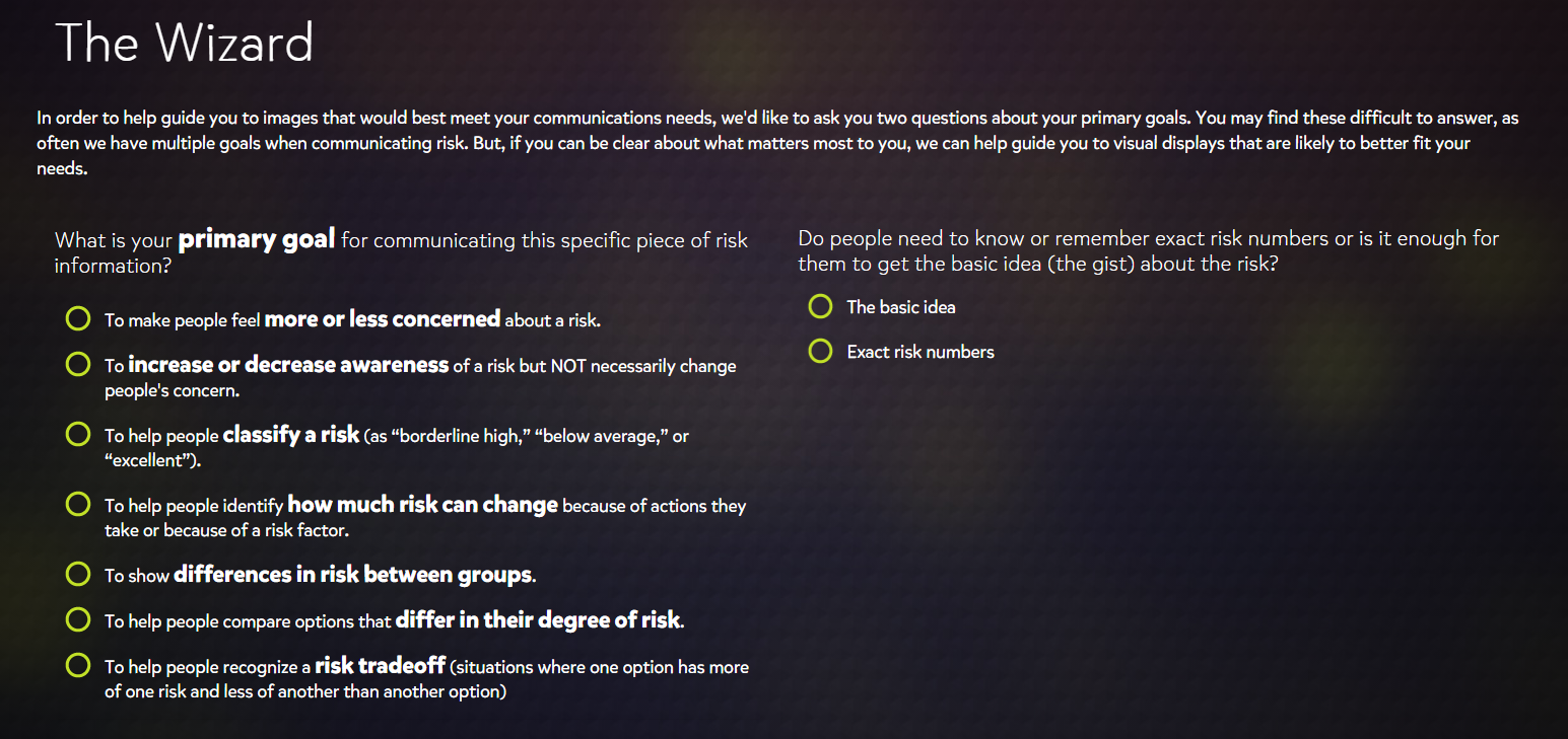
When I first viewed the wizard, I was surprised at how simplified the search criteria were. The eight primary goals were easy to understand while also being as non-specific as possible so that you could apply them other datasets that were not medical related.

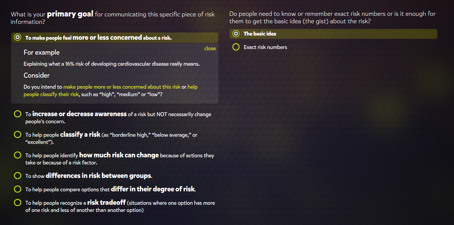
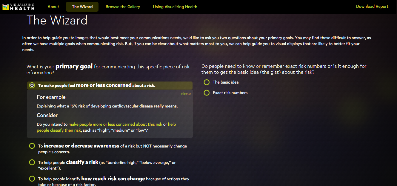
Selecting a graphic style also provided a short example of how the described graphic would be used and poses several questions that might help you confirm whether or not you choose the correct category. I found this to be a very useful addition as I had difficulty fully understanding the difference between the second and third to last options on the list. The filters for exact numbers and basic concepts were also useful features for determining graphic styles based on whether the graphic is meant for the general public or a more professional audience.

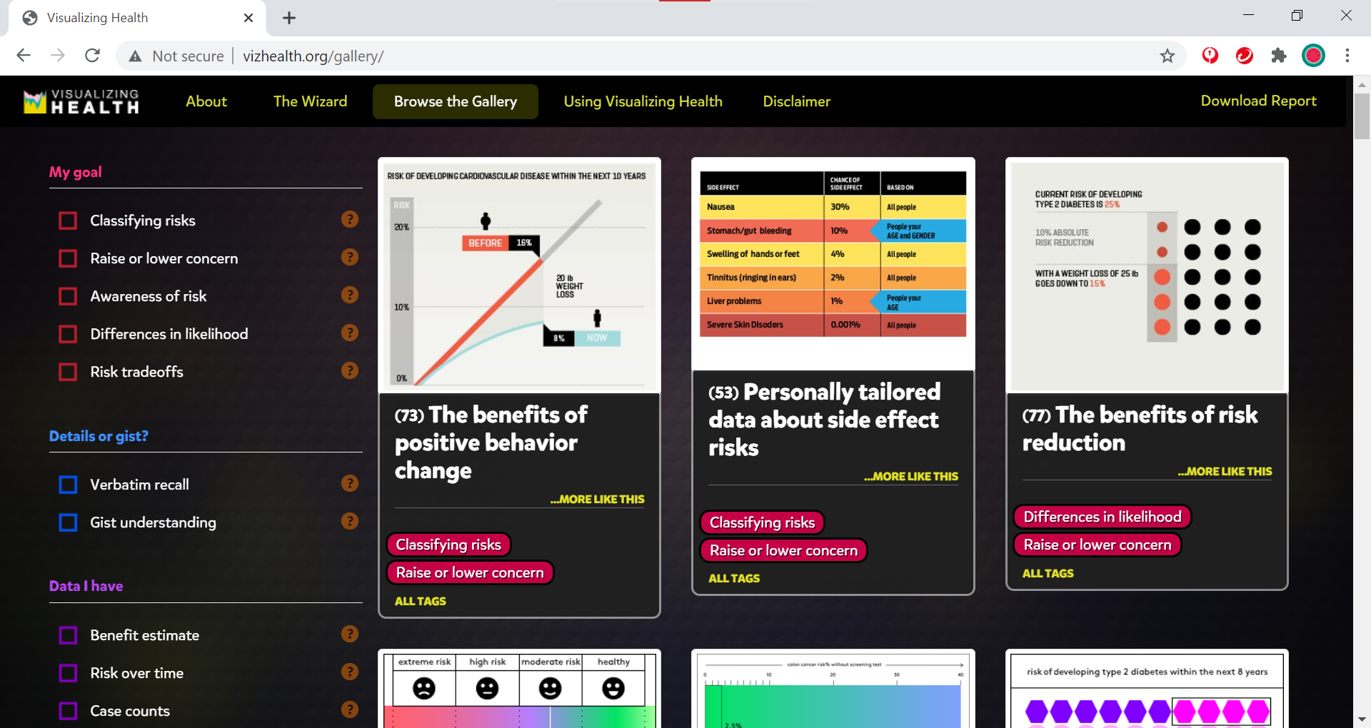
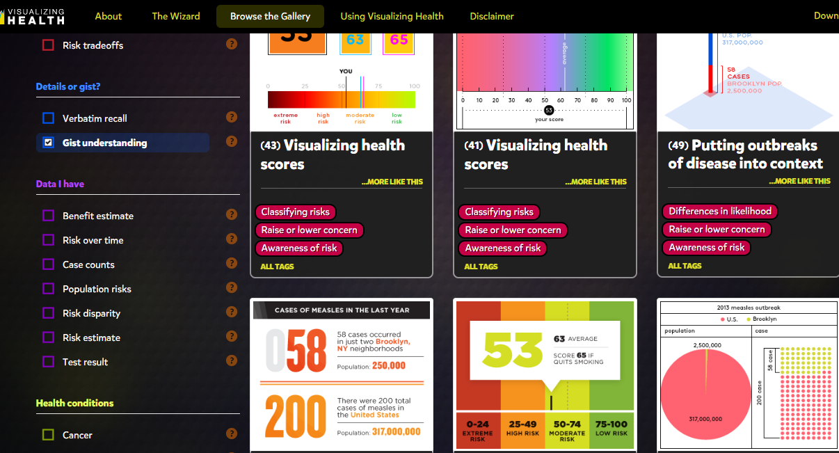
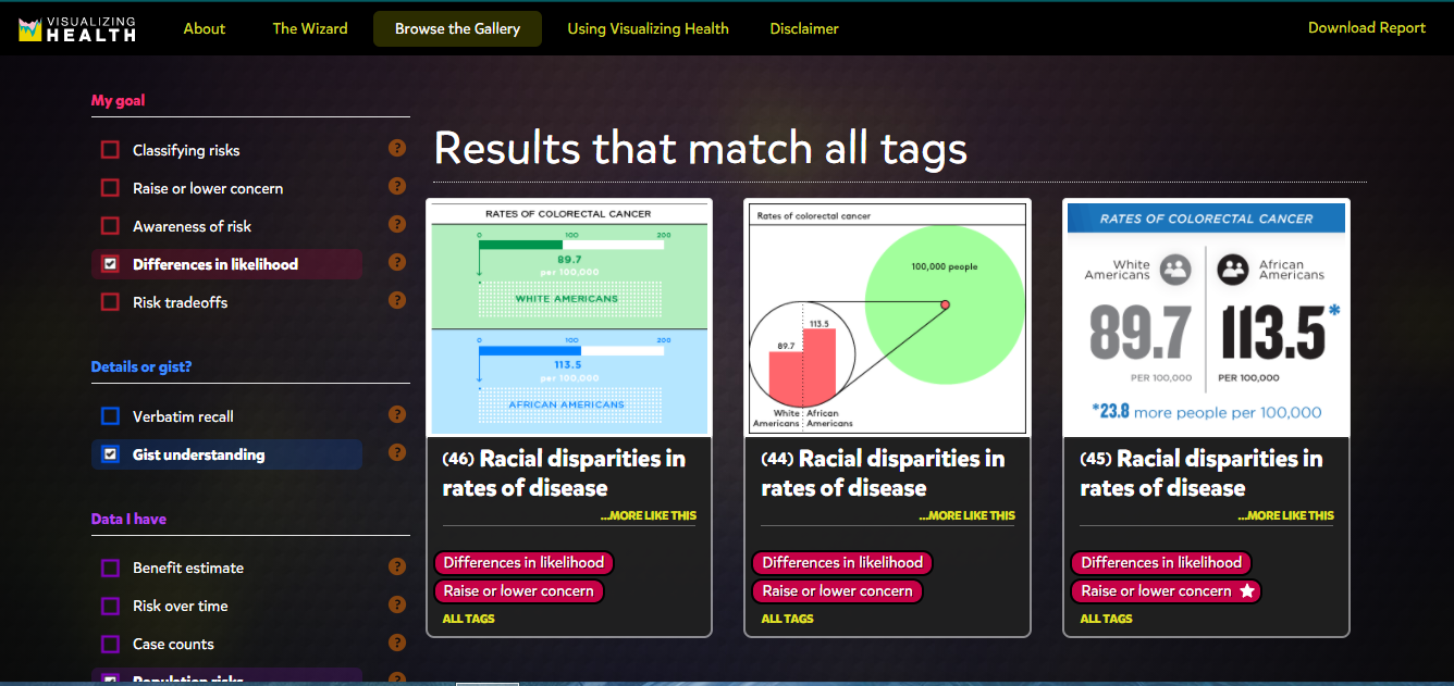
The Graphics Gallery

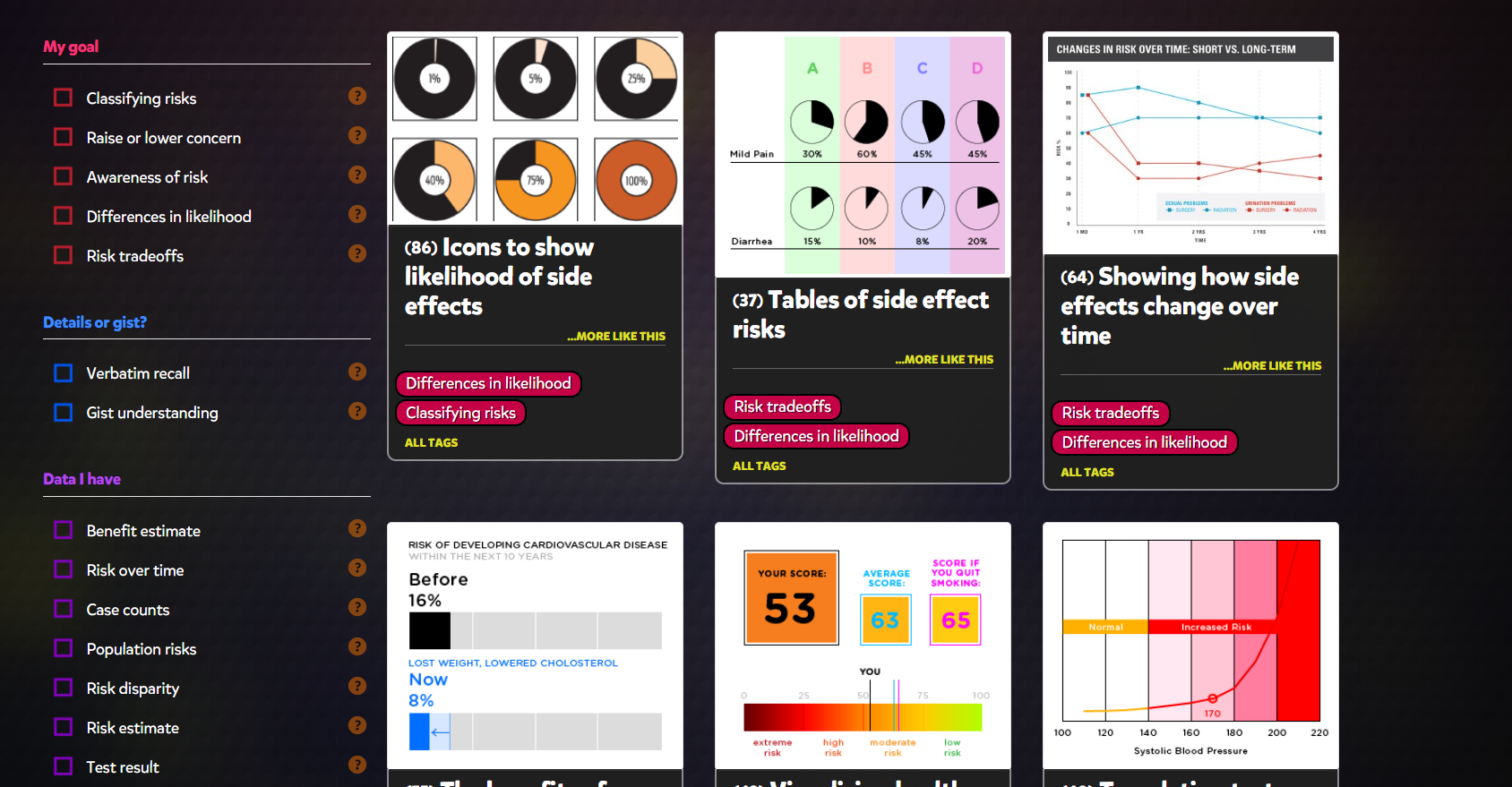
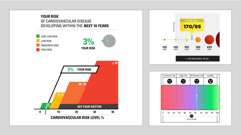
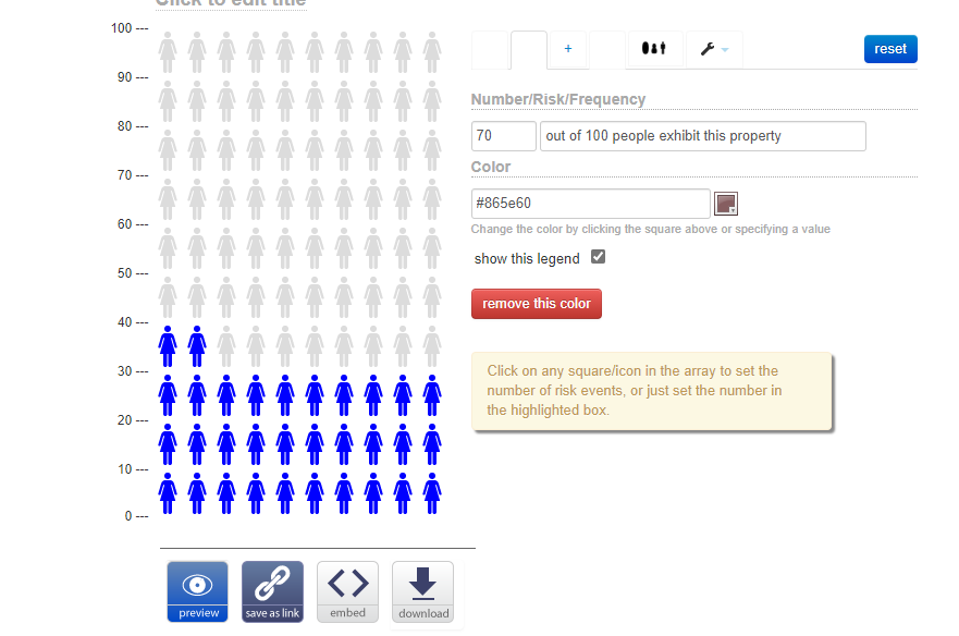
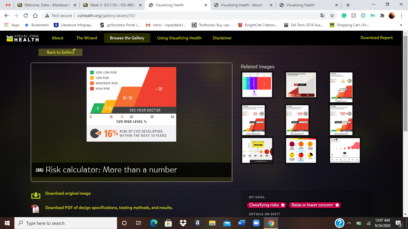
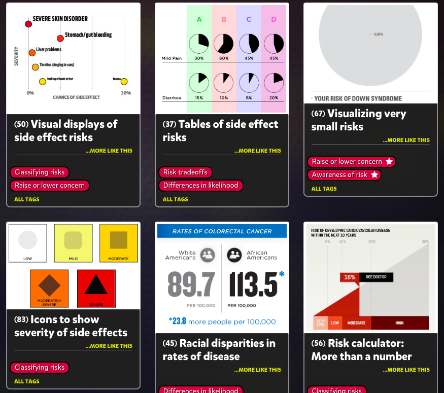
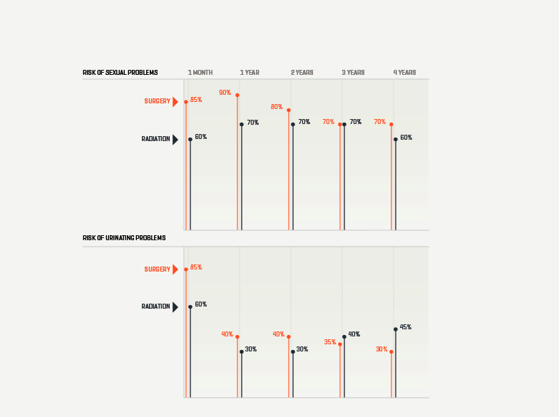
While I found the Wizard to be helpful overall if you are looking to design an infographic, I was much more interested in the actual graphics browser that accompanies it. This browser displayed about 50 different styles of graphics that all feel under the purpose categories that the Wizard describes. While there were quite a few styles that I was familiar with, there were also significant number that were new to me or that I had never really considered to be infographics.

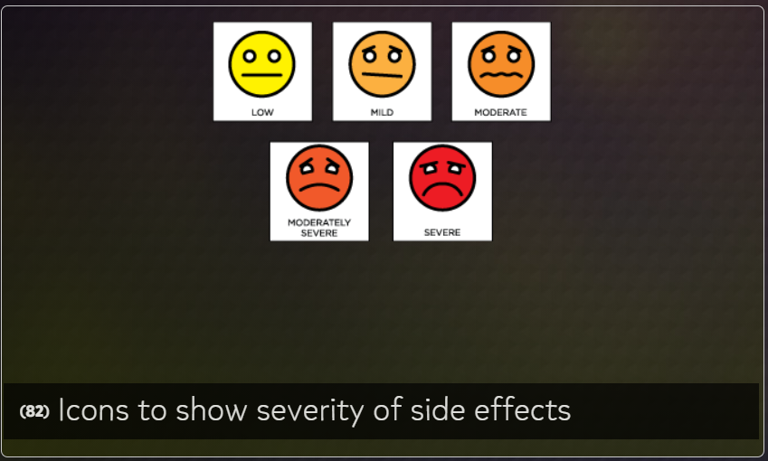
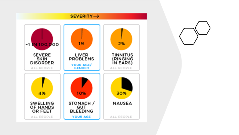
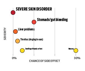
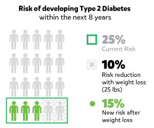
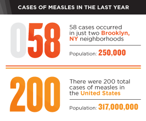
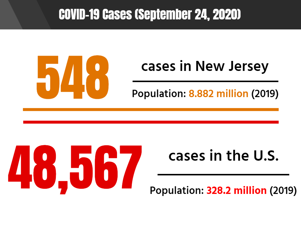
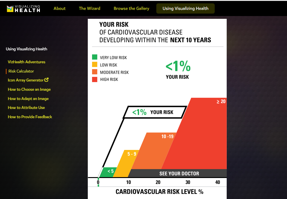
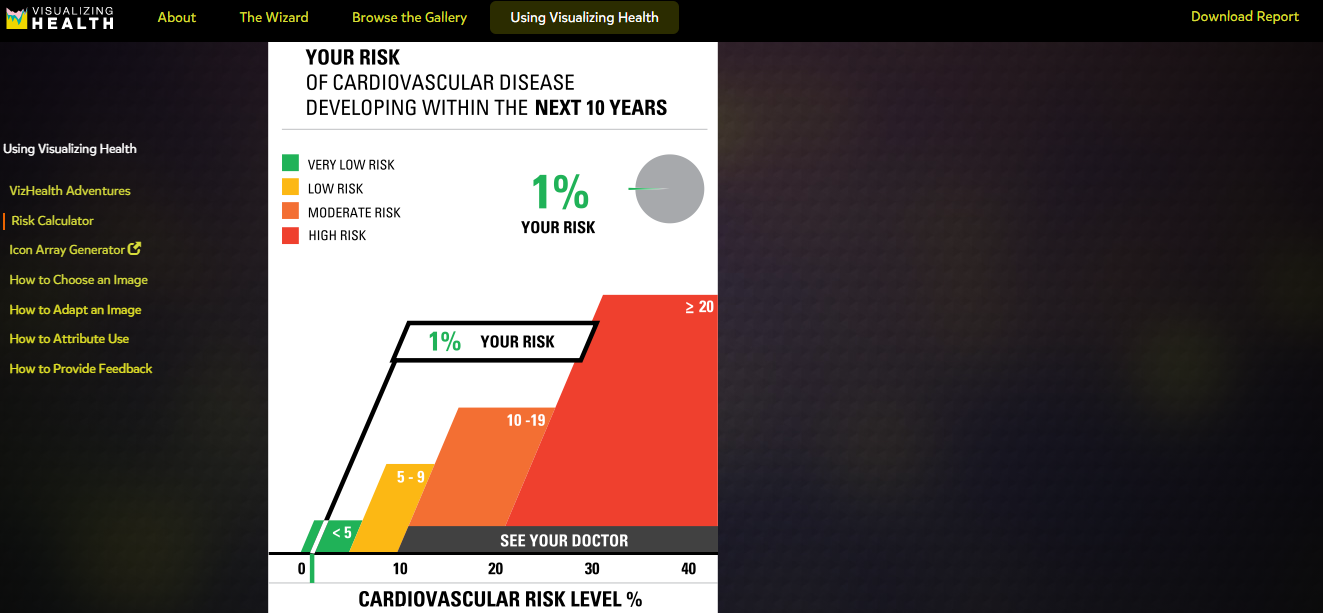
For example, we all have most likely seen this table at a doctor’s office and I had never realized it might be considered an appropriate way of displaying data. A variety of the presented graphics directly address this issue of determining if a graphic is appropriate for conveying certain types of data and the impacts they have had historically.

This image has an empty alt attribute; its file name is Graphic-2.png

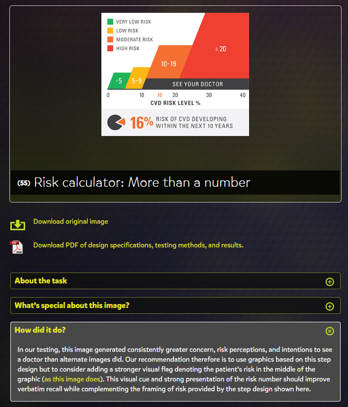
The “How did it do?” tab is the perfect addition to the site, as it allowed me to learn more about how well these different styles performed and any issues that arose from their use.

Final Thoughts

Overall, VizHealth seems to be perfect tool to get a wide-scale idea of the various styles of infographics that have been used in the past and provides fantastic information on how effective each is at their prescribed role. The Wizard is a great jumping off point for designing infographics when you are unsure of what kinds of visualizations are appropriate for your data set. I will definitely be using this site as a resource for when I have to

Categories
Uncategorized

Visualizing Health

I was usually proud about my health. So, I felt relaxed to visit this website. Visualizing Health was a project of the Robert Wood Johnson Foundation and the University of Michigan Center for Health Communications Research. My belief was increased after reading this information.

What I was waiting for not take VizHealth adventure? It was not useless for me to make better decision for my health despite its disclaimer. 6 of candies was not 10, but they were better than nothing, they were not? Also, I could enjoy the knowledge of data visualization in health field.

The authors of website promise that there would be a real- world story to help me to understand how my images would be adapted by visualization. But what should I do to limit my images within so much images in its gallery. Yes, a “wizard tool” was available for me to use, as well as risk calculator.

I started with wizard tool by answer some questions

Ok, the result were here. It was helpful for me to narrow my images by selections of ” My goals, Details or gist, Data I have, Health conditions, and Graphic type” . Two first selections were results from taking Wizard.

Next, I smiled to choose a specific type of graph for displaying my result. Otherwise, I could enter a matrix of health images? Could you have 11 your lovers at the same time? I only chose 1 lover and some friends. I was busy.

Ok, Let’s started with calculate my risk !

After that, I had my Cardiovascular risk level, the score of Health Risk Assessments ( HRA), as well as the translating test results into risk. Unlike secret data, I were available to share with all you. It were looked like…

Did you agree with me that it was important to access our health risk? It was not less useful to understand about health risk factor such as gen, gender, age, health condition, as well as living and working environment. So, the website remined me about attention for variety … These images were looked like…

The benefit of risk reduction and the benefit of positive change were also pointed. These images are looked like…, but not mine…

Some recommendations about treatment choice, specially for color cancer or diabetes were available. But not me… I was Ok!

Finally, I made decision not to visit doctor due to my health…!

More thinking…! 09/28/2020…

I would like to thank authors of the website and my instructor for this opportunity. It is not easy to make ideas about health visualization without their health knowledge and talent, specially their creativeness, organizational and computer skills. The images / infographics are lovely and understandable.

More ever, I was inspired to learn more some health knowledge while answering some questions, as well as how to make these lovely images/ infographics. Also, I got a little experience to determine where is starting point for a difficult math problem.

Thank you!

Categories
Data Visualization and Art Design Infographics

Exploring VizHealth

When it comes to a person’s health, having the right data can make a world of difference. But sometimes it’s hard to make sense of the data when it isn’t condensed. What does it mean when the doctor says their patient’s blood pressure is X-over-Y? Will this medication do more harm than good? What should a patient to do reduce their risk factors?

This week, I paid a visit to Visualizing Health (VizHealth), a data visualization style guide specifically designed for communicating health data. Going into this project, my main concern was COVID-19, so I hoped that they had at least some content related to the coronavirus.

First Impressions

The home page for VizHealth.

When I arrived at the VizHealth home page, the first thing I noticed was the University of Michigan logo. I moved my mouse over it and the Robert Wood Johnson Foundation logo, but there were no links to either program. Other than that, the page itself had a simple design with a limited color palette and several key links.

About VizHealth

VizHealth results from a collaborative effort between the Robert Wood Johnson Foundation and the University of Michigan Center for Health Communications Research. Their goal is to better communicate data for a variety of health issues through numerous scientific studies. In turn, the VizHealth team hopes that the graphics they designed will provide inspiration to other health data visualization designers who want to tell a different story with their data.

At the top of the “About VizHealth” page, they include a brief video detailing their mission and methods:

At the core of the program is the data visualization wizard, where users answer a few questions to help them select the right graphic for what they want to convey to their audience. Then, there’s the visualization gallery, which contains a variety of graphics depicting different design concepts. Finally, VizHealth’s resources page includes a sample risk calculator and a short comic detailing two real-world applications of health visualization.

The Wizard (of VizHealth)

The first tool on the site is the Data Visualization wizard. Two questions greeted me when I opened the wizard: “What is your primary goal for communicating this specific piece of risk information?” and “Do people need to know or remember exact risk numbers or is it enough for them to get the basic idea (the gist) about the risk?”. Put in simpler terms, the wizard asked me for the purpose of my data and how much of said data I wish to convey to my audience.

For the first question, the wizard gives explanation tooltips for each choice to help users decide what story they want to tell with their data. For example, the second option details risk awareness, and they use a measles outbreak as their source. They also ask the user to consider if they meant to tell a different story; clicking the second option in the tooltip redirects them to another choice. Once I’ve made my selection, the site brought me to a confirmation page where I can continue onto the visualization gallery (discussed below) or change my answers.

Visualization Gallery

VizHealth’s visualization gallery holds 54 pieces of data visualization examples for users to browse, filter, and examine. Immediately, I found myself checking off filters to sort through the examples provided, though I was somewhat disappointed when I saw that there was no option to display COVID-19-related visualizations.

The design I chose pulled information from a 2014 measles statistic report. It compared annual measles cases reported from Brooklyn to nationwide measles cases.

Using this as a design template, I decided to pull monthly COVID-19 statistics for New Jersey and compared them to the national cases reported. As of September 24, COVID-19 cases are slightly increasing when compared to numbers from the previous month. One possible explanation for the increase could be attributed to Labor Day crowds and people disregarding CDC guidelines for social distancing and wearing masks.

This image is based on original research and designs from Visualizing Health, a collaborative project between the University of Michigan and the Robert Wood Johnson Foundation made publicly available via Creative Commons license. Our use of this image should not be considered an endorsement from Visualizing Health. For more information, visit www.vizhealth.org.

Resources from VizHealth

Finally, VizHealth provides a list of resources on how to use their content as well as some interactive tools. The first thing I saw was a comic depicting a diabetes researcher, Melanie, as a sort of data-visualization superhero with an illustrator fox sidekick. It was rather cheesy but it also showed how health visualization can help ordinary people better understand their risk factors.

The front cover of the “VizHealth Adventures” comic: http://www.vizhealth.org/using/adventures/

While on the subject of risk factors, VizHealth also has a risk factor calculator that users can interact with to determine what daily habits impact their health.

I had my father, a casual smoker at age 70, enter some answers into the calculator. He thought the design of the graphic was neat, but when I told him that it meant that he was 30% at risk of developing cardiovascular disease, he simply said to me, “Well, there’s a 70% chance I won’t get cardiovascular disease.” Needless to say, I insisted that he consult a doctor about his risk factors, specifically his smoking habits.

My father’s results from entering information into the VizHealth risk calculator.

VizHealth also provides a link to an icon array generator (depicted below) that users can interact with.

Conclusion

Looking around VizHealth and pulling inspiration from the visualizations provided was a fun activity, but I think the program can truly benefit from including more issues such as mental health and COVID-19. Even more so, it would also be interesting to see more interactive tools added to the site, like a free-to-use template generator. If there are any other health issues that arise, I’ll be sure to use VizHealth to learn more.

Categories
data visualizations Uncategorized

Visualizing Health

An interactive website that helps pair visuals to medical information thus making it easier to communicate with patients. The website itself is well organized and is easy to navigate; The University of Michigan also lays out its goals and objectives for the website on the home page.

As I navigated through the website, I found a tab labeled “The Wizard” which asks two questions to help guide users toward an image that helps display the information they want to transmit.

Once past the questions on “The Wizard” then the site guides you to a page that displays multiple colorful images to the right and down the left-hand side is a widget that a user can elaborate more on what they are looking to create.

The generator was for Icon array, which transferred you to another website. On the page, ironarry.com, there were a few questions listed that help generates an icon graph, like posters seen in a doctor’s office. The generator also had options of changing the icon on the chart, male, female, etc.

Being a new user to this website, I decided to try out the calculator, it asked a few simple questions and within seconds I had an easy-to-read visual before my eyes. I was honestly surprised by how simple the chart was to read and I think it is a wonderful tool for people like myself who are usually confused by all the charts and analyze from a doctor’s office.

Overall, I think this website could be helpful to not just medical professionals or patients but to those who are trying to understand and grasp the concept of visual data. I feel like it explains and shows how each type of graph can portray specific knowledge and be used to target consumers in a simple and understandable form. I think what helped me tie in how well visualization can help the brain compute data was manipulating the data on the graphs and seeing it come to life, so to speak, in graph form. Even using the calculator, I was able to insert data I did not quite understand and receive an image that got straight to the point with little to no confusion.

Categories
Uncategorized

Vizhealth

Vizhealth is a website created to help view/explain/visualize health risks and overall help us make decisions over our health. While looking through the website it takes you through steps to get to the visualization that best fits your needs. It shows you various styles of visualization according to questions they ask you (primary goal – awareness, classify risk, differences in risk between groups, degree of risk, and lastly whether the type of visualization basic idea or exact risk number). They also provide a fun comic, risk calculator, and a generator to help view population risks with icons.

The creators of this website have a wizard tool that helps you find the right visual display for you to understand certain health information. This basically helps narrow down the display option to one that fits any need you have.
For the wizard at first, I tried the options “To help people classify a risk (as”borderline high,” “below average,” or “excellent.”). and “exact risk numbers” This is one fo the visualizations that popped up for my needs. It shows you the different risk levels and then shows you where you are at. It provides the number for you and you just look for it on the risk levels. For most visuals, it gives you options to download a pdf of the design specifications, testing methods, and results.
This is an example of the Generator that helps visualize risk population with icons. I typed in 10 out of 100 people exhibit this property. This highlighted the amount of people that the sentence was about. In gray was the people that didn’t exhibited the property.
Categories
Data Visualization and Art

Visualizing Health

Figure 1

Visualizing Health

: is a unique way to transfer medical data about health conditions into charts, graphs, and diagrams that are easily understandable by a broad audience. It enables someone to better understand their health risk, uses icons to represent side effects, and benefits of reducing risk.

Figure 2: The Wizard

Figure 2: The Wizard is an interesting tool for visualizing health. It’s used to assist individuals in carefully choosing their primary goals when it comes to their health. For example, an individual who smokes a lot might want to know what are their chances is of getting a heart attack, stroke, or lung cancer.

Figure 3

Figure 3: By clicking on the goal, it then displays examples of the risks or racial disparities and it asks for a reason for choosing the goal. This is a great way for individuals who are uncertain about the right steps that are needed to reducing their health risks. The Wizard breaks down complicated medical questions and conversations about health risks into simple questions that the individual can understand through visualizing.

Figure 4

Visualizing Health provides various charts for different goals such as increasing or decreasing awareness, risk reduction, differences in age groups, or race. Each chart breaks down percentages and numbers and only highlights the important data so that the audience can understand the information. It also allows the individual to select different data, the type of graph he/she would like to see the data on, different health conditions, or the type of details that he/she would like to know about a certain health condition.

Figure 5: The Risk Calculator

Figure 5: The Risk Calculator is a good way to get an estimate on someone’s risk of a heart attack, stroke, and other serious health conditions. It should be noted that the Risk Calculator is not 100% accurate, but it does give the individual an idea of their condition, which would prompt the individual to visit his/her doctor.

Figure 6: My results using the Risk Calculator on Visualizing Health

Figure 6: My Risk Calculator results indicates that I am 1% at risk for cardiovascular disease and suggests that I “see your doctor”. This provides an excellent opportunity for me to speak to my doctor about reducing my risks on my next visit.

Categories
Uncategorized

Vizhealth

Vizhealth is a unique way of creating a certain style of data visualizations for healthcare and health data. With that, it is also a great source to help anyone that learning about data visualizations in any job. I had a very pleasant experience going through the website and I loved how everything was organized on the pages. The neatness and amount of information throughout the entire website caught my attention.

The Wizard, being one of my favorite tools that I explored, is a helpful way for healthcare providers to focus on how they would like to present their data to a patient or boss. The Wizard tries to analyze your goal and then gives you many results to choose from.

I noticed that Vizhealth has a lot of different links and hyperlinks that point to other web pages, web sites, graphics, visuals, files and even e-mail addresses. The ones that I came across definitely helped me understand certain data and words that I was not familiar with. The colors that were used throughout the website as well were also appealing. The colors blended together and there were just enough.

Visuals

The Gallery had a plethora of different kinds of data visualizations that presented great information on how you can rearrange your numbers and data in a colorful and fun way. These are just a couple of examples that I found effective and interesting to look at.

Vizhealth also had an entire page about how they choose their visuals to go onto their site, giving a brief description of their process. I think that this is something good to have on a website like this one so viewers can see how each visualization is picked to be shown.

I think that I would recommend this website for someone who is learning about data visualizations because it gives great resources as well as helpful tips to guide you in the right direction of analyzing your numbers. My overall experience was a good one and I continued to learn new things.

Categories
Uncategorized

Visualizing Health; A Reflection.

Visualizing Health offers a wonderful tool to assist you in selecting the appropriate visualization for your dataset. Upon entering the website, you are greeted by the homepage pictured below.

Once on the homepage navigate to “The Wizard” tab, highlighted in green in the photo above. You will then be brought to a new page that asks you to further explain what your primary goal is for your visualization & exactly how much knowledge your audience should take away from your visualization.

If someone is looking to create a visualization for the differences in risk for two medical conditions over time, they may select the highlighted options in the photo above. Selected is, “to show differences in risk between groups” as the two different medical conditions (sexual & urinating problems) are measured in individuals who had reconstructive surgery and those who choose radiation. It is not crucial for people to understand exact figures, just that one may have a better effect then the other. This is why “the basic idea” is selected.

Shown above is one of the numerous visualizations that “The Wizard” recommended for the data set. As you can see, this visualization is clear & direct in communicating that for sexual problems, surgery was a better overall choice for patients. For the case of urinating problems, surgery also appears to be the better overall choice although it could be questionable as a longer term solution.

Visualizing Health is a wonderful website to explore if you find yourself wondering if there is a better way to depict your data. Taking the time to look through this website will offer any user insight into what clean & concise visualizations look like. Keeping this website on hand could be the difference between creating an average visualization, and a perfect one!

Categories
Uncategorized

Visualizing Health

Visualizing Health is a handy website that helps you create infographics regarding health. In addition, it provides people with a simple way to retain information about their health. For example, instead of a long paragraph that one may have to read, this website combines important information and portrays it in images.

Visualizing Health also has a handy tool called “The Wizard”. By asking two questions, the Wizard helps you narrow down your communication goals and your primary needs. This then filters out infographics that best suit your needs.

Questions that the wizard asks you are in the photo above.

After completing my questions and letting the wizard do its work, one eye catching inforgraphic that it found for me was this one.

This image was a product of me choosing option of “increasing the awarness of a risk by a lifestyle change” and the topic i chose was “diabetes.

All together, Visualizing Health is a handy website that provides information in eye catching images. Most importantly, if focuses on the health of people by educating them and on how they can make themselves better.

Categories
Uncategorized

STANLEY CUP: 2020

Presented in: Infographics

via moneypuck.com
via cbssports.com