I would just like to say that the Visualizing Health Website is a dream come true for all Hospital Marketing departments. This site is very easy to navigate because they made the tabs really simple to understand.

There are four tabs: the about section which is basically the history of the website and their purpose, the Wizard which separated into two main questions, what is the primary goal and whether you want it to be a general idea or specific.
The next part if the gallery that has hundreds of charts and graphs about almost everything health related that one could think of.

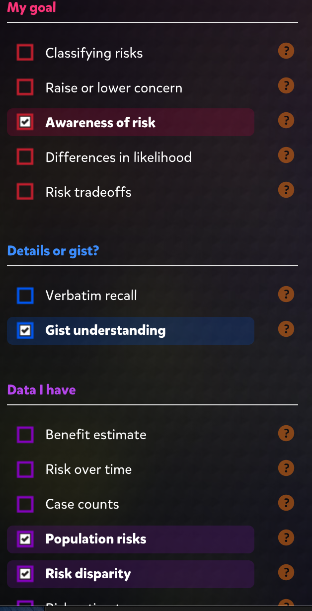
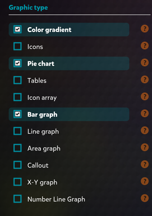
The left side of the page is separated into sections and you can filter your searches through there. You can choose what you want you goal to be and what data you want to present. Then towards the end of the filters there is an option to choose what graph time you. This is great because not all graphs fit the needs of your audience and not all of them have the same effect.
The last part of the site is basically a how to page. It explains how to pick the correct image to fit your needs and how to adapt the image when you pick the one to that is the best for you.

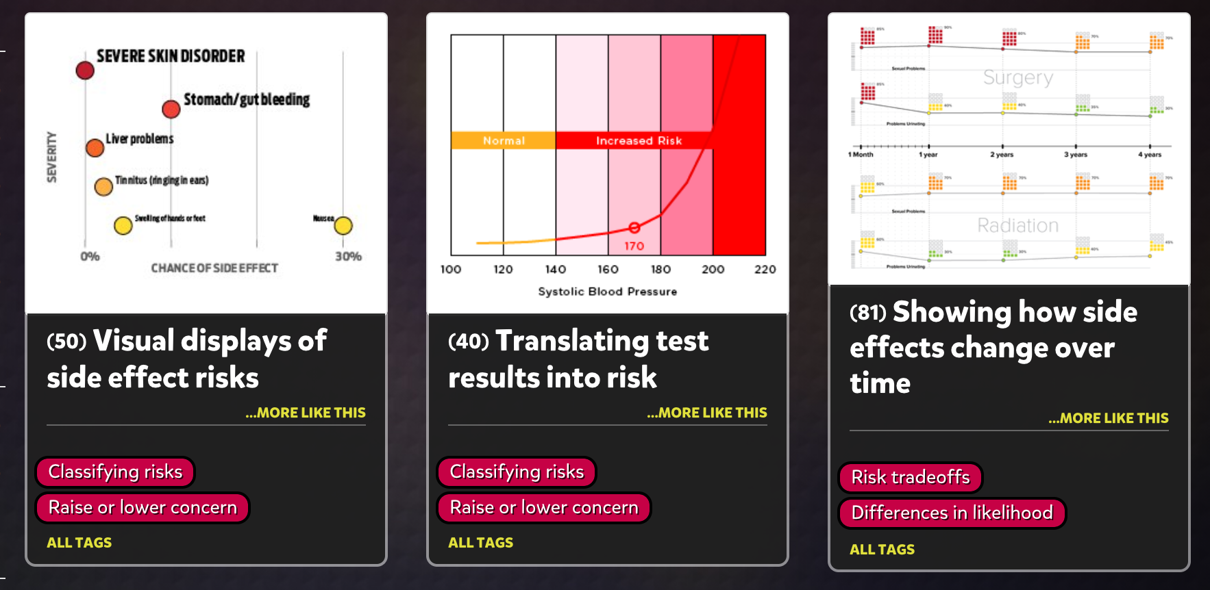
The graphs that you can choose from will look like this and when you click on them there is an option to download them. Since these graphs are so specific to some data and research that has been done, they also give you an option to look at that data that is presented in a graph form as an actual PDF document.
In conclusion, this is a gem for all health care professionals including myself. It’s amazing how there is really something out here for everything you could possibly need. This is something I will for sure be using in the future!