This site appears to be made with only good intentions. I like that the website chose not to host the public’s graphs, being they could be inaccurate and lead to a lot of disinformation. This site can be useful to help the general public have more understanding of how their personal decisions can impact their health. Many people are unaware of how they have affected their overall health through positive or negative decisions.

The site used information gained through surveys to test the effectiveness of their images.

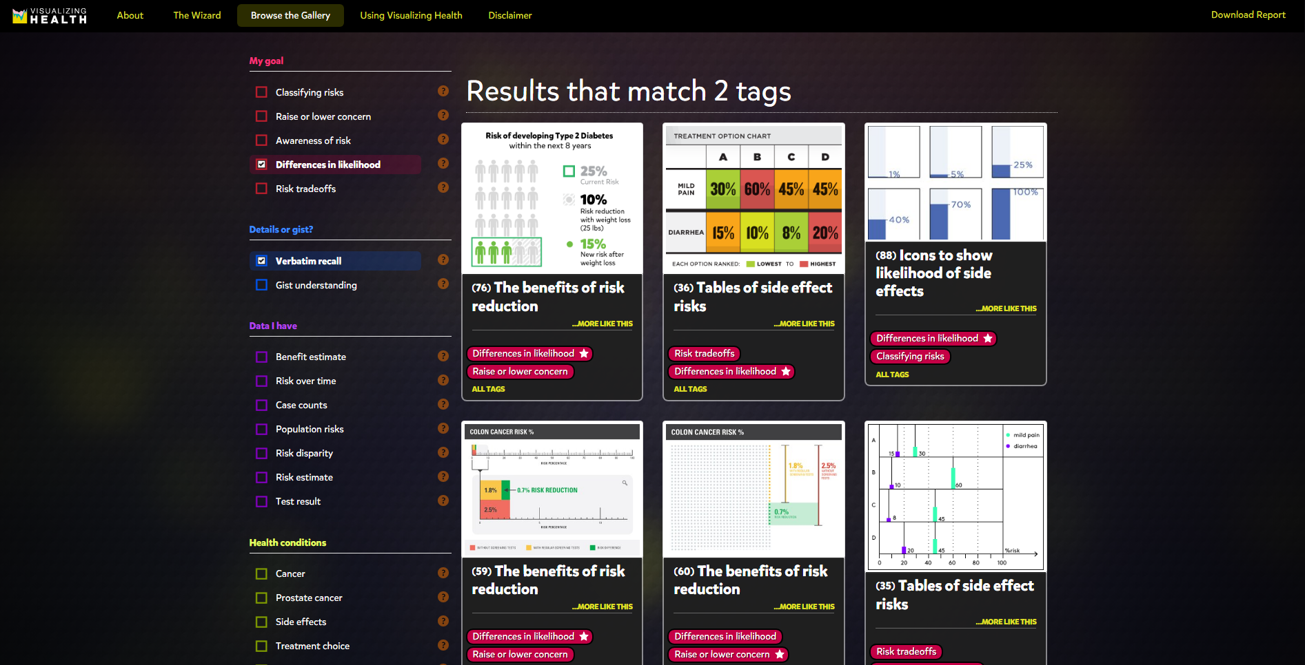
The site helps to bring risk factors to light with easily digestible infographics to choose from.
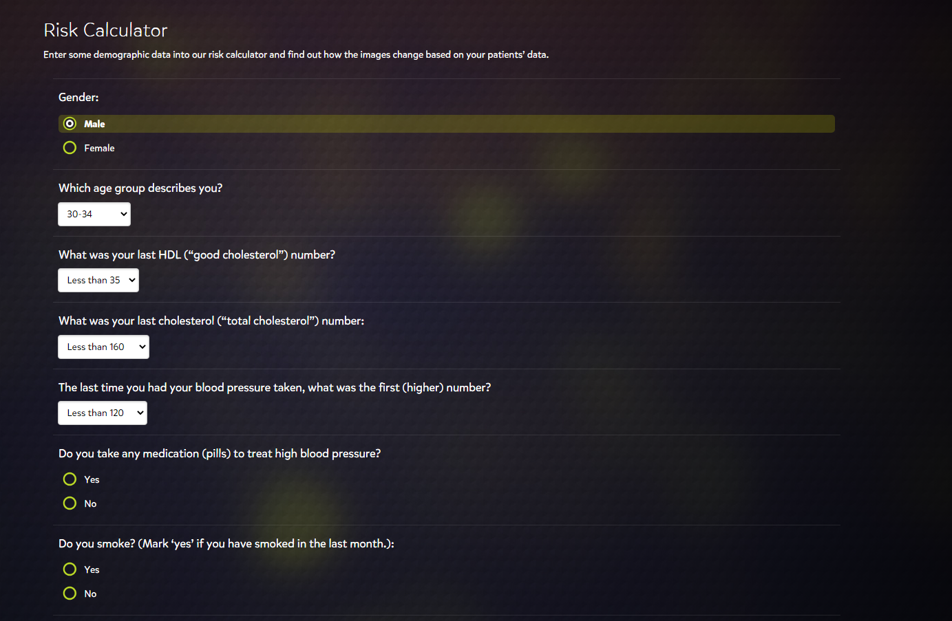
The design of the site is user-friendly. A person not well-versed in technology could easily make some digital graphics from this site. There appears to be some lack of variety in the risk calculator, however. I noticed that the risk calculator’s youngest age group option was 30-34. If we wanted to use the risk calculator for an age group younger than 30, the option would not be available.