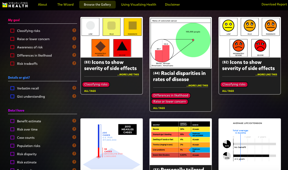
In a collaboration study with the University of Michigan Center for Health Communication and the Robert Wood Johnson Foundation, vizhealth was born! This website is an ambitious way to communicate what we need to know about our bodies in the simplest of forms. Data is what drives us to come to decisions. When we receive news about our health, those of us who don’t have medical degree’s are dumbstruck and don’t know what steps to take next. Visualize Health is your next step.
“This site contains 54 examples of tested visualizations – that is, graphic displays of health information that we’ve evaluated through research among the general public. Our objective was to create a gallery of beautiful and easy-to-make-sense-of graphs, charts, and images that effectively communicate risk information. Health data that makes sense.”
vizhealth.org
Here are some of the features from the site!
Using the ‘Wizard Tool’, you can edit the site to specify what your will help you in the most effective way. The gallery of images on the site are helpful visual aids that really help you understand your needs.
The risk calculator is very useful and shows off the newest and best designs for infographics. Combined with stories from other people, you can get a real idea of the help you need!

If you want to become a serious Infographic Designer, www.vizhealth.org is the place you should start.

One reply on “The Importance of Visualizing Health”
I think your blog post was a lovely introduction into what exactly the Viz Health website offers to its users! I do feel that it would have been a little more helpful for your audience if you had walked them through an example using the website but this was not required. The visuals you included from the website offered a great idea of what to expect when using the website yourself!