This week I had the pleasure of exploring VizHealth.org, a data visualization site for the medical field run by the University of Michigan. My initial impressions on the site were mixed at best, as I was not sure how useful a site categorizing visualizations specific to the medical field would be to other areas. I am happy to say that this impression was completely untrue and I will most likely use VizHealth as a reference for any future infographic projects.
A Brief Synopsis
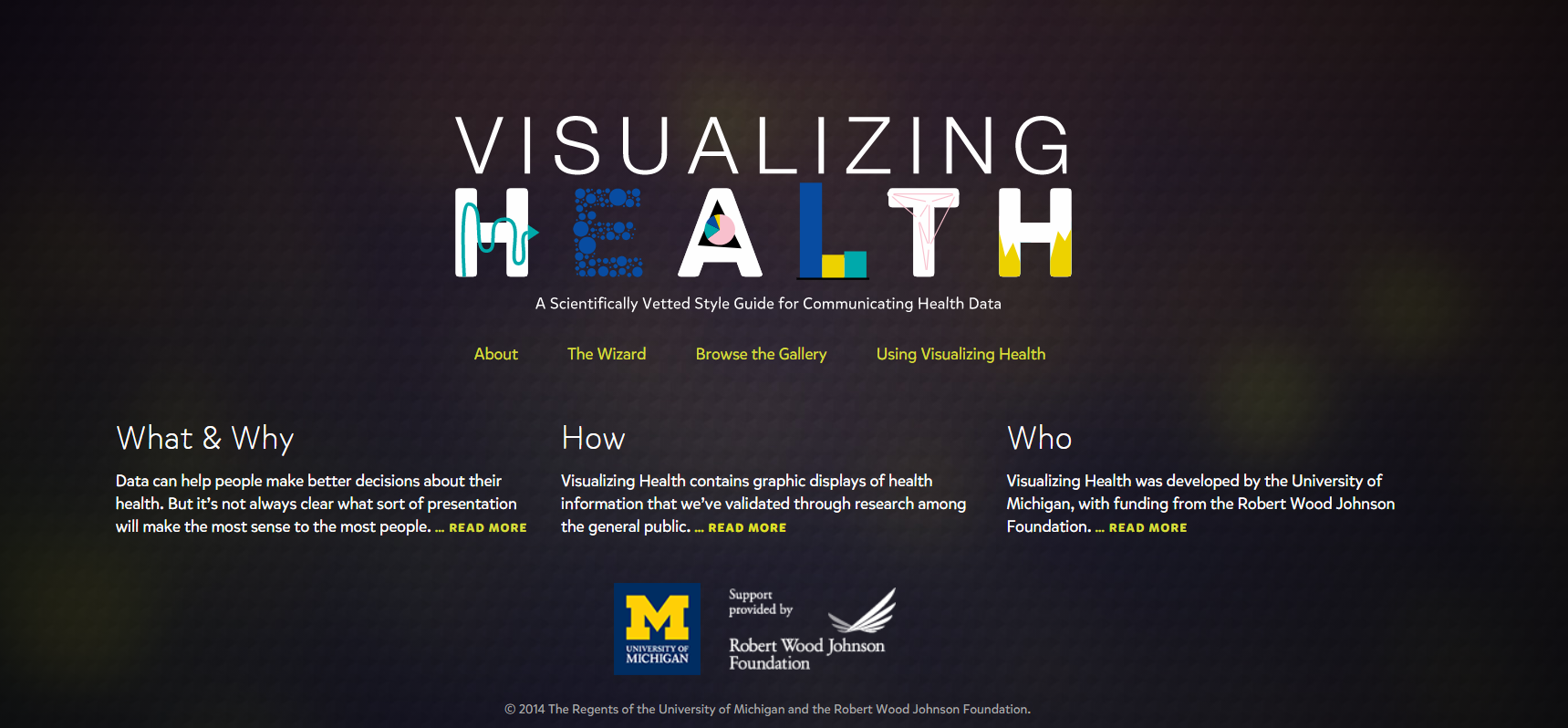
VizHealth serves as a database detailing a wide variety of infographic examples and their potential uses. The two main features of the site are its gallery of infographic examples and, more importantly, a search wizard for finding infographic designs. Given the wide range of designs and searchable tags the site presents, they thankfully provide a simple but concise guide on how to navigate the site and attribute any of designs for your own use.
The VizHealth Wizard
Serving as the main attraction of the site, the VizHealth wizard is an easy to use tool that allows you to quickly search for specific infographic designs based on a variety of criteria.
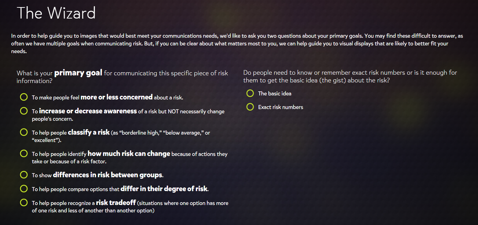
When I first viewed the wizard, I was surprised at how simplified the search criteria were. The eight primary goals were easy to understand while also being as non-specific as possible so that you could apply them other datasets that were not medical related.
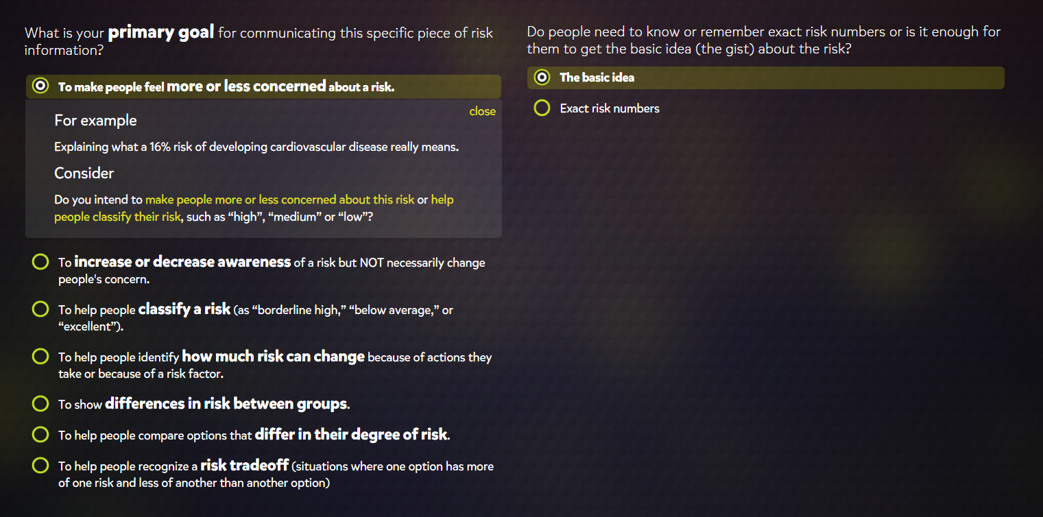
Selecting a graphic style also provided a short example of how the described graphic would be used and poses several questions that might help you confirm whether or not you choose the correct category. I found this to be a very useful addition as I had difficulty fully understanding the difference between the second and third to last options on the list. The filters for exact numbers and basic concepts were also useful features for determining graphic styles based on whether the graphic is meant for the general public or a more professional audience.
The Graphics Gallery
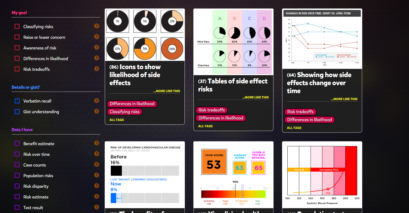
While I found the Wizard to be helpful overall if you are looking to design an infographic, I was much more interested in the actual graphics browser that accompanies it. This browser displayed about 50 different styles of graphics that all feel under the purpose categories that the Wizard describes. While there were quite a few styles that I was familiar with, there were also significant number that were new to me or that I had never really considered to be infographics.
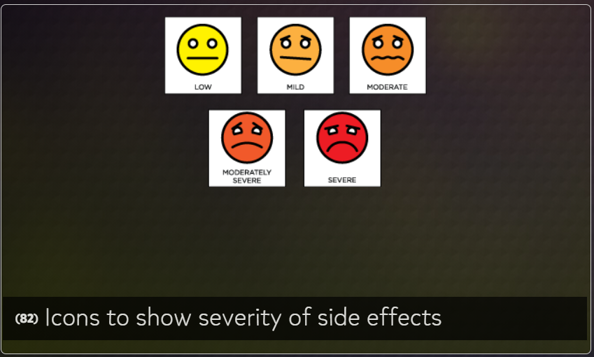
For example, we all have most likely seen this table at a doctor’s office and I had never realized it might be considered an appropriate way of displaying data. A variety of the presented graphics directly address this issue of determining if a graphic is appropriate for conveying certain types of data and the impacts they have had historically.
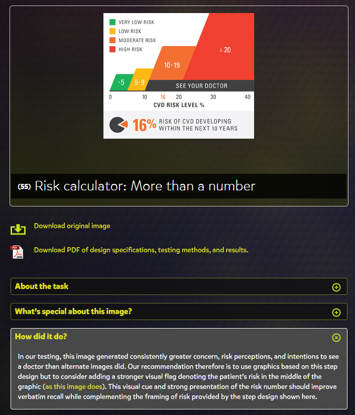
The “How did it do?” tab is the perfect addition to the site, as it allowed me to learn more about how well these different styles performed and any issues that arose from their use.
Final Thoughts
Overall, VizHealth seems to be perfect tool to get a wide-scale idea of the various styles of infographics that have been used in the past and provides fantastic information on how effective each is at their prescribed role. The Wizard is a great jumping off point for designing infographics when you are unsure of what kinds of visualizations are appropriate for your data set. I will definitely be using this site as a resource for when I have to