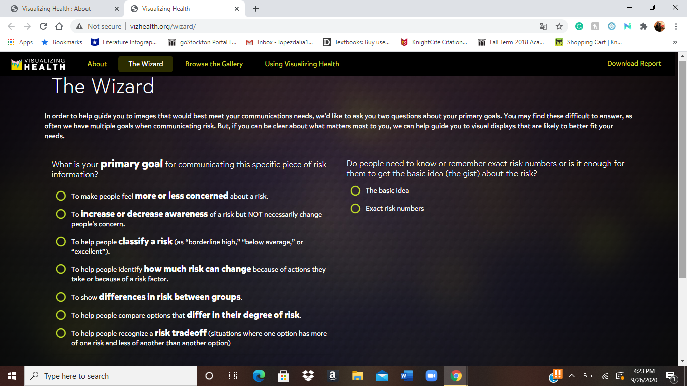
Vizhealth is a website created to help view/explain/visualize health risks and overall help us make decisions over our health. While looking through the website it takes you through steps to get to the visualization that best fits your needs. It shows you various styles of visualization according to questions they ask you (primary goal – awareness, classify risk, differences in risk between groups, degree of risk, and lastly whether the type of visualization basic idea or exact risk number). They also provide a fun comic, risk calculator, and a generator to help view population risks with icons.
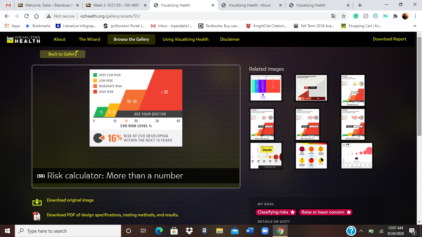
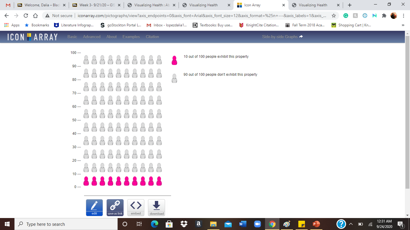
The creators of this website have a wizard tool that helps you find the right visual display for you to understand certain health information. This basically helps narrow down the display option to one that fits any need you have. For the wizard at first, I tried the options “To help people classify a risk (as”borderline high,” “below average,” or “excellent.”). and “exact risk numbers” This is one fo the visualizations that popped up for my needs. It shows you the different risk levels and then shows you where you are at. It provides the number for you and you just look for it on the risk levels. For most visuals, it gives you options to download a pdf of the design specifications, testing methods, and results. This is an example of the Generator that helps visualize risk population with icons. I typed in 10 out of 100 people exhibit this property. This highlighted the amount of people that the sentence was about. In gray was the people that didn’t exhibited the property.