Types of Infographics
Since their inception in the late 1700’s, infographics have proven themselves to be invaluable tools for neatly visualizing data and presenting it to the public at large. These early graphics mainly focused on topics relating to business, such as with the case of the first recorded infographic which related wheat prices to labor wages, or geographic information. Some examples of these graphics can be found by following this link to Atlas Obscura. As the field of data visualization has grown and infographics have become more complex, encompassing a much wider variety of topics, several infographic archetypes have been created.
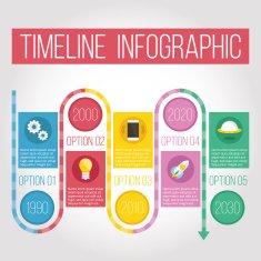
- The Timeline
2. Data Visualizations

3. The Comparison

4. The Geographic

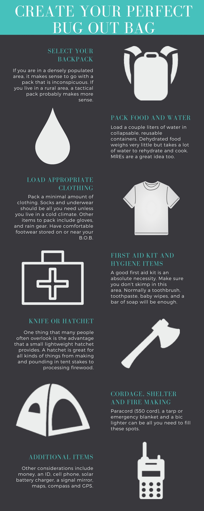
5. The List/Visualized Article
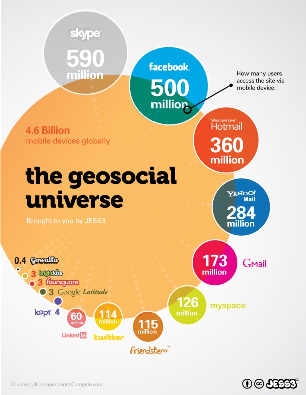
6. The Statistical
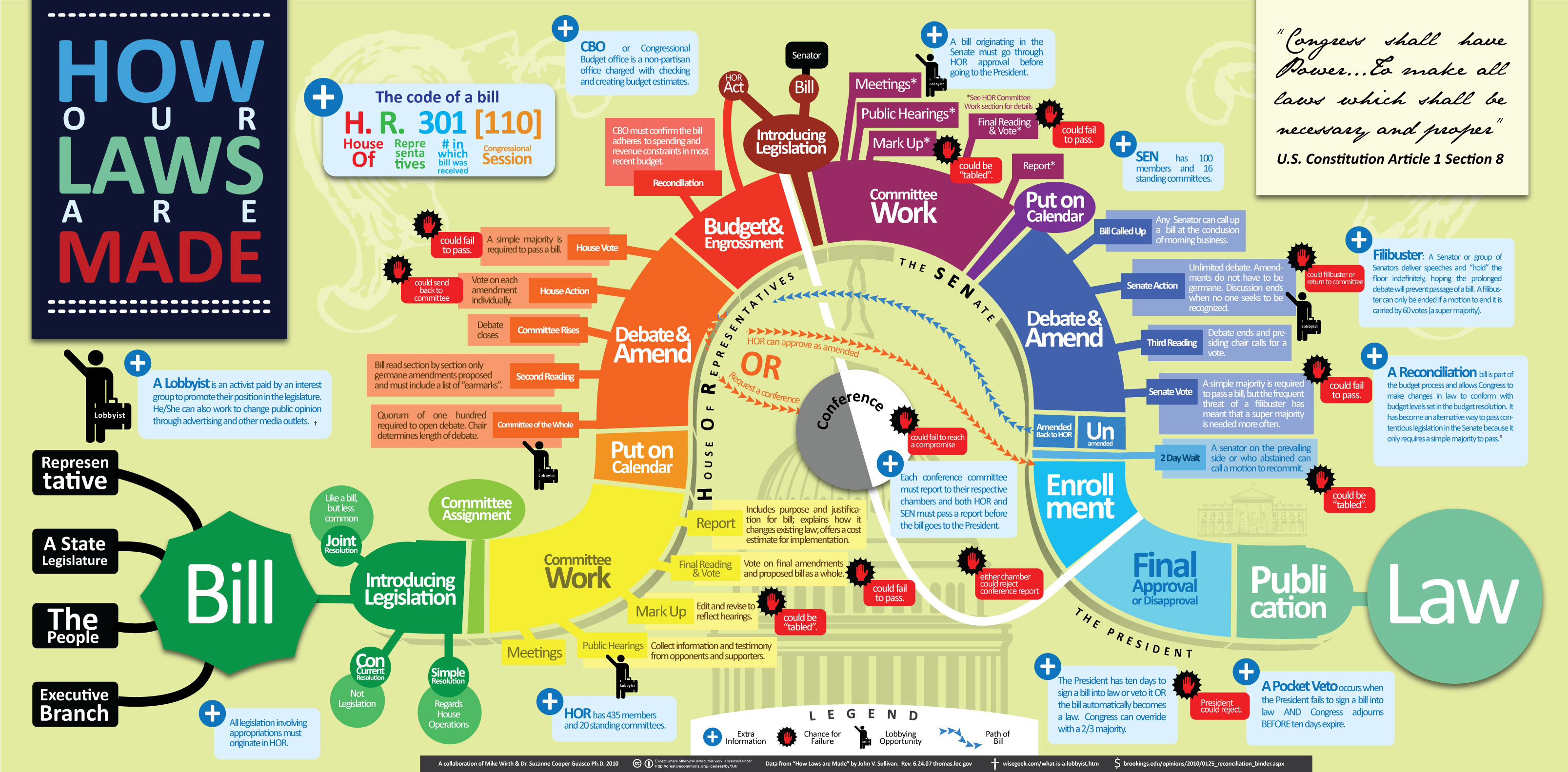
7. The Process
Tools to Help Create Infographics
Creating organized and eye-catching infographics from scratch can be a difficult task. For this reason, I have put together a list of sites and resources that make creating infographics a breeze.
- Canva.com – allows limited creation of infographics with a free account
- Easely.ly – alternative to Canva and also free
- Venngage.com – similar to Canva and Easely, but with a more limited scope for free student accounts
- Adobe Spark – Spark allows full access to college students and provides a wide range of graphic styles and tools
These are just a few examples out there that greatly simplify the process of creating infographics. There are other sites that offer similar services, but these are usually limited in scope with a free account. In terms of generating simple charts and other quick data visualizations, Microsoft Excel and Google Sheets are the best choices available to you.
Interesting Data Sets
I am a Sustainability major who is concentrating in Energy, so I am very interested in all things related to energy efficiency and generation. I managed to pull together a few different sets of data relevant to the field of Sustainability which you can find below.
One reply on “Infographics and Data Visualization”
Hey, I appreciate your post because you went out of your way to present types of infographics, tools to help create them, and data sets that can be used to create infographics. I believe we could have just chosen one bullet point to do but you presented us with more. The photos you provided for the types of infographics would help people understand the type of infographic better because they’re getting the written explanation but also a visual. I also enjoyed how you researched the data sets, with a topic of your interest in energy efficiency and generation. It probably made your assignment easier and more interesting to do.