Categories
Uncategorized

Visiualising Health Data

Haneef Abdul-Jabbaar

Blog Post 3

This website and the way it works came at a very interesting time. My dad is currently going through health complications and frequently complains about the feedback that doctors give people such as him. It is not intuitive, to my dad, and many other people. He would have to go to another doctor in order to hear another explanation. Which, realistically, should never have to happen. Especially when health care isn’t always free.  And it’s not necessarily anyone’s fault.

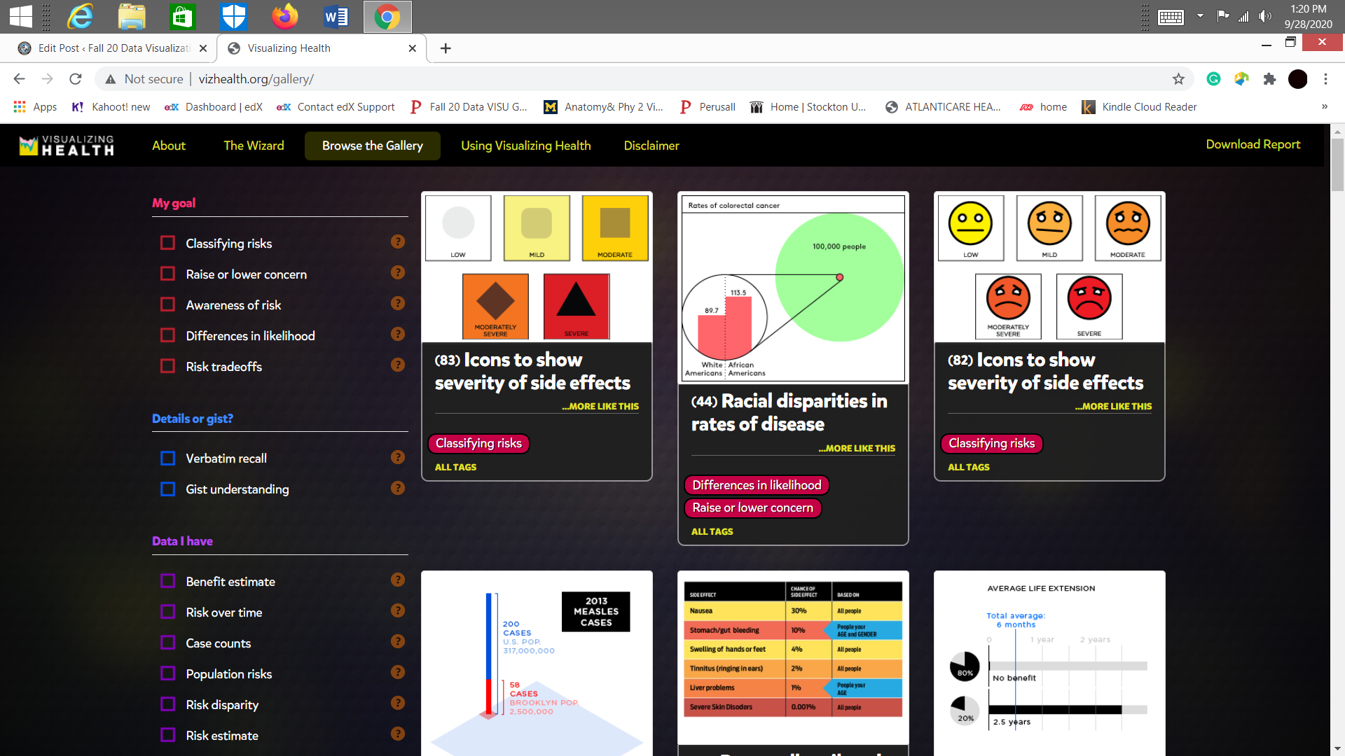
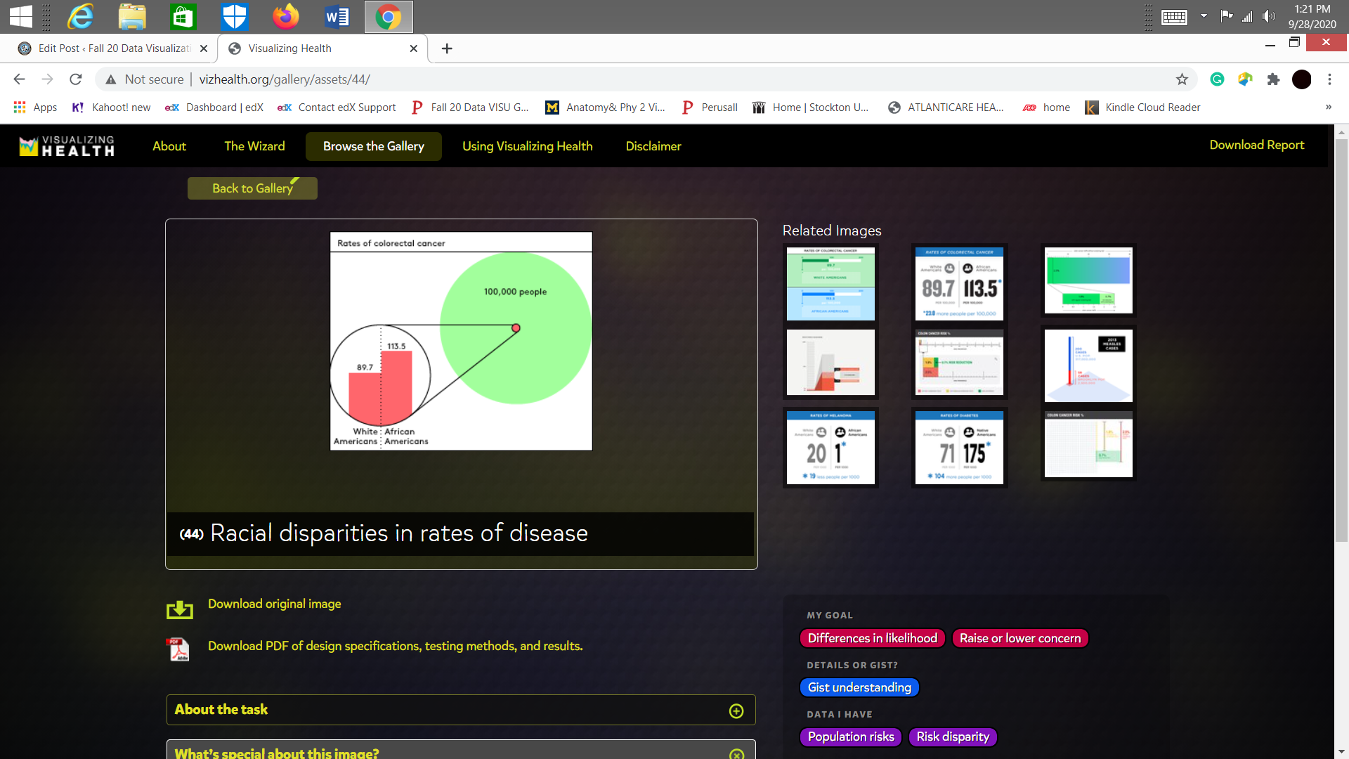
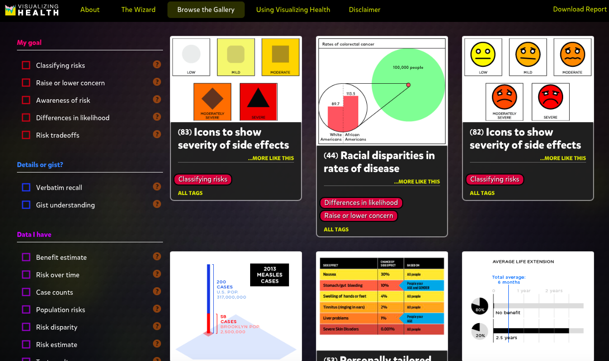
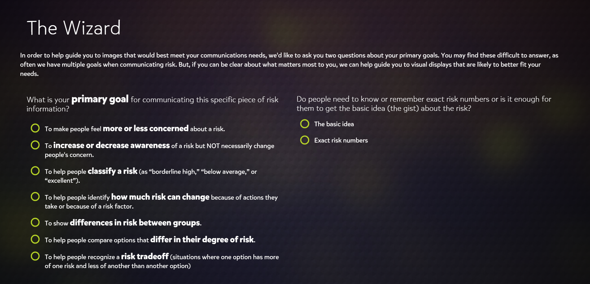
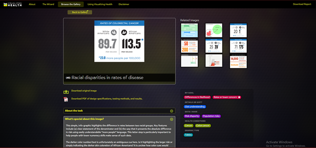
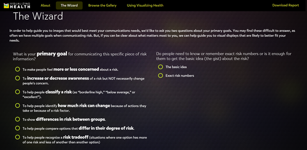
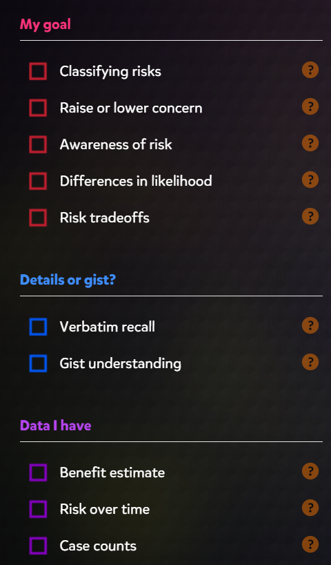
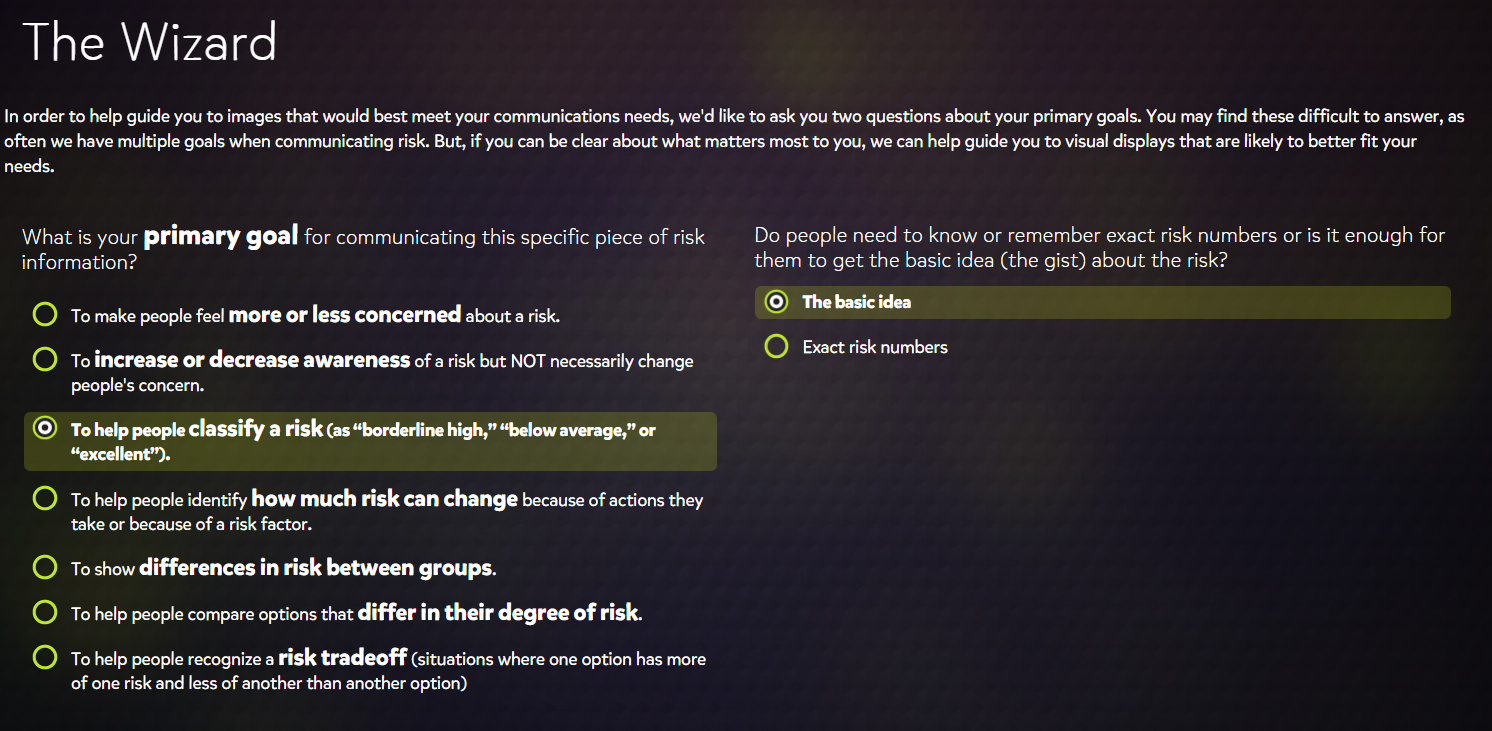
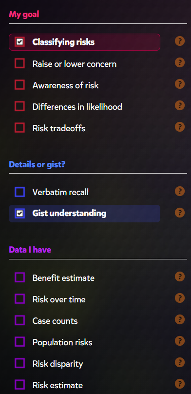
Instantly, someone like me looks for verbatim data, and where the concern should be so I appreciated the tiny quiz. I personally fail to see the benefits in “gist understandings.” Perhaps if you legitimately do not care about your health, but I’m not sure.

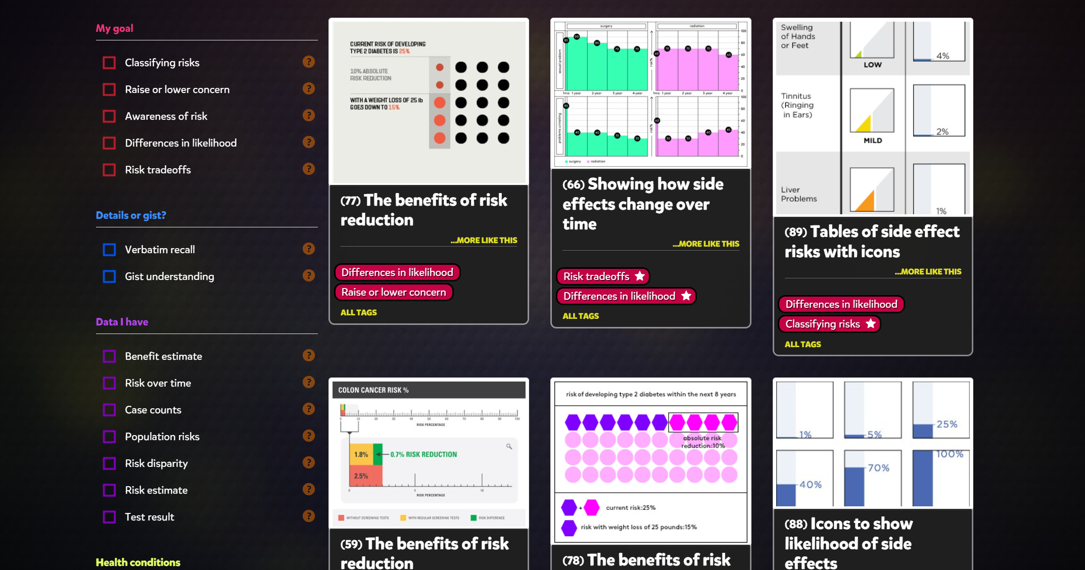
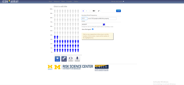
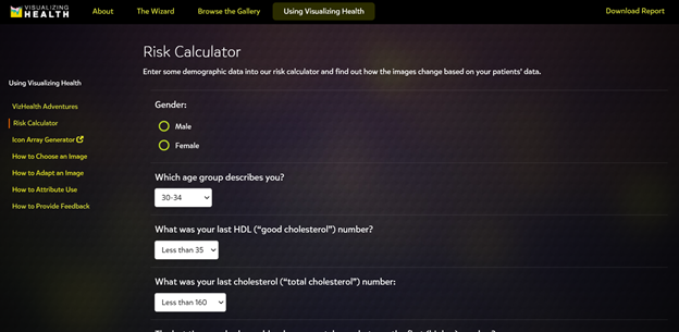
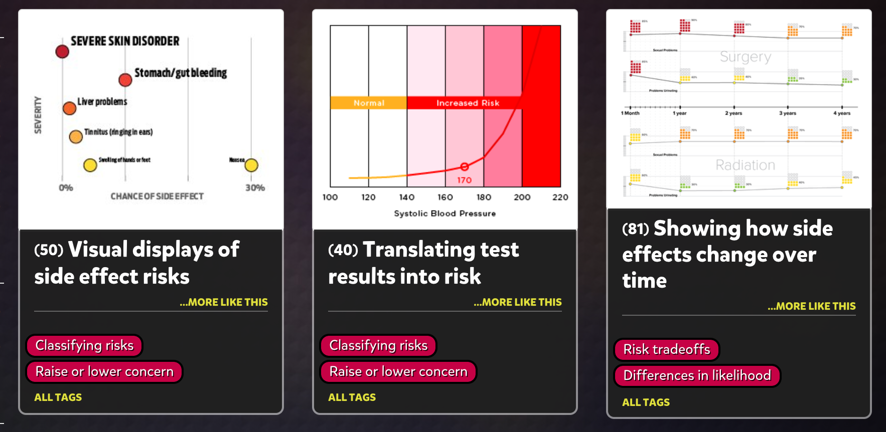
The Risk calculators are, without a doubt, my favourite part, and finding intuitive ways to share calculated figures and a beneficial way is a goal of mine. There were a few boring graphs.There is always some difficulty with displaying very small or large numbers, but imagination is key. 

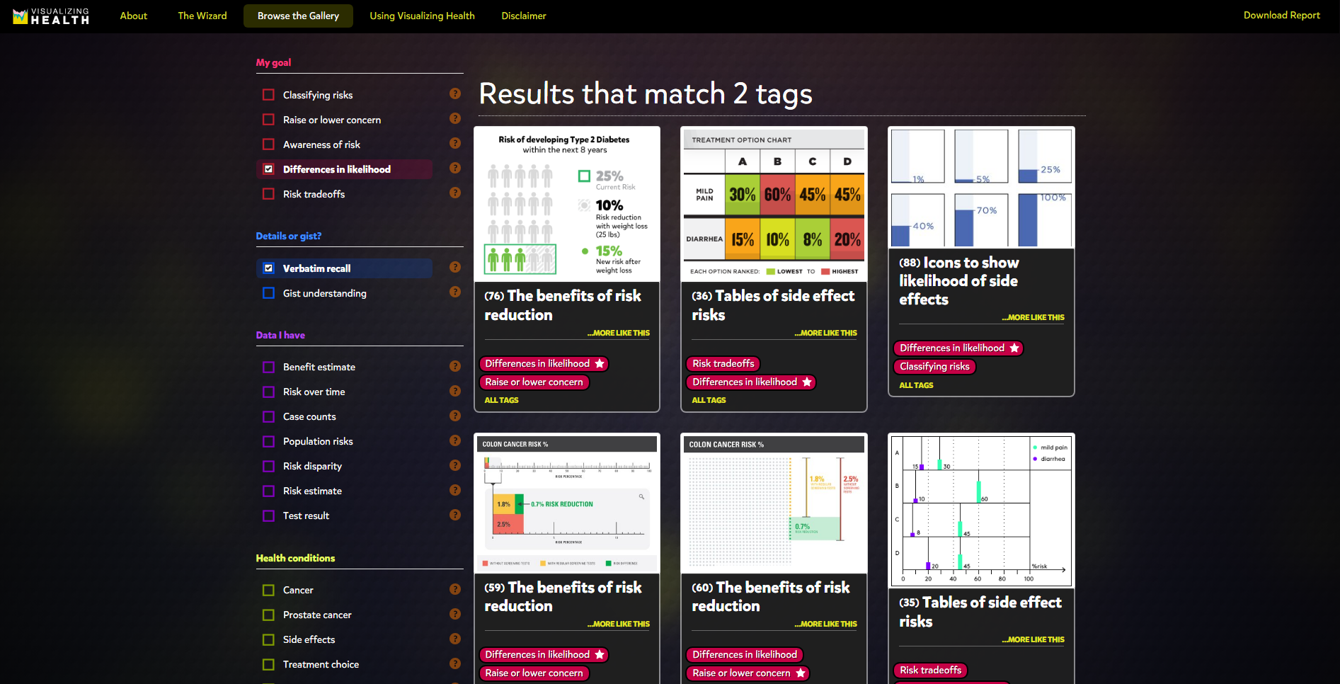
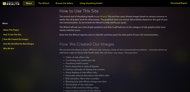
There should always be a balance of visual data and practical knowledge, but In general, seeing more stuff like this may lead to some benefit.  

Categories
Uncategorized

Visualizing Health

By Thamina Akther

The first thing that stood out the most after visiting the site and watching the video is the visualizing color and the color coordination of the site. As you can see below, the theme color of the site is very dark, almost pitch black, however, the main topics are highlighted in neon colors. Which is extremely helpful for individuals with astigmatism and light sensitivity like myself.

Visualizing health is a scientifically style guide for communicating health data. The homepage of the site contains about four different sections, the about section, the wizards section, browse the gallery section and using visualizing health section .Hence, first and foremost, I visited the ” About” section, in order to learn the purpose of the website. There I was able to watch a video called ” About This Project”, which elaborated on what the project is about and it’s purpose.

According to my understanding the purpose of this website is help individuals learn the right information, along with images for better understanding. Visualizing health also contains a sample risk calculator with design concepts.

Furthermore, after reading the ” About” section, I switched to the ” Wizard” section, where I had to answer some questions in regards to what my primary goal is to learn about the risk factors. In the same page, I was also able to choose whether I wanted to the basic ideas for the risk factors or the exact numbers. In my opinion, these questionnaires are very helpful for first time visitors of the site and also for individuals like myself, who just wants to know what this site is about.

Ultimately, I switched to the gallery section. Which happened to be my favorite section out of the four due to the amount of info graphics and easy to understand information’s. These infographics not only contained primary information but also went in depth about health disparities between different age group, racial disparities in rates of disease, side effects, etc.

In conclusion, my experience with this site has been great so far. I even bookmarked it, as I am curious to learn about about these matters and also about the site. Would recommend as a great tool for health informatics and infographics.

Categories
Uncategorized

Visualizing Health

About the Project Page, detailing the what and why.

I personally found the first page of the website a little bothersome, mostly due to the speed at which all of the available widgets appeared. I thought it was kind of annoying to have to wait for everything to load and then load again. Seemed counterproductive for someone trying to do research.

All of the gallery images on this site are available for widespread use through a creative commons license. You are free to duplicate, adapt, and modify the images as you see fit—we just ask that you abide by the Creative Commons Attribution terms.

vizhealth.org

Categories
Uncategorized

The Importance of Visualizing Health

In a collaboration study with the University of Michigan Center for Health Communication and the Robert Wood Johnson Foundation, vizhealth was born! This website is an ambitious way to communicate what we need to know about our bodies in the simplest of forms. Data is what drives us to come to decisions. When we receive news about our health, those of us who don’t have medical degree’s are dumbstruck and don’t know what steps to take next. Visualize Health is your next step.

“This site contains 54 examples of tested visualizations – that is, graphic displays of health information that we’ve evaluated through research among the general public. Our objective was to create a gallery of beautiful and easy-to-make-sense-of graphs, charts, and images that effectively communicate risk information. Health data that makes sense.”

vizhealth.org

Here are some of the features from the site!

Using the ‘Wizard Tool’, you can edit the site to specify what your will help you in the most effective way. The gallery of images on the site are helpful visual aids that really help you understand your needs.

The risk calculator is very useful and shows off the newest and best designs for infographics. Combined with stories from other people, you can get a real idea of the help you need!

If you want to become a serious Infographic Designer, www.vizhealth.org is the place you should start.

Categories
Uncategorized

Exploring Viz Health.

Visualizing health is a website that contains graphic displays of health information that they’ve validated through research among the general public. Visualizing Health was developed by the University of Michigan, with funding from the Robert Wood Johnson Foundation. This website states that data can help people make better decisions about their health. There is a “wizard tool,” a gallery of images, a sample risk calculator, and a real world story. This site contains 54 examples of tested visualizations. The goal of this site was to beautifully display health information.

The Wizard Tool/ Gallery

This tool is designed to help you learn how to find the right type of display to fit your needs. The wizard asks you to choose the information you would like to know more about. I selected my options and the wizard provided me with some data. The picture below is what The Wizard looks like. The second picture shows the data visualizations that came up, which is called “The Gallery”. There are many different options and ways that data is displayed. You are able to choose which way you would like the data presented to you. The wizard will show you the same data many different ways. This is very helpful.

Conclusion

Overall, I think that the Visualizing health website is very beneficial when learning about data visualization. There is a lot of information to view on this website. You can view data 54 different ways, which is extremely helpful.

Categories
data visualizations Visualization Tools

Visualizing Health

VizHealth is a collaborative project developed by the University of Michigan and the Robert Johnson Wood Foundation. This tool allows users to choose from 54 original data visualizations which have been tested through research amongst the general public. Utilizing The Wizard tool allows users to figure out what the primary goal for communicating the risk is and whether their audience needs to understand the basic idea or to remember exact risk numbers.

Figure 1. The Wizard tool from Visualizing Health.

Based on the answer to these two questions, the tool will display graphics that best match your needs. These images can then be modified to fit your own data. You can also browse through the gallery according to specific tags to find the most effective visualization for you. This is a great tool that can be used by anyone from students to professionals as these graphics have already been tested and proven effective to convey information to the general public. There is also an external link to an Icon Array Generator provided by the University of Michigan Risk Science Center that users can utilize to create their own custom images.   

Figure 2. Gallery of 54 graphics that can be downloaded from Visualizing Health. Results shown for raise or lower concern and gist understanding tags.
Figure 3. Racial disparities in rates of disease visualization from Visualizing Health. Users can choose to download the original image or view the PDF file detailing design specs, testing methods and results for that specific image.


Fig. 4 External link to Icon Array Generator from the University of Michigan Risk Science Center.

Categories
data visualizations

Visualizing Health

This site appears to be made with only good intentions. I like that the website chose not to host the public’s graphs, being they could be inaccurate and lead to a lot of disinformation. This site can be useful to help the general public have more understanding of how their personal decisions can impact their health. Many people are unaware of how they have affected their overall health through positive or negative decisions.

Here we can see that anyone can use these graphs, and the creators would like to know how we’re using them. It is made clear that completed graphs are to be used for the users’ own objectives, and not for the website’s.

The site used information gained through surveys to test the effectiveness of their images.

3 tools were used to test the effectiveness of their images. This shows that the makers of this site are serious about getting the best possible images out to the public.

The site helps to bring risk factors to light with easily digestible infographics to choose from.

The user is able to choose options from the panel to make it easier to find a template.

The design of the site is user-friendly. A person not well-versed in technology could easily make some digital graphics from this site. There appears to be some lack of variety in the risk calculator, however. I noticed that the risk calculator’s youngest age group option was 30-34. If we wanted to use the risk calculator for an age group younger than 30, the option would not be available.

These are not all the risk factors to take into account for a patient, but it is a decent general overview to start with for plotting data.
Categories
data visualizations Visualization Tools

Visualizing Health

September 27th 2020 by Erika Kacprykowski


The Visualizing Health Website is a great tool to use as it is very easy to navigate. This website allows you to create infographics regarding health as well as a way to learn information about their health. There are four sections: About, The Wizard, Browse the Gallery, and Using Visualizing Health.

How We Created Our Images, About

The About page is an introduction to the site. This section explains how to use Visualizing Health, some background to how they created their images, as well as who they are. I found this to be a great tool because it is important to understand where the information is coming from and if they are a reliable tool to use.

The Wizard

The second section of this website is The Wizard which allows you to search for specific infographic designs based on two questions. These include your primary goals and whether you want it to be general or specific. Once you select a goal, they even give you an example as well as a point to consider. This feature truly helps you understand the difference between the various goals and allows you to make the best choice in order to fit your own individual needs.

Screenshot of Browse the Gallery section

The gallery contains hundreds of charts and graphs based on your goals, wants, and needs. On the left hand side, you have the ability to filter your searches through there. These options include “My goal”, “Details or gist”, “Data I have”, “Health conditions”, and “Graphic type”. This section displays many different styles of graphics according on your own specific goals.

Using Visualizing Health, Risk Calculator

The last section of the website is a how-to page. There are options on the left side (see picture above) which explain how to select the correct image and how to adapt that image as well. This is a great addition for those who are beginners and would like some more help.

Conclusion

This is a great tool for any and all health professionals, including myself. The ability to filter and sort through hundreds of data visualizations is super helpful. It is amazing that there is now a site geared more towards a specific audience. There is a ton of information out there on the internet and it can be difficult to navigate. Visualizing Health seems like a great site I can see myself using.

Categories
Uncategorized Visualization Tools

Visualizing Health

Homepage of VizHealth.org

When I first opened Visualizing Health homepage, I noticed the title graphic and the yellow text. The title isn’t overall complicated and easy to read. Looking closer, I realized that all the yellow text are links to other pages of the site, licenses, and emails. All are clickable links that a person can use to get information from and help recognize what they can click on.

Screenshot of video

Finding information about the project was very easy and they even added a video that helps explain their goals, how they put the wizard together and how was involved with the project.

The Wizard

The wizard was, to me, fun to use. It started out with 2 two questions, what is your primary goal of the infographic and how specific you want it to be. This is great because it help narrow down your choices and makes jumping into making an infographic less overwhelming. Starting small and specific is best and then you can always work up.

First page of the wizard

It then brought you to the gallery with samples of graphic based on the specifications that you chose. On the right hand side (screenshot on left) shows a menu with the same parameters that you were giving at first, with yours selected. Below your first options are more specific sections you can chose to help narrow down the type of graphic you need. It can help cater to the type of data you are working with, rather than have a general graphic. You can also select the type of graph you wanted, whether it was a bar graph, table, icon, or pie chart, etc. Using the Wizard was really straight forward and easy to navigate.

Menu for finding graphic

The site also gives tips on how to create icons, use images, and assess risks for the infographic. This site seems especially helpful to people in a medical field or people/companies that want to spread awareness about diseases or other health risks.

Categories
Uncategorized

VizHealth

I would just like to say that the Visualizing Health Website is a dream come true for all Hospital Marketing departments. This site is very easy to navigate because they made the tabs really simple to understand.

There are four tabs: the about section which is basically the history of the website and their purpose, the Wizard which separated into two main questions, what is the primary goal and whether you want it to be a general idea or specific.

The next part if the gallery that has hundreds of charts and graphs about almost everything health related that one could think of.

The left side of the page is separated into sections and you can filter your searches through there. You can choose what you want you goal to be and what data you want to present. Then towards the end of the filters there is an option to choose what graph time you. This is great because not all graphs fit the needs of your audience and not all of them have the same effect.

The last part of the site is basically a how to page. It explains how to pick the correct image to fit your needs and how to adapt the image when you pick the one to that is the best for you.

The graphs that you can choose from will look like this and when you click on them there is an option to download them. Since these graphs are so specific to some data and research that has been done, they also give you an option to look at that data that is presented in a graph form as an actual PDF document.

In conclusion, this is a gem for all health care professionals including myself. It’s amazing how there is really something out here for everything you could possibly need. This is something I will for sure be using in the future!