Health Visualizations
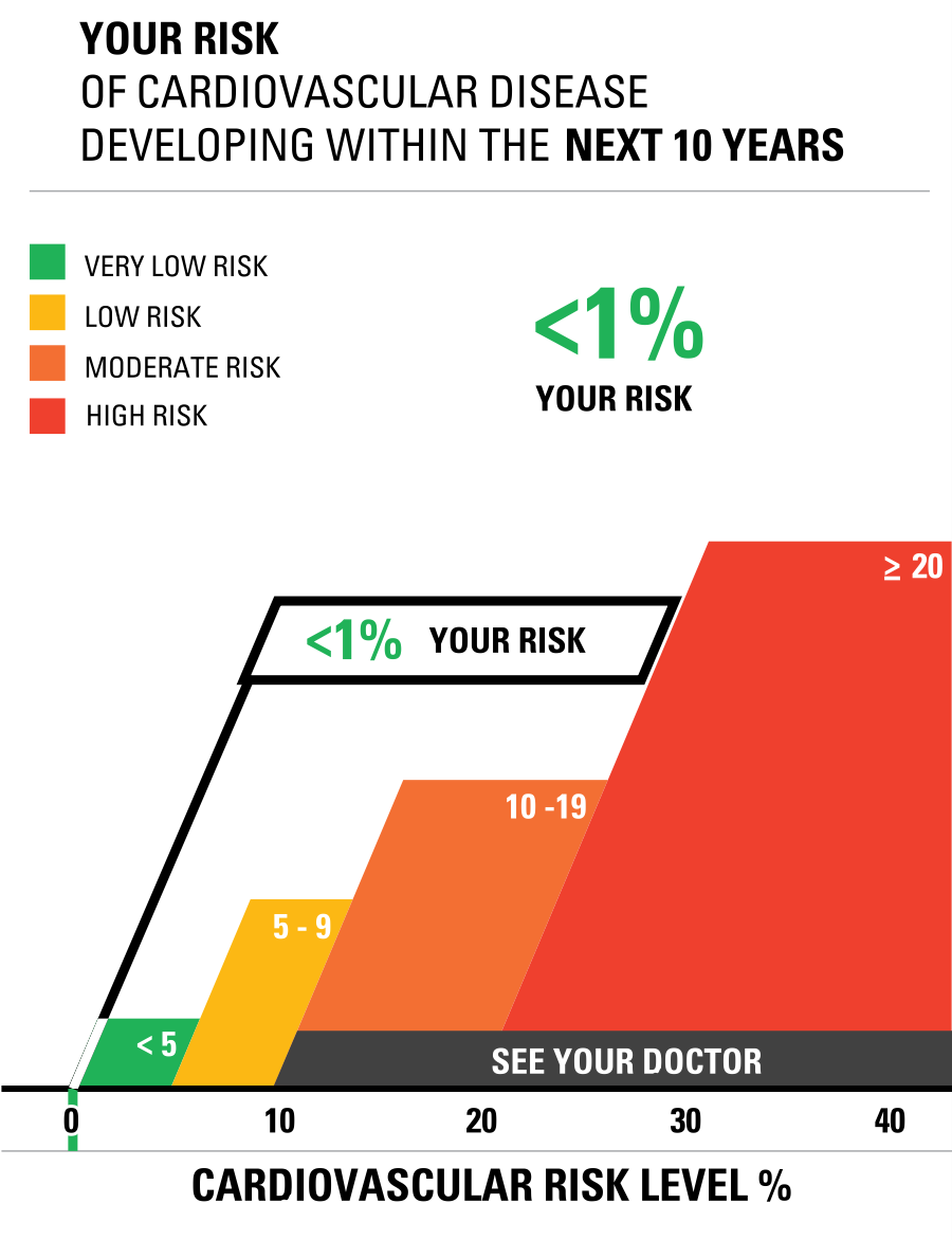
This was my first time visiting a site like ” Health Visualizations”. I really thought the creators used a great color popping technique and did not overcrowd the site. They made it organized and easy to articulate through to find the different links provided. For example, the Risk calculator tab was easy to find and actually located right in the center as you scroll down with an image / visualization clearly stating “cardiovascular risk” and a photo of a graph that calculates someone’s risks. I plugged in my actual data and got a <1% and then I played around with some numbers and doubled my weight and even added in that I had diabetes and really thought the risk calculation would change greatly. BUT IT DID NOT! It actually only rose from 1% to 2% in risk of cardiovascular disease. This was interesting information to see in actual recorded data.
Next, I clicked on the Icon Generator link and plugged in some data. I changed the title to “Diabetes Outcome”. I have a few family members, and even a friend whose daughter has Type I diabetes and has been living with it sine age 1 (now 6) y/o). So, it is a topic that interests me in knowing more about it with Health. I changed the color scheme of icons to something less harsh in my opinion to the eye and less crowded with the number of icons in the array. Here is what my icon generator looks like.
Overall, I found the website “Health Visualizations” helpful and easy to manage through. I know they mentioned this site was only a start and encouraged others to build off of this platform, but I think they really did a great job on explaining uncomfortable and unfamiliar terms in the health field to the viewer.
Clear Visuals = Clear messages

Infographics offer a visually appealing and easily understandable format. Make sure to not over clutter your infographics. Make sure to stay on topic when choosing the infographics that best aids you. And make sure to leave your audience thinking about what you told them. Data can be boring, Data can be overwhelming, and trying to communicate through words can be difficult for some. But pictures can say 1000 words.
CLEAR IMAGES:

FUNNY MEMORABLE IMAGES:
CONCISE AND EASY TO FOLLOW:
Insightful Infographics follow three main aspects…. clear image, concise and easy to follow…memorable imagery. Follow these guidelines and you will have insightful infographics and an insightful presentation for your audience.
Iveta Pavlova, made a wonderful post in 2022 showing 28… that’s right 28 examples of insightful infographics to use for displaying information/topics. https://reallygooddesigns.com/infographic-examples/


Podcast: Play in new window | Download