Home » 2024 (Page 3)
Yearly Archives: 2024
Clear Visuals = Clear messages
Infographics offer a visually appealing and easily understandable format. Make sure to not over clutter your infographics. Make sure to stay on topic when choosing the infographics that best aids you. And make sure to leave your audience thinking about what you told them. Data can be boring, Data can be overwhelming, and trying to communicate through words can be difficult for some. But pictures can say 1000 words.
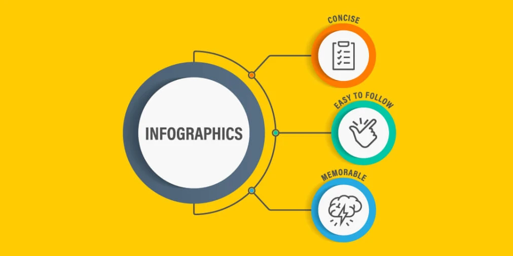
CLEAR IMAGES:

FUNNY MEMORABLE IMAGES:
CONCISE AND EASY TO FOLLOW:
Insightful Infographics follow three main aspects…. clear image, concise and easy to follow…memorable imagery. Follow these guidelines and you will have insightful infographics and an insightful presentation for your audience.
Iveta Pavlova, made a wonderful post in 2022 showing 28… that’s right 28 examples of insightful infographics to use for displaying information/topics. https://reallygooddesigns.com/infographic-examples/


Podcast: Play in new window | Download
Example Datasets for Infographics
Lamar Miller
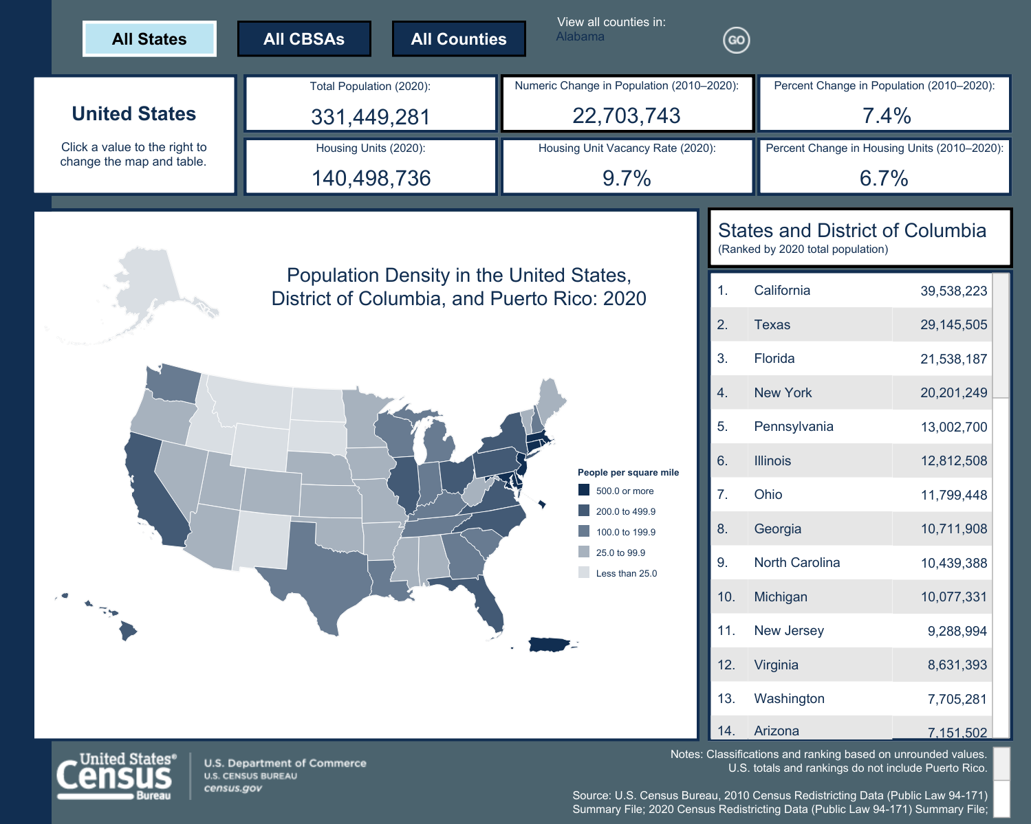
This is an example of a Census Bureau infographic depicting population density. Attached here you will find a link to redistricting datasets that were used to assist in building this graphic. Datasets like this one are used by government agencies and private firms to build insightful and factual infographics. The destination URL provided below will redirect to an interactive version of this graphic. Tableau offers tools that students can use to create interactive infographics. Graphic.
Infographics

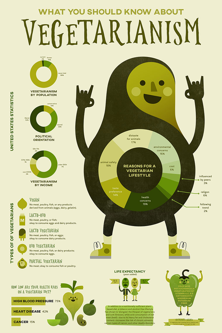
This is an example of an insightful infographic. This infographic is for if you get into an accident and you don’t know where to start. These help people in Panic mode, but also people who do not speak the languages in your country. It is also for people who can’t see very well or read well. These pictures are to help a person understand what they are trying to say without saying anything at all. You can find this and more examples of insightful infographics here.
Infographics
Tae Hee Lee

My infographics for my work
Tools to Help Construct Infographics
Infographics turn data into an appealing visual that is easily comprehendible. It has become an increasingly popular tool in presenting data. Here are a few online tools to construct a good infographic.
Canva
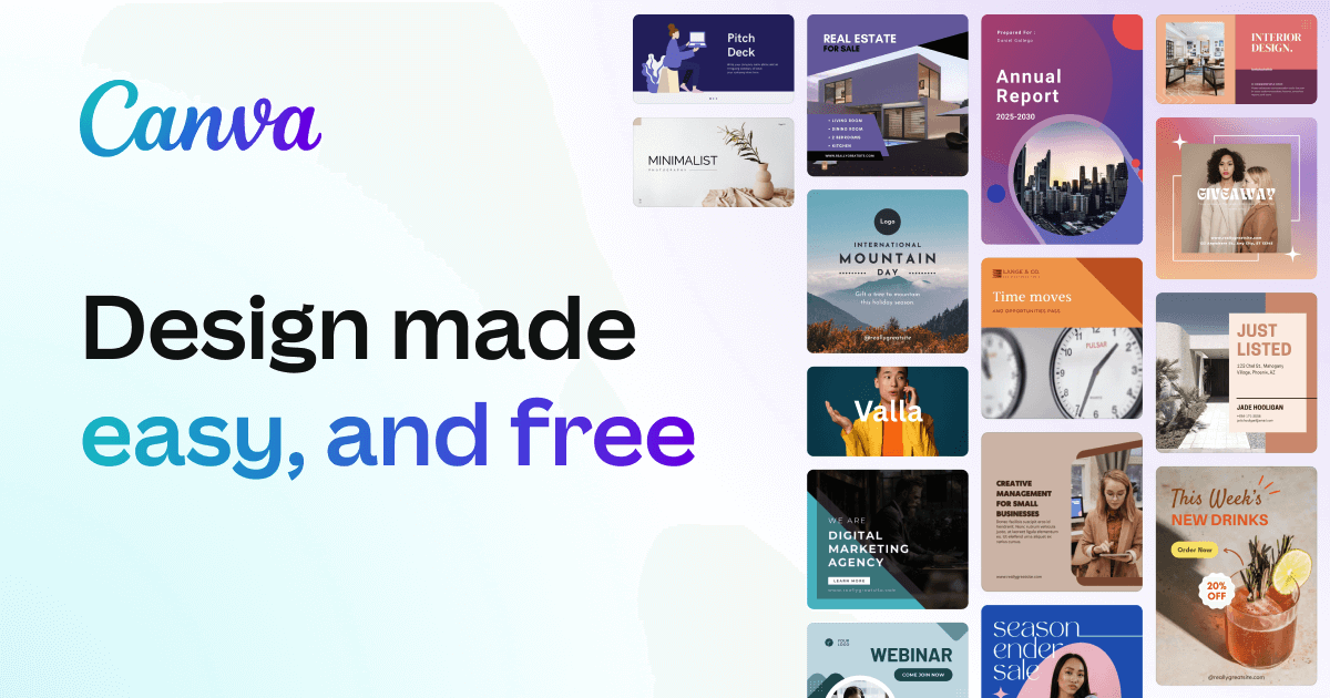
Canva is a free and easy-to-use design tool. It has an infographic creator where users can choose from hundreds of templates. Each template has many options to add information and customize your own visual. They offer millions of stock photos or you can upload your own. Along with infographics, Canva offers tools to create presentations, logos, videos, business cards, brochures, flyers, and many more.
Piktochart

Piktochart is another great tool for creating infographics. The basic plan is free, and they offer a premium plan that starts at $14 per month. It is a great way to turn complex data into a clear data visualization. They have a gallery of over 230 unique infographic templates to choose from. From charts, graphs, interactive maps, and many more. You are also able to create custom color palettes as well as upload fonts into the editor.
Visme

Visme is a platform for creating infographics, presentations, branded documents, data visualizations, videos, and more. It is an easy and effective way to get data across. Users can choose from an array of templates and mix and match designed content blocks to customize their results. There are thousands of templates and over a million stock photos to choose from. The basic membership is free, and they also offer a premium plan starting at $12.25 per month.
Podcast: Play in new window | Download
How to make ‘How-to’ Infographics!
Infographics are incredibly useful tools for disseminating information. Whether you are trying to visualize statistical information, creating a fact-orientated infographic, or something geographical (such as a map), an infographic can be made to cater to your needs!
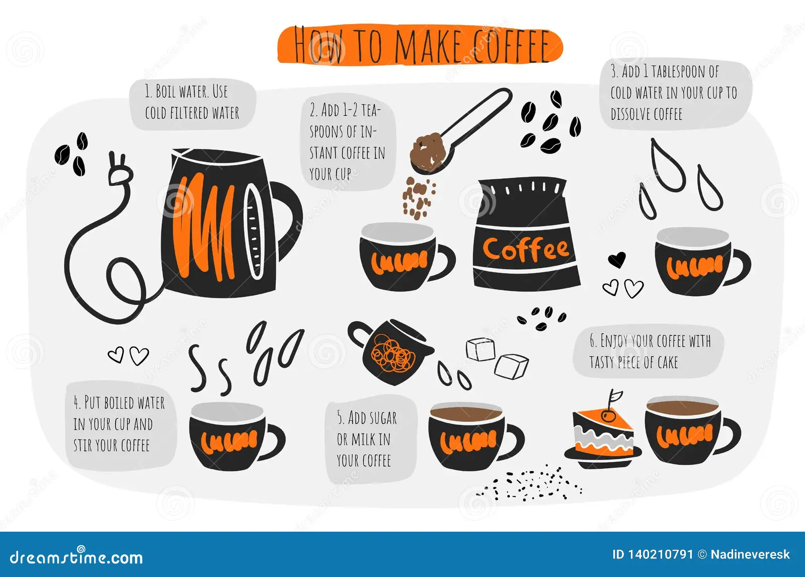
In my infographic, I will be demonstrating how you can make an infographic to visualize a set of instructions to be used for day-to-day processes, such as making a cup of coffee!
This simplistic, yet artistic infographic, it clearly demonstrates the step-by-step process that goes into making a cup of coffee. By using eye-grabbing colors, the artist can maintain the reader’s attention on the infographic, helping the reader to understand their point better.
This form of infographic relies more on the visual effect appealing to the reader, in order to get the author’s/artist’s point across. This infographic is more informative about what measures should be in place when making a cup of coffee. This is slightly different compared to the last one, where you only get the basic amount of information, but it takes you each step to making the final product. Whereas this infographic, assumes you know how to make a cup of coffee, and gives rules on how to hone the final product.
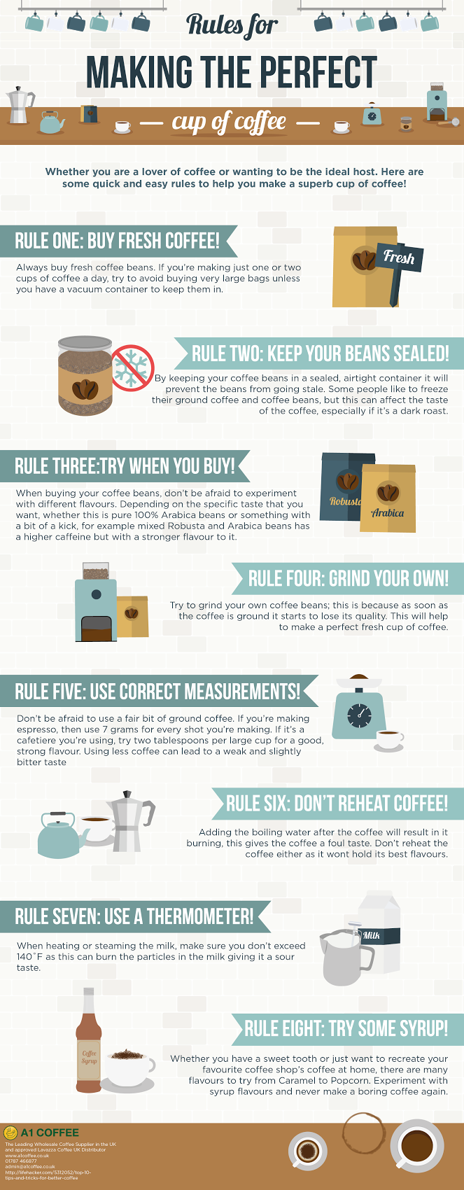
https://coffeeblog.co.uk/rules-making-perfect-cup-coffee-infographic
There are various different ways to present an infographic, but the purpose of being created to further inform remains the same!