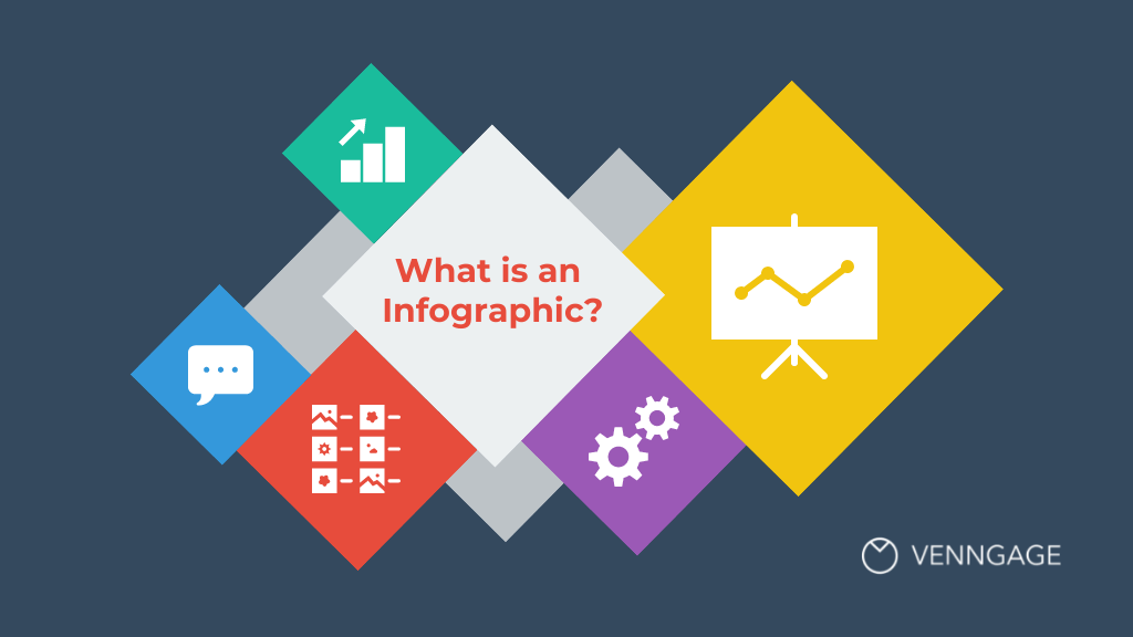
Examples Of “Good” Infographics
Infographics are a great tool for learning, retaining information, and organizing data sets to efficiently display information. There are infographics that can be considered “good” and some that can be considered “bad”. In this blog post I will share what makes a good infographic.
A good infographic often presents complex data into a more clear, simple, and concise way. A good infographic should use its visuals to help the audience interpret the main ideas through storytelling. Most importantly, a good infographic should be useful to the viewers.
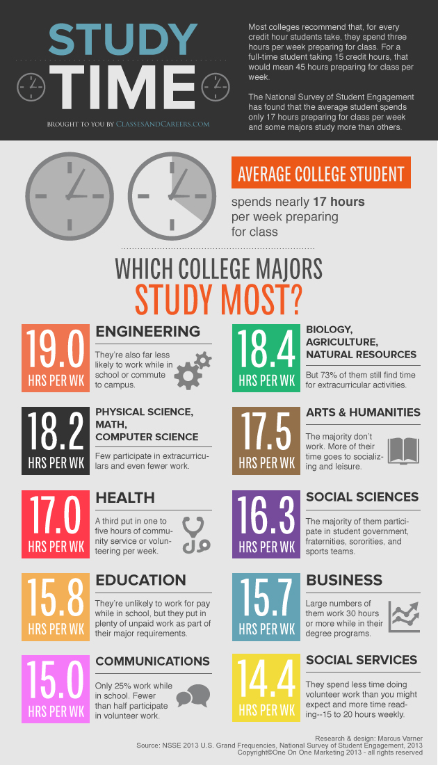
In this infographic on which college majors study the most, takes data that would most likely be very complex on a data sheet, and turns the data into a concise yet comprehensive story that displays the information readily available to the audience. This infographic is clear, easy to interpret, and tells the story on study times. Above all, it is useful information to the intended audiences.

This is another example a good infographic, that displays information clearly, effectively, and is useful to the intended audiences. It tells the story of students and what their weeks consist of. It utilizes good visuals that help the reader interpret the data effectively, making it a memorable visual.
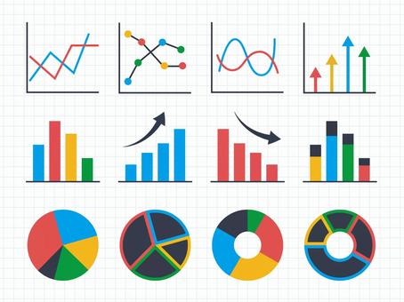
These graphs are great examples of insightful infographics. They’re useful, clear, effective, and display comprehensive data sets that are now easily interpreted by the audience. This is what every good infographic should look like.
Sources
Health Visualizations
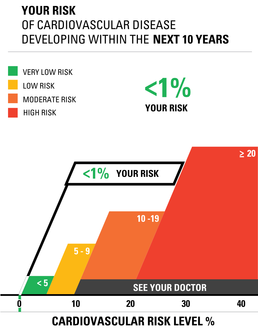
This was my first time visiting a site like ” Health Visualizations”. I really thought the creators used a great color popping technique and did not overcrowd the site. They made it organized and easy to articulate through to find the different links provided. For example, the Risk calculator tab was easy to find and actually located right in the center as you scroll down with an image / visualization clearly stating “cardiovascular risk” and a photo of a graph that calculates someone’s risks. I plugged in my actual data and got a <1% and then I played around with some numbers and doubled my weight and even added in that I had diabetes and really thought the risk calculation would change greatly. BUT IT DID NOT! It actually only rose from 1% to 2% in risk of cardiovascular disease. This was interesting information to see in actual recorded data.
Next, I clicked on the Icon Generator link and plugged in some data. I changed the title to “Diabetes Outcome”. I have a few family members, and even a friend whose daughter has Type I diabetes and has been living with it sine age 1 (now 6) y/o). So, it is a topic that interests me in knowing more about it with Health. I changed the color scheme of icons to something less harsh in my opinion to the eye and less crowded with the number of icons in the array. Here is what my icon generator looks like.
Overall, I found the website “Health Visualizations” helpful and easy to manage through. I know they mentioned this site was only a start and encouraged others to build off of this platform, but I think they really did a great job on explaining uncomfortable and unfamiliar terms in the health field to the viewer.
Visualizing Health
This week’s chapter in Effective Data Visualization is all about the importance of a single number. Chapter 2 explains that sometimes all we really need is for people to remember one important number because the number itself is impactful.
Risk Calculator
The Risk Calculator on VizHealth.org is a great example of the importance of a single number. It was very easy to input your information, and the calculated results display an effective visualization on your risk of developing cardiovascular disease within the next 10 years. When the results popped up, I immediately looked at the percentage for my risk. The number was big and bold, immediately attracting my attention. I believe this was the creator’s intent, so I would say they were successful in making an effective visualization.

Icon Array Generator
Another useful tool in creating an effective visualization is the Icon Array Generator on VizHealth.org. I was able to quickly input data and easily navigate through the various editing options. This is a great way to display a percentage because it clearly maps out the amount of people out of 100 that are at risk for a certain condition. You can adjust the quantity, gender, and color of each outcome value as well as adjust the labels for the Y-axis, legends, and title.
If I could change one thing about this generator, it would be to have the ability to edit the “default outcome value.” This website is meant to effectively communicate health data and risks, and I believe some data would be more effective out of different numbers such as 10, 20, etc. For example, in my Visualize a Big Number assignment this week I displayed the same data on breast cancer risks in women. Instead of showing 13 out of 100 women (as seen above), I wrote “1 out of 8.” In my opinion, 1 out of 8 seems like a lot more than 13 out of 100. Women may be more apt to get screened if the ratio is more impactful. I believe this minor change would positively help communicate health data.
Health Visualization
After visiting vizhealth.org I found a new perspective on how we can use scientific data to communicate health concerns to an audience. The website offers a pretty cool but limited interactive experience through their risk calculator. While it states that the risk assessment is only an estimation and shouldn’t be used for medical diagnosis it can certainly help bring to light a potential risk that maybe people didn’t realize was even a risk. I took some time and ran my own risk calculation and while I wasn’t expecting to be at risk a little reassurance never hurt anyone.
I think that this site is valuable to learning data visualizations. As it shows how a short questionnaire that requires the viewer to interact with then converts into a visual that is simple and easy for a person who has no medical background to understand. It also has an array generator that allows you to create your own. I took some time and created my own.
Visualizing Health
On the interactive infographic, I found that I have less than a 5% chance of developing heart disease within the coming years. Not only was I fully engaged during my time of inputting all the information, but that same attention carried over into reading the results.
The idea of creating an interactive infographic was incredible! The biggest problem with most static information is establishing the connection and sparking the interest from the author to the reader. By allowing for a dynamic source of information to vary based on the results inputted into it, it allows for the reader’s to stay focused longer and absorb information better!
Not only was the user experience informative and interactive, the infographics themselves would change depending on the information submitted to it, allowing the user to see where they stand against the numbers. While this exact website may only be used for medical purposes, the idea of turning an infographic, into a dynamic piece of information, is a monumental step in the way that information can be disseminated through it.
Additionally, the website allows users to create their own graphics to display information, such as survey counts and icon arrays. The following example is my own:

While it may be very rudimentary, the point of it remains the same. By allowing this information to be created by anyone, and still be accessible for everyone, it can help to usher in a new wave of how information can be disseminated! However, the potential for false information to be spread through this infographics still exist, so it is important to always conduct research or fact-check on whatever it may be that you have read!
Honeybee Infographic
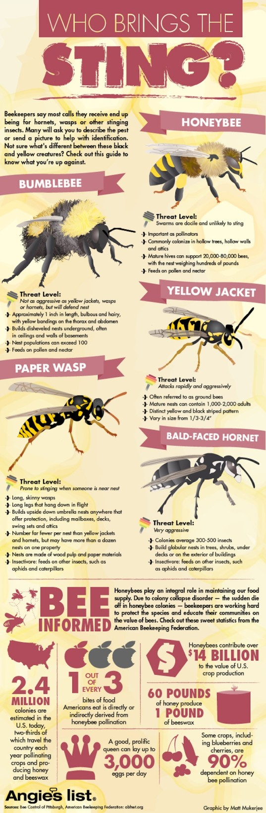
Honeybees are the perfect topic for a striking infographic. These little pollinators are integral to the health of our ecosystems today. In this infographic, you can see a concise presentation of facts on the bottom, with large blocks of text near the bee species. A limited color palette prevents distractions. I feel there is too much text near the species, leading to distractions. The use of symbols helps to drive the infographic’s points home – the colored apples resemble the “1 out of every 3” point underneath it. This graphic is compact, sure, but this compaction takes away some breathing room for the viewer. Adding space could also be used to create more eye-catching visualizations. I’d still consider this a good infographic, but the bottom section focusing on data could maybe use a chart to represent the changes over time.
You can find the infographic here.
Infographics


This is a great infographic of one of my favorite vegan restaurants to go to whenever I’m in Atlanta, Georgia. This restaurant promotes a healthy lifestyle of eating a plant-based diet that is not only good for the body, but good for the earth as well! Lol, TRY to be MATURE and MOVE PAST THE NAME, the name of its menu items, and what it might imply, and moreover FOCUS on its TRUE MESSAGE!!! https://sluttyveganatl.com/


Podcast: Play in new window | Download
Tools for Constructing Infographics
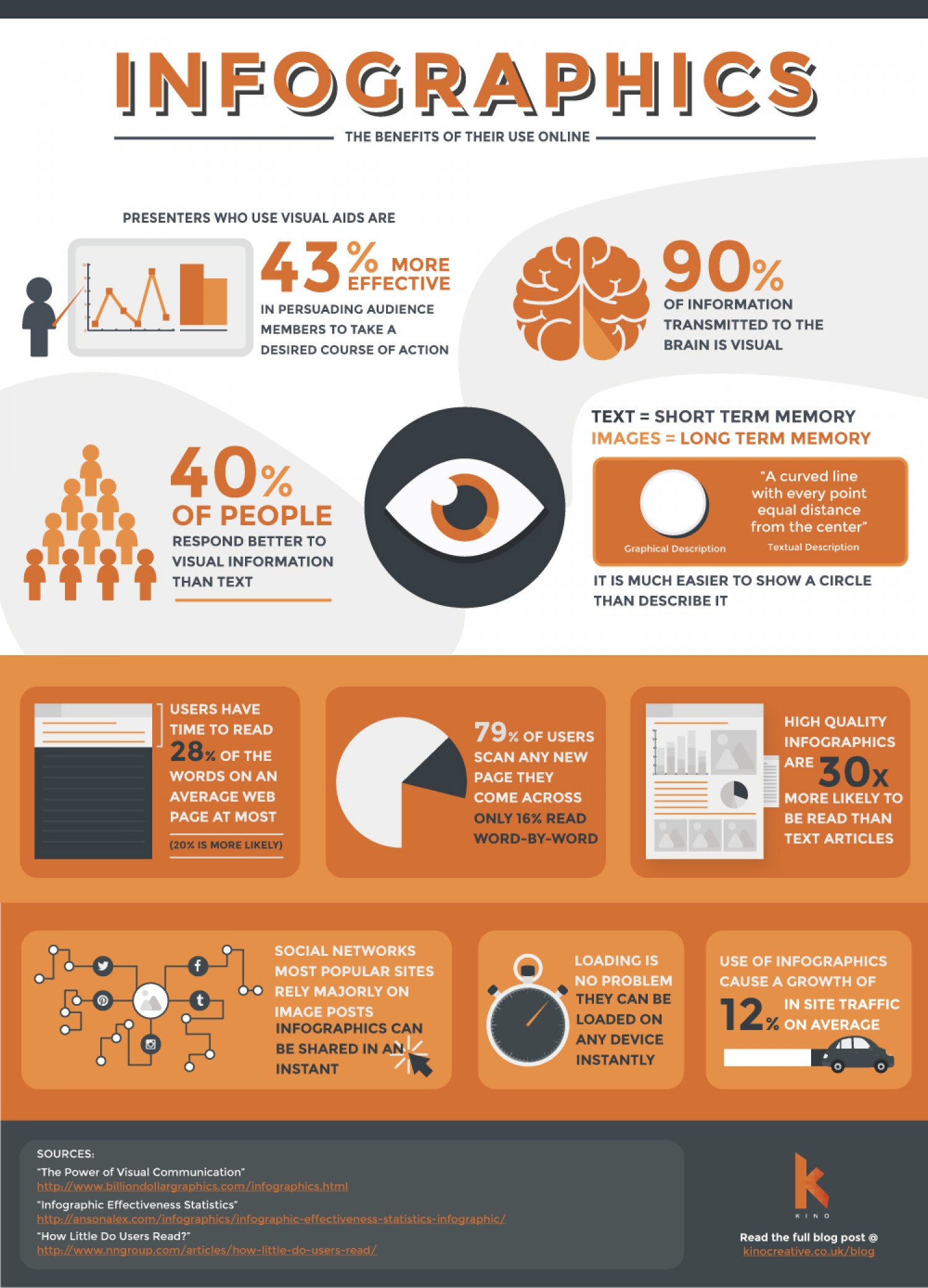
Infographics are powerful visual tools that can significantly enhance our ability to convey complex information in a more digestible and engaging manner. In an age where attention spans are shorter and information overload is common, the use of infographics has become increasingly important. They serve as a bridge between data and understanding, transforming intricate concepts into visually appealing representations that are easier for audiences to grasp.
There are various tools available for creating infographics, each designed to cater to different needs and skill levels. Popular platforms such as Canva, Piktochart, and Adobe Spark offer user-friendly interfaces that make the design process accessible to everyone, from beginners to seasoned graphic designers. These tools come equipped with a wide range of templates, allowing users to choose from pre-designed layouts that suit their specific content and style preferences. This not only saves time but also ensures that the final product is polished and professional. The platform known as Canva actually made a step-by-step video on how to make an infographic on their website, that video can be find at https://www.youtube.com/watch?v=36SIUe_mOZU.
One of the standout features of these infographic creation tools is their ability to easily incorporate various elements such as charts, images, and icons. This flexibility enables users to present data in a visually compelling way, making it simpler to highlight key points and trends. For instance, a complex set of statistics can be transformed into a clear bar graph or pie chart, while relevant images can provide context and enhance the overall narrative. Icons can also be used to symbolize ideas, making the information more relatable and memorable.
By utilizing infographics, we can significantly enhance our communication skills. Infographics not only make our presentations more visually appealing but also serve to clarify and emphasize the information we wish to convey. When information is presented in a structured and visually engaging format, it can lead to better understanding and retention among our audience. This is particularly important in educational settings, business presentations, and marketing campaigns, where the goal is to inform, persuade, or educate.
Infographics
Examples of Insightful Infographics
Robert Kosara shares in Visualization Criticism- The Missing Link Between Information Visualization and Art, that there are many different classifications in data visualization. However, the following criteria are a minimal set of requirements for any visualization: information is based on (non-visual) data, it produces an image, and the result is readable and recognizable. There are many different examples of insightful infographics within this general definition, and below I will share a few common types of infographics that can be insightful and help convey a message to an audience efficiently and effectively.
- Mixed Charts Infographics
2. Informational Infographics
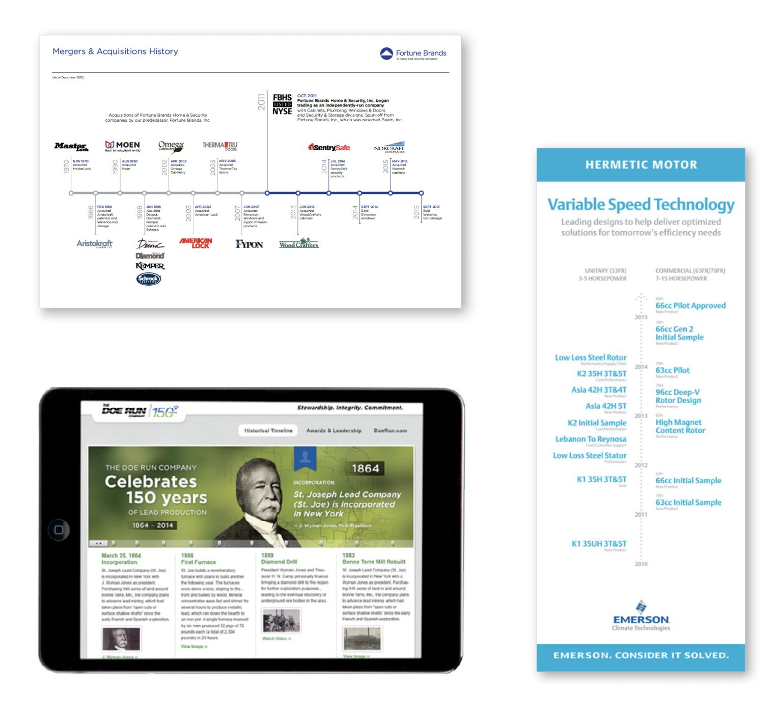
3. Timeline Infographics
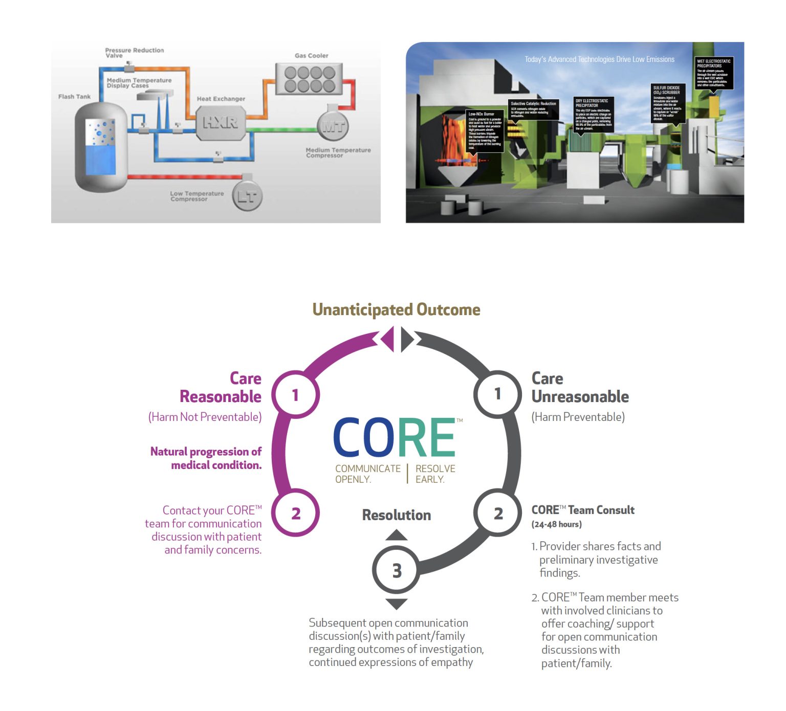
4. Flow Chart Infographics
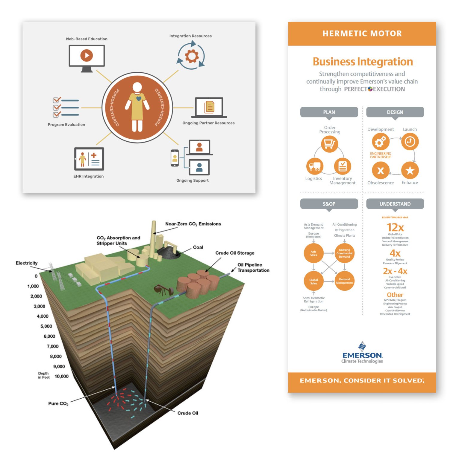
5. Process Infographics
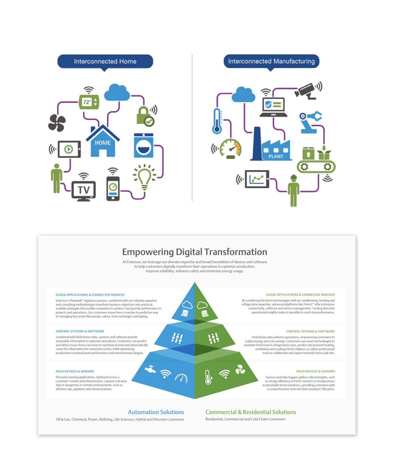
6. Comparison Infographics
7. Location Infographics
8. Photographic Infographics
9. Hierarchical Infographics
10. Interactive Infographics
All of the infographics listed above are different types of commonly used infographics. It is important to note that these are all from one website, and there are many other infographics that are commonly used to convey information.
Sources:
R. Kosara, “Visualization Criticism – The Missing Link Between Information Visualization and Art,” 2007 11th International Conference Information Visualization (IV ’07), Zurich, Switzerland, 2007, pp. 631-636, doi: 10.1109/IV.2007.130. keywords: {Art;Data visualization;Bridges;Computer science;Visual communication;Computer graphics;Handicapped aids;Mice;Joining processes;Concrete},
Prow, B. (2024, July 24). Common types of infographics and when to use them. OBATA. https://obata.com/10-types-of-infographics/
Constructing Infographics with Visme
Infographics are more popular than ever and are a great way to communicate ideas without reading pages and pages of information. Creating an infographic may seem like a daunting task that could takes hours to complete. Some might question is it really worth it. Well, the data show’s it certainly is!
With Visme, creating infogrphics is simple and easy.